We may not have the course you’re looking for. If you enquire or give us a call on 01344203999 and speak to our training experts, we may still be able to help with your training requirements.
We ensure quality, budget-alignment, and timely delivery by our expert instructors.

Have you ever sat through a report filled with endless numbers and thought, “What does all this even mean?” You’re not alone. Data on its own can feel overwhelming, but when presented with the right visual, confusion quickly turns into clarity. That’s why Excel provides different Types of Charts in MS Excel; tools designed to bring numbers to life, reveal patterns, and make stories jump off the screen.
So, here’s the real question: Are you using the right chart for the right purpose? Choosing wisely matters because with so many Types of Charts in MS Excel available, the one you pick can completely change how your audience interprets and reacts to your data. In this blog, we’ll explore 12 powerful chart types that transform plain numbers into meaningful insights.
Table of Contents
1) What is an Excel Chart?
2) Types of Charts in MS Excel
3) How Can I Create a Chart in Excel?
4) How Charts Help in Data Visualisation?
5) Conclusion
What is an Excel Chart?
An Excel chart is a pictorial representation of data in a spreadsheet that helps users quickly understand trends, models, and relationships in the data. Instead of analysing rows and columns of numbers, charts make it easier to interpret and communicate insights through visuals like bars, lines, and slices.
Key Features of Excel Charts:
1) Visual Clarity: Makes complex data easier to understand at a glance.
2) Customisable: You can adjust colours, labels, titles, and chart types.
3) Interactive: Some charts allow filtering or dynamic updates with pivot tables or slicers.
4) Versatile: Suitable for business reports, academic analysis, financial dashboards, and more.
Types of Charts in MS Excel
Excel provides several chart types, each serving unique purposes. Below are the 12 most commonly used charts, showing how the different Types of Charts in MS Excel help in Data Analysis and reporting.
1) Column Chart
Column charts use vertical bars to display data across categories. They are best for showing comparisons where each bar represents a different category or time period.
Best for:
a) Comparing discrete categories
b) Showing growth or decline
c) Ranking items side by side
Example:
A company might use a column chart to compare monthly revenue across different departments. The taller the column, the higher the revenue, making it easy to see which department performs best.

2) Bar Chart
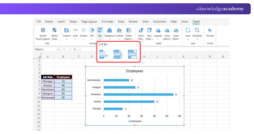
Bar charts use horizontal bars instead of vertical ones, making them useful when category labels are long.
Best for:
a) Comparing large sets of categories
b) Displaying long labels clearly
c) Ranking values side by side
Example:
An HR team might use a bar chart to compare the number of employees in different job roles across the company.
3) Line Chart
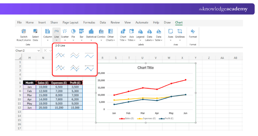
Line charts connect data points with a line to show changes over time.
Best for:
a) Tracking trends
b) Forecasting
c) Showing continuous data
Example:
A retailer might use a line chart to track monthly online sales across a year.
4) Scatter Chart (XY Chart)
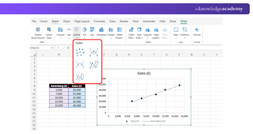
Scatter charts plot individual data points to show relationships between two variables.
Best for:
a) Identifying correlations
b) Spotting patterns
c) Scientific/analytical data
Example:
A marketing team might analyse the relationship between advertising spend and sales revenue.
5) Pie Chart
Pie charts indicate data as slices of a circle, representing proportions of the total.
Best for:
a) Showing percentages
b) Part-to-whole analysis
c) Limited categories (up to 6)
Example:
A company might use a pie chart to show the share of total expenses by department.

6) Doughnut Chart
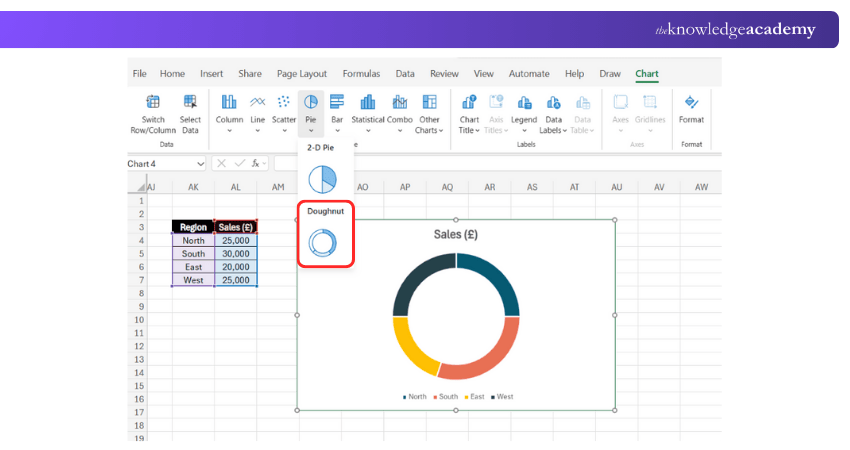
Doughnut charts are like pie charts but allow multiple data series in concentric rings.
Best for:
a) Showing proportions with more detail
b) Comparing categories in layers
c) Displaying part-to-whole relationships
Example:
A retailer might use a doughnut chart to show sales distribution by region and product category.
7) Bubble Chart
Bubble charts expand scatter charts by adding a third variable represented by bubble size.
Best for:
a) Multi-variable analysis
b) Visualising proportions within relationships
c) Market analysis
Example:
A Business Analyst might compare a company’s sales, profit, and market share.

8) Area Chart
Area charts are almost similar to line charts but fill the area under the line, highlighting magnitude over time.
Best for:
a) Showing cumulative totals
b) Comparing multiple trends
c) Emphasising volume
Example:
A gym chain might use an area chart to track new memberships, cancellations, and net active members across months. This provides insights into both growth and retention performance.

9) Radar Chart
Radar charts (spider charts) plot values on multiple axes starting from the same centre point.
Best for:
a) Performance analysis
b) Skill comparison
c) Multi-dimensional data
Example:
An HR Manager might use a radar chart to compare employee skill ratings.

10) Combo Chart
Definition:
Combo charts combine two chart types (e.g., column and line) to compare datasets with different scales.
Best for:
a) Comparing two variables
b) Showing values and trends
c) Dual-axis analysis
Example:
A company might show revenue as columns and profit margin as a line on the same chart.

11) Histogram
Histograms group data into bins (ranges) to show frequency distribution.
Best for:
a) Analysing distributions
b) Showing data spread
c) Statistical insights
Example:
A teacher might use a histogram to show the distribution of student exam scores.

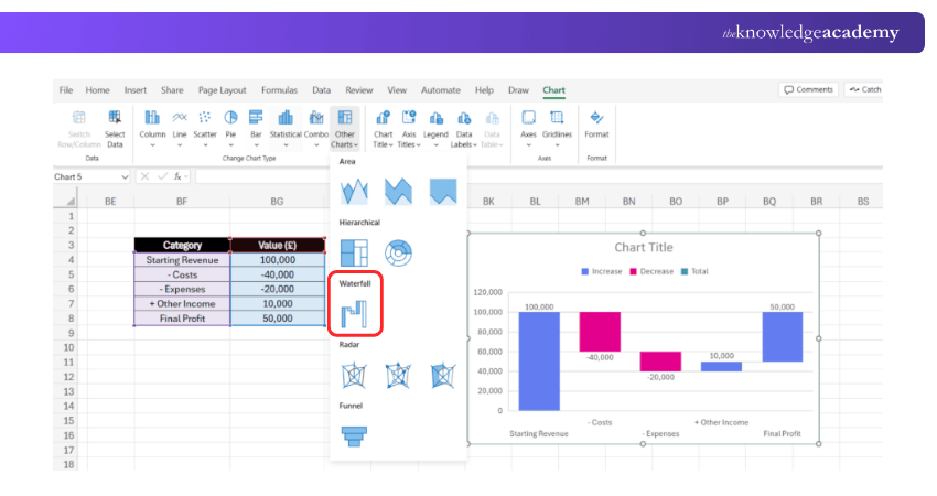
12) Waterfall Chart
Waterfall charts show how an initial value increases or decreases through a series of steps to reach a final total.
Best for:
a) Financial breakdowns
b) Showing cumulative impact
c) Explaining step-by-step changes
Example:
A finance team might use a Waterfall chart to explain how revenue turns into net profit after costs and taxes.
How Can I Create a Chart in Excel?
Creating a Chart in Excel is a simple and powerful way to visualise your data. If you’re wondering How to Create a Chart in Excel, here’s a step-by-step guide to help you get started:
1) Select Your Data: Highlight the table or data range
2) Go to the Insert Tab: On the ribbon, choose the chart type
3) Pick a Design: Click the chart icon (e.g., column, line, pie)
4) Customise the Chart: Add titles, axis labels, and legends
5) Format for Clarity: Adjust colours, font size, and data labels for better readability
With these steps, you can create professional-looking charts in minutes.
Learn Excel step by step, boost productivity, and impress employers with certified expertise – Register for Microsoft Excel Courses now.
How Charts Help in Data Visualisation?
Charts are more than just pretty images; they play a vital role in effective Data Analysis and reporting.
1) Simplify Complex Data: Charts convert raw data into visuals that are easier to interpret.
2) Spot Trends Quickly: Line, area, and column charts reveal patterns and future directions.
3) Highlight Comparisons: Bar and column charts make category comparisons clear.
4) Communicate Insights: Visuals help audiences grasp information faster than spreadsheets.
5) Enhance Reports: Professional-looking charts improve the impact of presentations and business documents.
Conclusion
Excel charts are essential tools for Data Analysis and reporting. By understanding the purpose of different Types of Charts in MS Excel, you can choose the right one to represent your data, making reports more insightful and impactful. Excel doesn’t just store numbers; it helps you tell a story with them.
Frequently Asked Questions
How to Apply Chart Style 7 in Excel?

To apply Chart Style 7 in Excel, select your chart, go to the Chart Design tab, tap the More button in the Chart Styles group, and choose Style 7 from the gallery. It updates the chart’s visual appearance instantly.
How do I Add Chart Tools in Excel?

To add Chart Tools in Excel, simply insert a chart using the Insert tab. Once the chart is selected, the Chart Tools (Design and Format tabs) will automatically appear on the ribbon for customisation.
What are the Other Resources and Offers Provided by The Knowledge Academy?

The Knowledge Academy takes global learning to new heights, offering over 3,000 online courses across 490+ locations in 190+ countries. This expansive reach ensures accessibility and convenience for learners worldwide.
Alongside our diverse Online Course Catalogue, encompassing 19 major categories, we go the extra mile by providing a plethora of free educational Online Resources like Blogs, eBooks, Interview Questions and Videos. Tailoring learning experiences further, professionals can unlock greater value through a wide range of special discounts, seasonal deals, and Exclusive Offers.
What is The Knowledge Pass, and How Does it Work?

The Knowledge Academy’s Knowledge Pass, a prepaid voucher, adds another layer of flexibility, allowing course bookings over a 12-month period. Join us on a journey where education knows no bounds.
What are the Related Courses and Blogs Provided by The Knowledge Academy?

The Knowledge Academy offers various Microsoft Excel Courses, including Microsoft Excel Course, Excel Training with Gantt Charts and Microsoft Excel VBA and Macro Training. These courses cater to different skill levels, providing comprehensive insights into How to Create a Pivot Table in Excel.
Our Office Applications Blogs cover a range of topics related to Microsoft Excel, offering valuable resources, best practices, and industry insights. Whether you are a beginner or looking to advance your Microsoft Office Applications skills, The Knowledge Academy's diverse courses and informative blogs have got you covered.

The Knowledge Academy is a world-leading provider of professional training courses, offering globally recognised qualifications across a wide range of subjects. With expert trainers, up-to-date course material, and flexible learning options, we aim to empower professionals and organisations to achieve their goals through continuous learning.

Upcoming Office Applications Resources Batches & Dates
Date
 Microsoft Excel Course
Mon 1st Jun 2026
Mon 6th Jul 2026
Mon 3rd Aug 2026
Tue 1st Sep 2026
Mon 5th Oct 2026
Mon 2nd Nov 2026
Mon 7th Dec 2026


 Top Rated Course


 If you wish to make any changes to your course, please


