




We may not have the course you’re looking for. If you enquire or give us a call on 01344203999 and speak to our training experts, we may still be able to help with your training requirements.
How to Make a Gantt Chart in Excel: A Complete Guide
ByGaurav KalitaLast updated on: 03 October 2026
A Gantt chart is a project management tool that helps you visualise timelines for your project at a glance by listing the tasks and deadlines that must be met. With it, you can List your project tasks, start dates, and end dates in a table, then insert a stacked bar chart to visually represent your project timeline.

Ever wish you could magically organise your project timeline in one go? Learning How to Make a Gantt chart in Excel is the next best thing! This easy-to-use tool lets you see your project’s entire journey from start to finish without chaos. With just a few clicks, you can transform scattered tasks and deadlines into a sleek, visual plan that keeps everything on track.
Once you discover How to Make a Gantt chart in Excel, you’ll wonder how you ever managed without it. It’s more than just a timeline; it’s a game-changer. You can customise colours, adjust the timeline, and even add labels to highlight key milestones. It’s all about making your project not only organised but visually appealing too, because managing a project should feel as good as it looks.
Before You Start
Before creating a Gantt chart in Excel, prepare a simple project table with task names, start dates, end dates, and durations. Keeping this information accurate and organised makes it easier to build the stacked bar chart, add task labels, and format the timeline correctly.Also ensure that your Duration values are calculated consistently from the project dates before adding them to the chart.
How to Make a Gantt Chart in Excel?
Here are the quick steps to help you get started:
1) List Your Project Schedule in an Excel Table
Start by creating a project schedule with the information required for your Gantt chart.
1) Create a Table: Set up columns for Task Name, Start Date, End Date, and Duration.
2) Enter Data: Add the tasks and their corresponding start and end dates.
3) Calculate Duration: Use the formula =End Date - Start Date to calculate the duration of each task.
4) Add Optional Information: Include columns for status, resources, or dependencies if required.
For example, if the start date is in cell B2 and the end date is in cell C2, you can calculate the duration using =C2-B2.
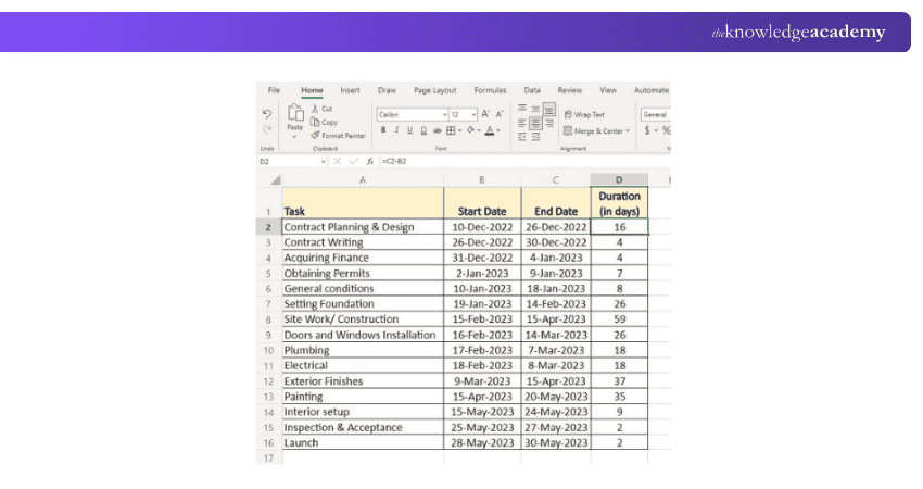
Once your project data is organised, you can use it to create the Gantt chart.

2) Create a Stacked Bar Chart
Use a 2-D Stacked Bar chart as the foundation for your Gantt chart.
Select a Blank Cell: In the same worksheet as your project table, click any blank cell.
Insert a Stacked Bar Chart: Go to the Insert tab, select the Bar Chart dropdown, and choose 2-D Stacked Bar.
Add Your Project Data: Right-click the chart and select Select Data to add the Start Date and Duration data series.
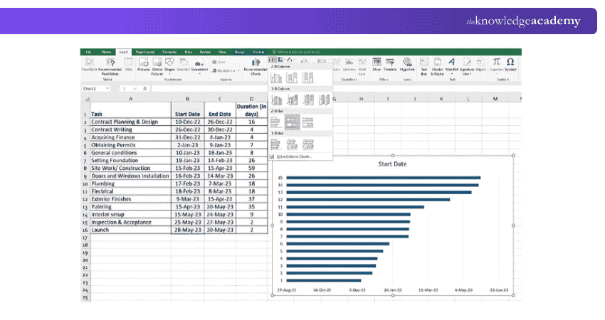
Pro Tip: Keep task names short and specific. Clear labels make the chart easier to scan, especially when managing multiple activities across a long timeline.
3) Add Start Dates and Task Durations
The Start Date and Duration data determine where each task appears on the Gantt chart and how long its bar extends.
1) Select Data: Right-click the chart and select Select Data.
2) Add the Start Date Series: Add the Start Date column as a data series.
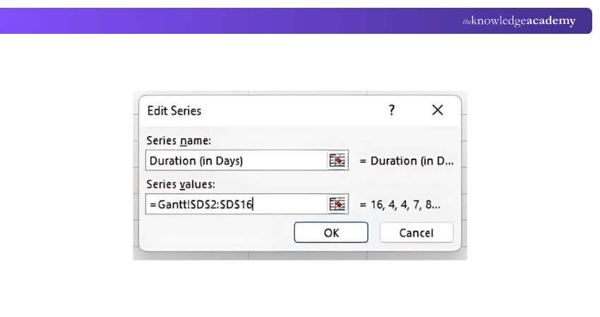
3) Add the Duration Series: Click Add under Legend Entries (Series) and select the cells containing the task durations.
4) Enter the Series Values: In the Edit Series window, enter the appropriate range, such as D2:D16, for the Duration values.
5) Click OK: Confirm the selections to add the Duration series to the chart.
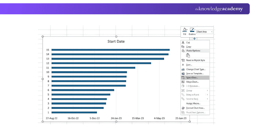
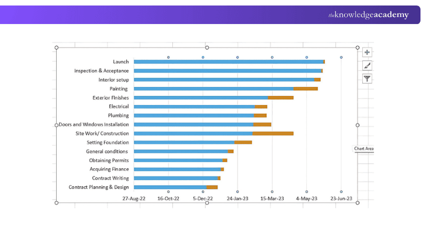
The Start Date and Duration series will now appear as two sections of the stacked bars.
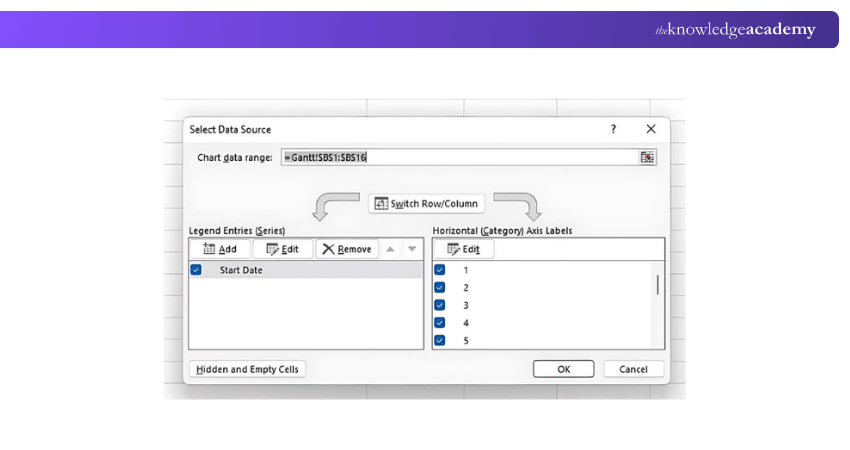
The Edit Series window allows you to enter the series name and the range containing the relevant values.
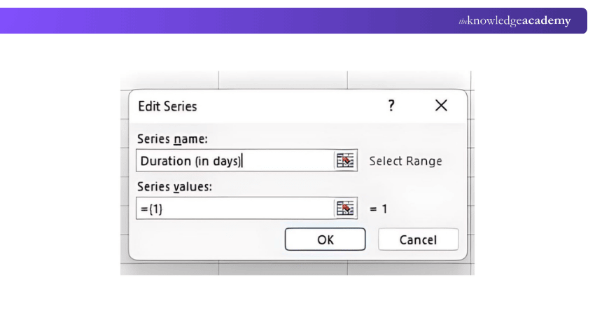
Make sure the selected range contains only the required data values and does not include headers or empty cells.
The resulting stacked bar chart will look similar to the following image.
4) Add Task Names to the Gantt Chart
Replace the default category labels with the names of your project tasks.
1) Open Select Data: Right-click the chart and select Select Data.
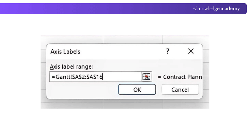
2) Edit Axis Labels: Under Horizontal (Category) Axis Labels, click Edit.
3) Select Task Names: Select the range containing the task names, such as A2:A16.
4) Click OK: Confirm the selection to apply the task names to the chart.
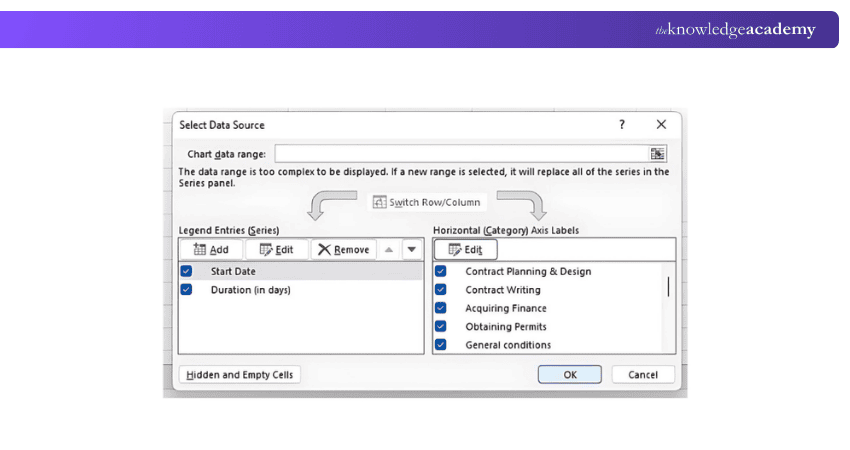
In the Axis Labels window, select the task-name range and click OK.
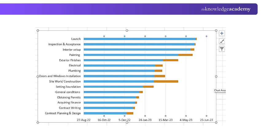
The task names will now appear on the left side of the Gantt chart.
5) Format the Chart as a Gantt Chart
The Start Date series is required to position the tasks correctly, but it should not remain visible in the final chart. Format the chart to display only the Duration bars.
1) Select the Start Date Bars: Click the Start Date bars in the chart.
2) Open Format Data Series: Right-click and select Format Data Series.
3) Remove the Fill: Select No Fill for the Start Date series.
4) Remove the Border: Set the border to No Line.
5) Reverse the Task Order: If required, right-click the vertical axis, select Format Axis, and enable Categories in reverse order.
6) Adjust the Time Scale: Format the horizontal axis and set the required minimum and maximum bounds.
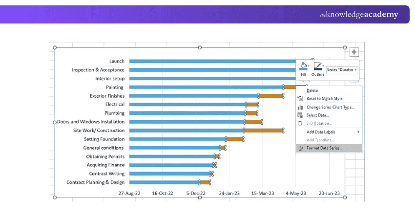
You can use the Format Data Series options to adjust the appearance of the chart.
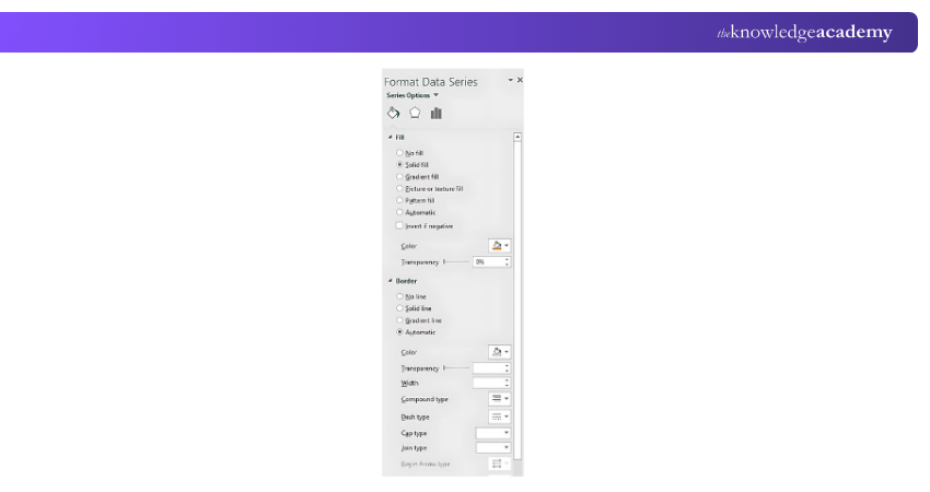
To hide the Start Date bars, select the series and choose Format Data Series > No Fill.
Then select Border > No Line.
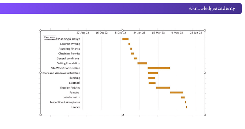
Key Point
Hiding the Start Date series is the key formatting step that transforms the stacked bar chart into a Gantt-style timeline.
6) Customise Your Gantt Chart
Once the basic Gantt chart is ready, you can customise its appearance to make project information easier to understand.
1) Colour Code Tasks: Use different colours to distinguish task categories.
2) Adjust Bar Width: Modify the Gap Width to make the task bars thicker or thinner.
3) Add Task Labels: Use data labels when additional information needs to be displayed directly on the chart.
4) Label Milestones: Use distinctive formatting to highlight important project milestones.
5) Add Gridlines: Add gridlines to make tasks and dates easier to follow.
6) Customise Fonts: Adjust font size and style to improve readability.
Enhance your skills with Excel VBA & Macro training with our Microsoft Excel VBA And Macro Training – Register today!
Gantt Chart Template in Microsoft Excel
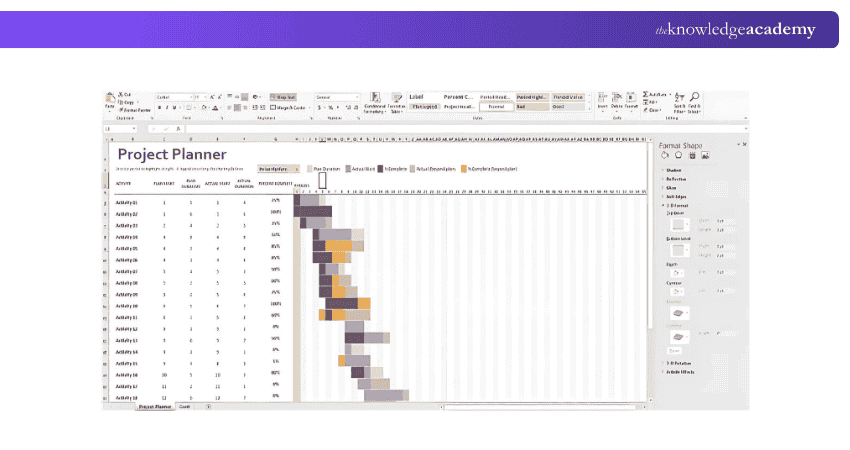
Microsoft provides Gantt chart templates for Microsoft 365 and supports desktop versions of Excel.
The Excel template displayed in the image is called the Gantt Project Planner, a useful tool for creating a Gantt chart with Dependencies in Excel. The purpose of this project planner is to keep track of your project's progress for a set of activities.
Advantages of Excel Gantt Charts
Using Excel to create Gantt charts comes with several benefits, making it a go-to tool for project managers and those involved in project planning. Here are a few key advantages:
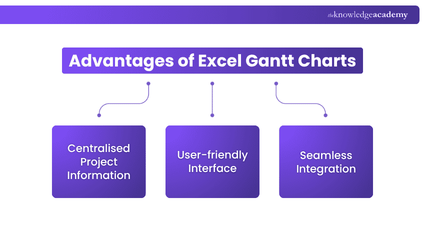
1) Centralised Project Information: Excel allows you to store all your project data in one place. You can access your tasks, deadlines, and milestones in a single view, making project tracking more streamlined.
2) User-friendly Interface: Excel offers an easy-to-use platform for building Gantt charts manually. Simply input the date range, highlight relevant data, and use the Insert tab > Charts to create the chart. Customise it further to suit your specific project needs.
3) Seamless Integration: Excel’s integration capabilities allow you to combine Gantt charts with other tools like formulas, calculations, and data analysis features. This offers a more holistic approach to project management within a single platform.
Learn advanced formulas and functions with our Excel For Accounting Course – Join now!
Disadvantages of Excel Gantt Charts
Although Excel Gantt charts are commonly used in project management, they come with a few drawbacks that could limit their effectiveness in certain scenarios. Here are some of the key disadvantages:
1) Manual Schedule Maintenance: Excel Gantt charts often require more manual updating than dedicated project management tools, particularly when task dates, dependencies, or project scope change.
2) Limited Project Management Features: Although Excel supports task assignment through features such as comments and @mentions, it does not provide the same specialised scheduling, dependency management, resource planning, and workflow capabilities as dedicated project management software.
3) Complexity for Large Projects: Excel can become difficult to maintain when projects contain numerous dependencies, resources, milestones, and frequently changing schedules.
Quick Check
Which Excel chart type is commonly used to create a Gantt-style chart?
A. Pie ChartB. 2-D Stacked Bar ChartC. Scatter ChartD. Radar ChartCorrect Answer: B. 2-D Stacked Bar Chart

Gaurav Kalita is a Content Writer with 2+ years of experience in content development, research and storytelling. His background in English literature and teaching, combined with his growing interest in AI and Machine Learning, supports his writing across Business Skills and IT and Tech.
View Detail

 If you wish to make any changes to your course, please


