




We may not have the course you’re looking for. If you enquire or give us a call on +41 315281584 and speak to our training experts, we may still be able to help with your training requirements.
What is an S-curve: Meaning, Types and Uses in Project Management
ByScarlett AdamsLast updated on: 19 August 2026
Explore What is S-curve, how it represents cumulative project data and how Project Managers use it to monitor performance. It help track progress, costs, resources and performance throughout a project lifecycle.

Key Takeaways
1. An S-curve plots cumulative project data such as cost, progress or labour hours against time.2. Its typical shape reflects slow initial progress, faster activity during execution and slower growth near completion.3. Common types include Cost vs Time, Baseline, Target, Actual and Man-hours S-curves.4. Comparing planned and actual S-curves helps Project Managers identify performance variances.5. S-curves support cost monitoring, resource forecasting, progress tracking and stakeholder reporting.
A project may start according to plan but gradually move away from its expected schedule, cost or resource requirements. Without a clear way to compare planned and actual performance, these changes can be difficult to identify early.
Understanding What is S-curve gives Project Managers a visual way to monitor how project values change over time. By plotting cumulative data such as costs, progress or labour hours, teams can compare expectations with actual performance and identify emerging variances.
This blog explains What is S-curve, its main types, why it is used in Project Management, how to create one and how to interpret the information it provides.
What is an S-curve?
An S-curve is a graphical representation of cumulative project data plotted against time. In Project Management, it is commonly used to track values such as project progress, expenditure, labour hours or resource usage throughout the project lifecycle.
It gets its name from the characteristic S-shaped pattern that often develops. Progress tends to accumulate slowly during the early stages of a project, accelerates as more work is carried out and then slows again as the project approaches completion. The existing blog already identifies several useful types, including cost, baseline, target, actual and labour-related curves. Here are the main types:
1) Initial Phase
Progress is usually gradual while planning, mobilisation and early project activities take place. Fewer resources may be active, so cumulative cost or work increases slowly.
2) Growth Phase
As the project moves into full execution, more activities take place simultaneously. Costs, labour hours or completed work accumulate more quickly, causing the curve to rise more steeply.
3) Final Phase
The rate of growth slows as major activities are completed. Fewer tasks remain, and the cumulative value gradually approaches its final level.
These phases help Project Managers understand not only how much work has been completed but also when project activity is accelerating or slowing down.

What are the Types of S-curves in Project Management?
Different S-curves can be created depending on the information a Project Manager wants to measure. The existing article already identifies several useful types, including cost, baseline, target, actual and labour-related curves. Here are the main types:
1) Cost vs Time S-curve
A Cost vs Time S-curve plots cumulative project expenditure against time.
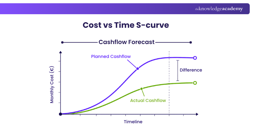
It helps Project Managers understand how spending develops throughout the project and compare actual expenditure with planned financial requirements.
For example, a construction project may spend relatively little during early planning before costs increase rapidly during procurement and construction. Spending then slows as the project enters completion and handover.
2) Value and Percentage S-curve
A Value S-curve represents cumulative project values such as cost, work hours or another measurable quantity.
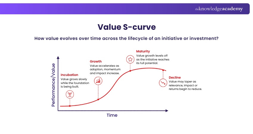
A Percentage S-curve expresses progress as a percentage of the total project. This makes it easier to compare planned completion with actual completion at different points in the schedule.
For example, a project may be planned to reach 60% completion by Month 6 but have achieved only 50%. Comparing the curves makes the difference immediately visible.
3) Baseline S-curve
The Baseline S-curve represents the project's planned performance before or during execution.
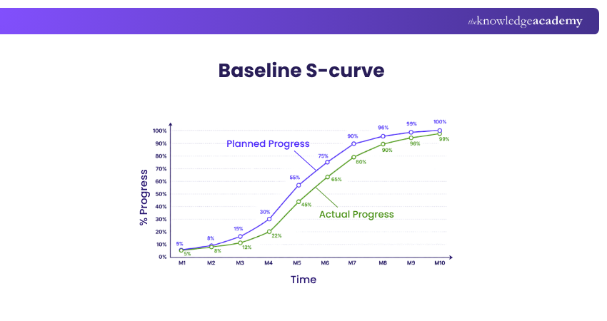
It can show expected progress, cost or resource consumption across the agreed project schedule. This becomes the reference against which subsequent performance is compared.
4) Target S-curve
A Target S-curve represents a revised or updated performance objective.
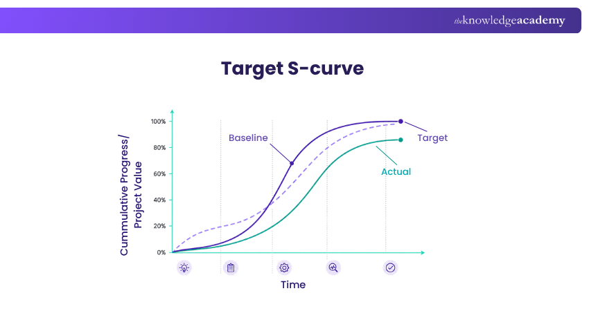
It may be introduced when the original plan changes and the project team needs a new target for completion, expenditure or progress.
For example, if a major scope change alters the schedule, the project may establish a revised target curve to reflect the new expected performance.
5) Actual S-curve
The Actual S-curve shows what has actually happened during project execution.
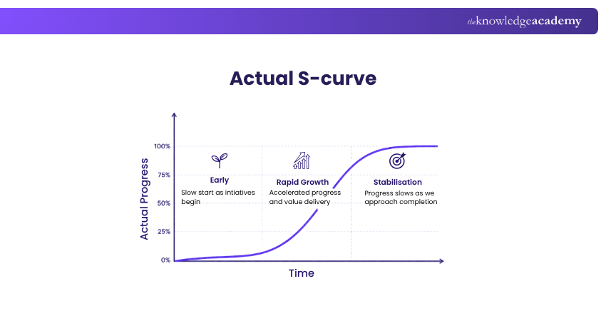
It uses current project information such as completed work, actual expenditure or labour hours. Project Managers commonly compare it with the baseline to identify whether performance is developing as expected. The current article already recognises this baseline-versus-actual comparison as an important use.
6) Man-hours S-curve
A Man-hours S-curve tracks cumulative labour hours over time.
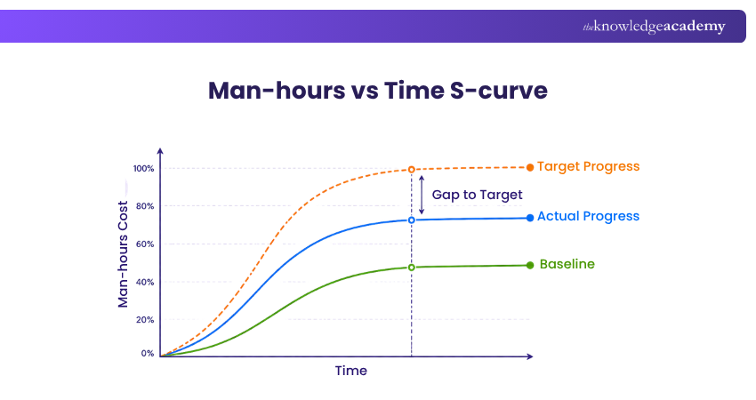
It can help teams understand how much human effort has been used compared with what was planned. This is particularly useful for labour-intensive projects where staffing levels change significantly throughout the lifecycle.
Want to become an expert in Project Management? Then register for our Project Management Black Belt Course!
Why are S-curves Used in Project Management?
S-curves turn large amounts of project data into a visual format that makes trends and differences easier to identify. To better understand What is S-cruve, let’s look at how Project Managers can use them in several ways:
1) Performance and Progress Evaluation
Comparing planned and actual curves helps determine whether progress is following expectations. If the gap between the curves increases, the Project Manager can investigate what is causing the variance rather than waiting until the end of the project.
2) Cash Flow Forecasting
Cost-based S-curves show when expenditure is expected to occur. This can help organisations estimate future funding requirements and understand periods where project spending is likely to be highest.
3) Planned vs Actual Comparison
One of the most useful applications of an S-curve is placing a baseline and actual curve on the same graph. For example, if actual physical progress remains below planned progress for several reporting periods, the project may be developing more slowly than expected.
The important point is that the meaning of the variance depends on what the curve measures. A higher cost curve may indicate overspending, while a higher progress curve may indicate that more work has been completed.
4) Resource and Effort Forecasting
S-curves can show how labour hours or other resources are expected to accumulate. This helps Project Managers anticipate periods of high resource demand and compare expected usage with actual requirements.
5) Stakeholder Reporting
Project information can be difficult to communicate through detailed schedules or spreadsheets alone. An S-curve gives stakeholders a quicker visual representation of performance, helping them understand whether cost, progress or resources are developing according to plan.
The original article discusses many of these benefits after its Excel section, including cost control, resource allocation, stakeholder communication and planned-versus-actual comparisons. These ideas fit more naturally here.
How to Create an S-curve in Excel?
Microsoft Excel can be used to create a simple S-curve from project data. Instead of using unrelated annual profit data, it is more useful to build the chart using cumulative project information.
For example, consider a 10-month project with planned costs. To convert this information into an S-curve, follow these steps:
1) Prepare the Project Data
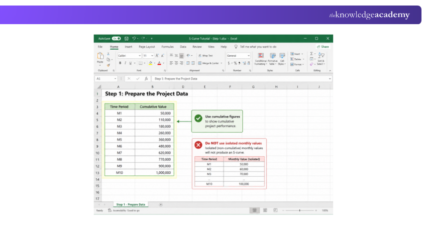
Enter the time periods in one column and cumulative project values in another.
Make sure you are using cumulative figures, rather than isolated monthly values, if your intention is to show cumulative project performance.
2) Select the Data
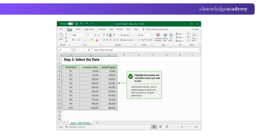
Highlight the timeline and cumulative values that you want to plot.
If you want to compare performance, include additional columns for information such as actual cost or actual progress.
3) Insert the Chart
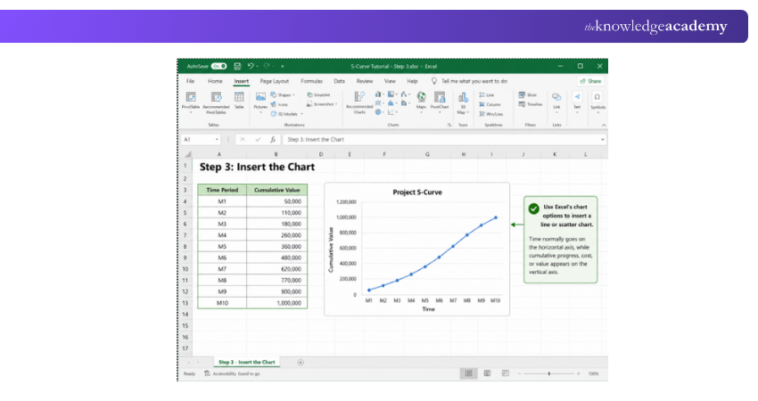
Use Excel's chart options to create an appropriate line or scatter chart.
Time should normally appear on the horizontal axis, while cumulative progress, cost or another project value appears on the vertical axis.
4) Add Baseline and Actual Data
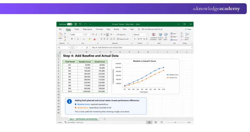
Adding both planned and actual values allows the graph to show performance differences.
For example:
Baseline Curve: expected expenditure
Actual Curve: expenditure recorded so far
This makes the chart much more useful for monitoring than showing a single curve alone.
5) Review the Variance
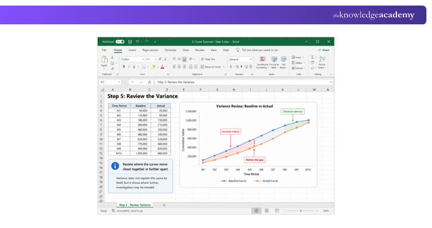
Examine where the curves move closer together or further apart.
These differences do not automatically explain the cause of a problem, but they can show where further investigation may be required.
How to Read an S-curve?
Creating an S-curve is only useful if the information can be interpreted correctly. Project Managers should pay particular attention to the relationship between the curves and the shape of the data.
1) Comparing Planned and Actual S-curves
Suppose an S-curve measures project progress.
If the actual curve remains below the planned curve, less cumulative progress may have been achieved than expected. If it moves above the planned curve, progress may be ahead of the baseline.
However, consider a cost S-curve.
An actual cost curve significantly above the planned cost curve could indicate higher expenditure than expected.
This is why an S-curve should always be interpreted according to the metric being measured.
2) Front-loaded S-curve
A front-loaded S-curve shows greater activity, expenditure or resource usage during the earlier part of the project before the rate gradually slows.
This may occur where significant resources or costs are required early, such as procurement, mobilisation or initial implementation work.
3) Back-loaded S-curve
A back-loaded S-curve shows slower accumulation during the early stages, followed by more significant activity later.
This may occur where extensive planning and design take place before the majority of construction, implementation or delivery work begins. The original article already distinguishes front-loaded and back-loaded patterns, although these are better treated as curve patterns rather than simply different “lines”.
Learn all the intricate details of Project Management with our Project Management Green Belt Course - join today!
Conclusion
An S-Curve gives Project Managers a clear view of how cumulative progress, cost and effort change over time. By comparing baseline, target and actual performance, teams can identify variances and monitor trends. Understanding What is S-curve supports informed decisions about project schedules, budgets and resources.
Want to elevate your skills in Project Management with no prior experience? Sign up for our Project Management for Non-Project Managers Course.

 If you wish to make any changes to your course, please


