We may not have the course you’re looking for. If you enquire or give us a call on 01344203999 and speak to our training experts, we may still be able to help with your training requirements.
Training Outcomes Within Your Budget!
We ensure quality, budget-alignment, and timely delivery by our expert instructors.

Tableau is a widely acclaimed Data Visualisation tool that empowers industries with powerful capabilities. Within Tableau, charts are vital tools to transform raw data into meaningful insights. These Tableau Charts are the visual medium to analyse and communicate data effectively. Learning the details of such charts and their applications can equip you with the knowledge to create compelling visualisations that bring data to life.
There are many basic charts like bar charts and line charts to advanced ones like area charts and heat maps, which can be used to create effective visualisation charts which breaks down complex data into simplified information. . In this ultimate guide on Tableau Charts, we will discuss their types, usage and different types of applications in detail and with examples.
Table of Contents
1) Understanding Tableau Charts
2) Categorising Tableau Charts
a) Basic Tableau Charts
b) Advanced Tableau Charts
c) Specialised Tableau Charts
3) Tips for using advanced charts in Tableau
4) Conclusion
Understanding Tableau Charts
Tableau Charts are visual representations that play a pivotal role in understanding patterns, trends, and insights within data. They transform raw data into compelling visuals that facilitate the exploration and interpretation of complex information. By presenting data in a graphical format, these charts enhance comprehension and enable users to derive meaningful insights.
Selecting the appropriate chart type is vital to effectively communicate data based on its characteristics and the goals of the analysis. Different chart types offer unique data representations, such as comparisons, distributions, and relationships. Choosing the right chart type ensures that the data is presented accurately and maximises the impact of the visual representation. It lets viewers grasp key insights quickly and intuitively, enhancing decision-making.
Key components of Tableau’s charts include dimensions, measures, and visual encoding techniques. Dimensions are categorical variables that provide context and define the distinct categories within the data. They allow data grouping, sorting, and filtering based on specific criteria. Measures, on the other hand, represent the quantitative values being analysed. They encompass numerical data and enable calculations and aggregations.
Visual encoding techniques are used to map data attributes to visual properties, enhancing the clarity and effectiveness of charts. These techniques involve encoding data through visual elements such as position, length, colour, shape, and size. For example, using colour to represent a categorical variable or varying the length of bars in a bar chart to represent quantitative values. By leveraging visual encoding techniques, these charts can convey information more intuitively and facilitate a deeper understanding of the data.

Categorising Tableau Charts
Tableau, a leading data visualisation tool, offers various chart types to transform raw data into insightful visuals. Categorising charts in Tableau based on their characteristics and applications is crucial for effective data communication. In this section, you will delve into different Tableau Charts, exploring the different categories and their unique features.
Understanding the various chart types available in Tableau allows professionals like analysts and data enthusiasts to select the most appropriate visualisation to convey their insights accurately. You can dive into fundamental charts like bar, line, pie, and scatter plots by categorising charts in Tableau, which are the building blocks of Data Visualisation.
This section will also help you learn about advanced charts like area charts, bubble charts, heat maps, tree maps, box plots, and Gantt charts, which offer more sophisticated ways to represent complex data relationships. Additionally, you will explore specialised charts that cater to specific data analysis needs, such as geographic analysis, goal tracking, cumulative changes, and word frequency analysis.
Basic Tableau Charts
Basic charts are the fundamental building blocks of Data Visualisation in Tableau. They allow us to present and analyse categorical and numerical data clearly and concisely. This section will explore four essential types of basic charts.
Each chart's unique purpose and characteristics can empower you to uncover insights, track trends, and understand relationships within our data. Let's dive into the world of basic charts and discover how they can enhance our data storytelling abilities:
1) Bar charts: Bar charts are visual representations used to display categorical data. They consist of rectangular bars of varying lengths, where the length of each bar corresponds to the quantity or value it represents. Bar charts are effective in comparing and contrasting data across different categories.
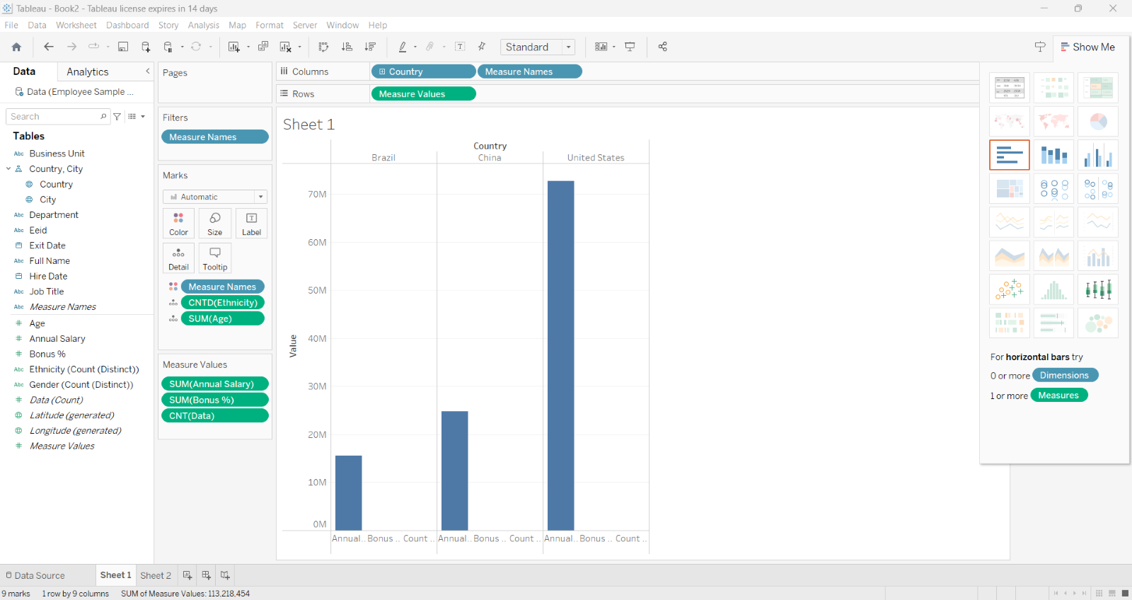
Variations of bar charts include horizontal bar charts, where bars are oriented horizontally, and stacked bar charts, where bars are stacked to represent multiple variables within each category. Bar charts are commonly used to showcase survey results, sales figures by product category, and population distribution by age group.
2) Line charts: Line charts illustrate trends and changes over time. They are created by connecting data points with lines, forming a continuous curve. Line charts are particularly useful in depicting data progression and identifying patterns or fluctuations.
They are commonly employed in tracking stock market trends, visualising temperature variations throughout the year, and analysing population growth over time.
3) Pie charts: Pie charts are circular visualisations that represent proportions within a whole. The circle is divided into slices, each representing a specific category or group. The size of each slice corresponds to the proportion it represents. Pie charts showcase part-to-whole relationships and highlight the relative contributions of different categories.
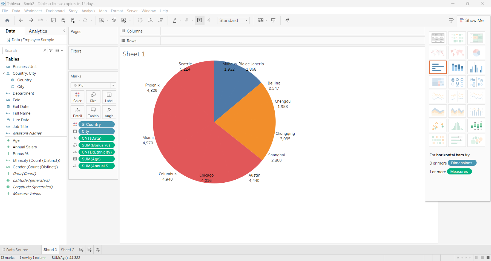
However, it's important to use pie charts judiciously, as they can become difficult to interpret when there are too many slices or when the differences in proportions are subtle.
4) Scatter plots: Scatter plots are graphical representations that display the relationship between two variables. They use dots or markers to represent data points on a Cartesian plane, plotting one variable along the x-axis and the other along the y-axis. Scatter plots are valuable for identifying dataset correlations, clusters, or outliers.
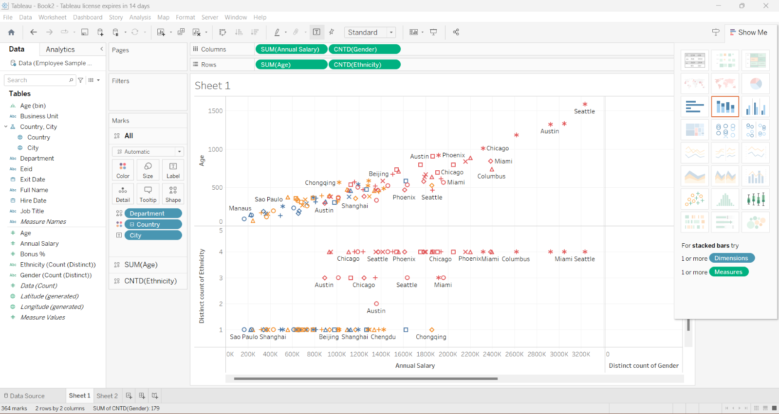
They find applications in analysing the relationship between advertising expenditure and sales, examining the correlation between height and weight, and exploring the impact of study time on exam scores.
Prepare for analytical and strategic roles with our Business Intelligence Reporting Course!
Advanced Tableau Charts
When it comes to Data Visualisation, basic charts lay the foundation, while advanced charts elevate storytelling capabilities. Advanced charts in Tableau offer a deeper level of sophistication, allowing us to explore complex data relationships, patterns, and distributions.
In this section, you will delve into various advanced chart types, including area charts, bubble charts, heat maps, tree maps, box plots, and Gantt charts. Each chart brings its unique set of features and applications, enabling us to uncover deeper insights and present data in a visually compelling manner. Let's embark on this journey of discovering the power of advanced charts in Tableau.
In advanced charts, these visualisations provide powerful ways to represent complex data relationships, patterns, and progressions. Analysts can unlock deeper insights and effectively communicate their findings to stakeholders by understanding and utilising these advanced chart types.
1) Area charts: Area charts depict quantitative data as filled areas under a line. They provide a powerful way to represent cumulative values and compare trends. The filled areas between the line and the x-axis allow for clear visualisation of the data's magnitude. Area charts excel in scenarios where tracking stock prices, visualising population growth or analysing revenue trends is essential.
2) Bubble charts: Bubble charts are dynamic visualisations incorporating three dimensions: the x-axis, y-axis, and bubble size. The size of each bubble represents an additional variable or data attribute, providing a deeper level of information.
Bubble charts are particularly useful for showcasing complex relationships among multiple variables. They find applications in analysing market data, visualising survey results with multiple dimensions, or exploring the correlation between three different metrics.
3) Heat maps: Heat maps are visual representations utilising colour gradients to represent data density or values. They provide a quick and intuitive way to identify patterns, correlations, or distributions within a dataset.
Heat maps are commonly used in various domains, such as analysing customer behaviour on a website, visualising population density across geographic regions, or tracking performance metrics across periods.
4) Tree maps: Tree maps are hierarchical visualisations that employ nested rectangles to represent data. The size and colour of each rectangle convey information about the presented data.
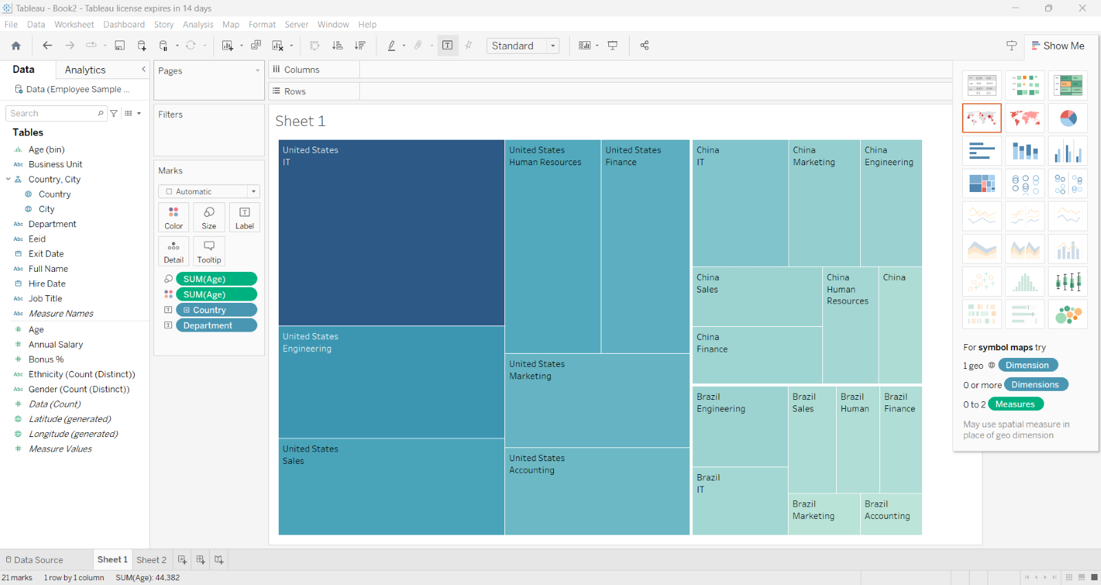
Tree maps are particularly effective in showcasing hierarchical structures and comparing proportions across different categories. They find applications in areas such as file directory visualisation, portfolio analysis, or visualising market share by industry segments.
5) Box plots: Box plots, also known as box-and-whisker plots, are graphical representations of statistical measures such as the median, quartiles, and outliers.
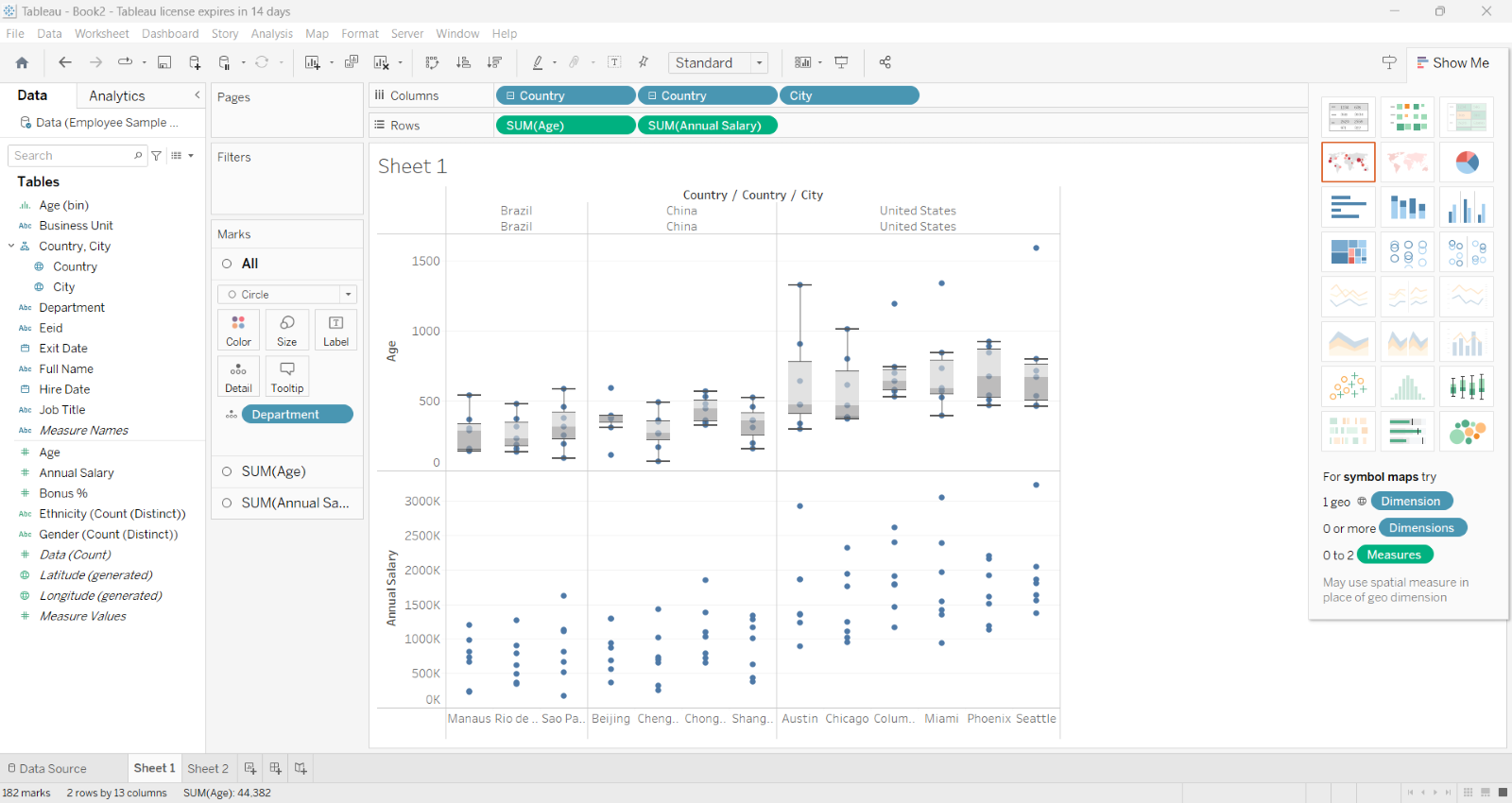
They provide a concise summary of data distributions and help identify anomalies or variations within a dataset. Box plots are valuable when comparing sales performance across regions, analysing test scores, or understanding income distributions is necessary.
6) Gantt charts: Gantt charts are visual tools that illustrate project schedules, timelines, and dependencies. They show project tasks' start and end dates as horizontal bars, allowing for easy visualisation of task durations and overlaps.
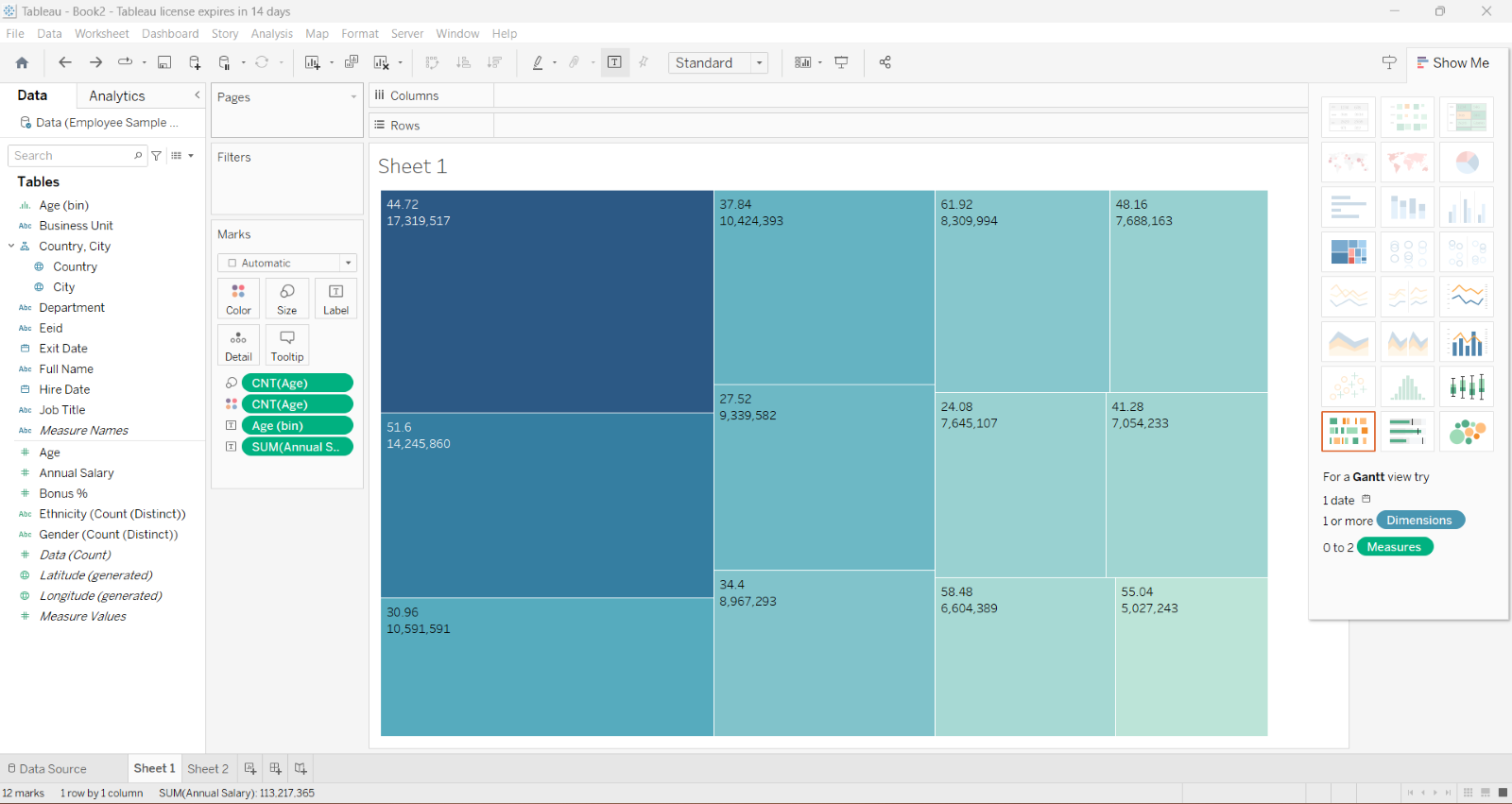
Gantt charts are widely employed in project management, construction planning, event planning, and other industries where visualising project progress and managing timelines is crucial.
Learn Data Visualisation in Power BI with Microsoft Power BI Course!
Specialised Tableau Charts
Specialised charts offer a rich array of tools to tackle unique data scenarios and address specific analytical needs in the vast landscape of Data Visualisation. In this section, you will explore a diverse range of specialised charts, each designed to serve a particular purpose and provide valuable insights.
Specialised charts offer unique ways to visualise and communicate specific data types and insights. By harnessing the power of these specialised chart types, analysts can present information in a targeted and impactful manner, gaining a deeper understanding and enabling effective decision-making.
Professionals such as analysts can uncover hidden patterns, trends, and relationships within their data by understanding and leveraging these chart types. Join us in exploring specialised charts, where you will unlock new dimensions of data understanding and expand our visualisation tool kit.
1) Geographic maps: Geographic maps are invaluable tools for displaying data concerning geographical locations. They allow us to visualise data points on a map and provide spatial context to our analysis.
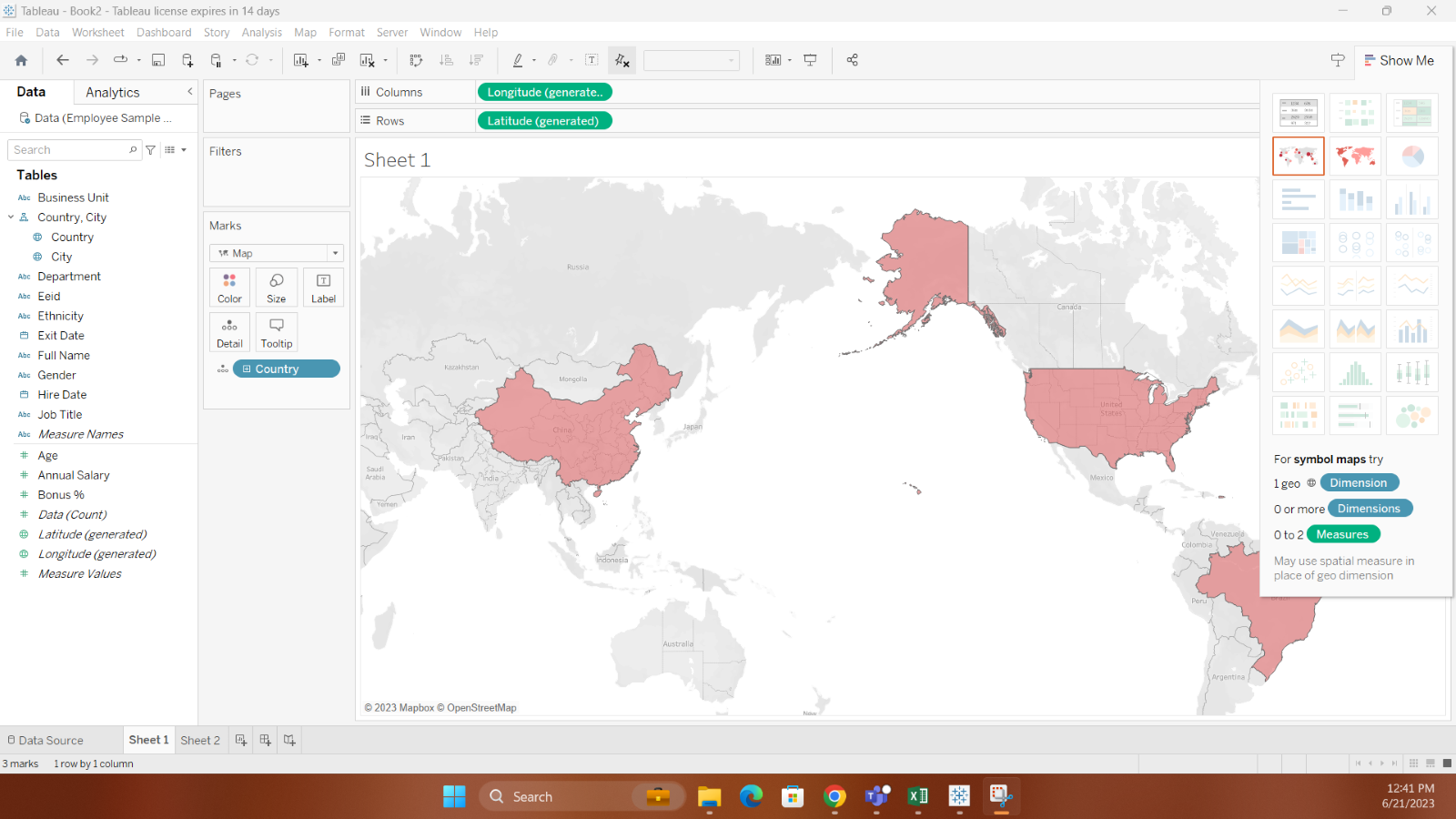
Various geographic maps exist, including point maps, which plot individual data points on a map. Choropleth Maps use colour shading to represent data values within predefined areas, and connection maps, illustrate connections or flows between different locations. Geographic maps are widely used in logistics, marketing, and urban planning industries.
2) Bullet charts: Bullet charts are linear visualisations designed to showcase progress towards goals or benchmarks. They consist of a single bar representing a target or benchmark and additional bars representing actual performance or progress.
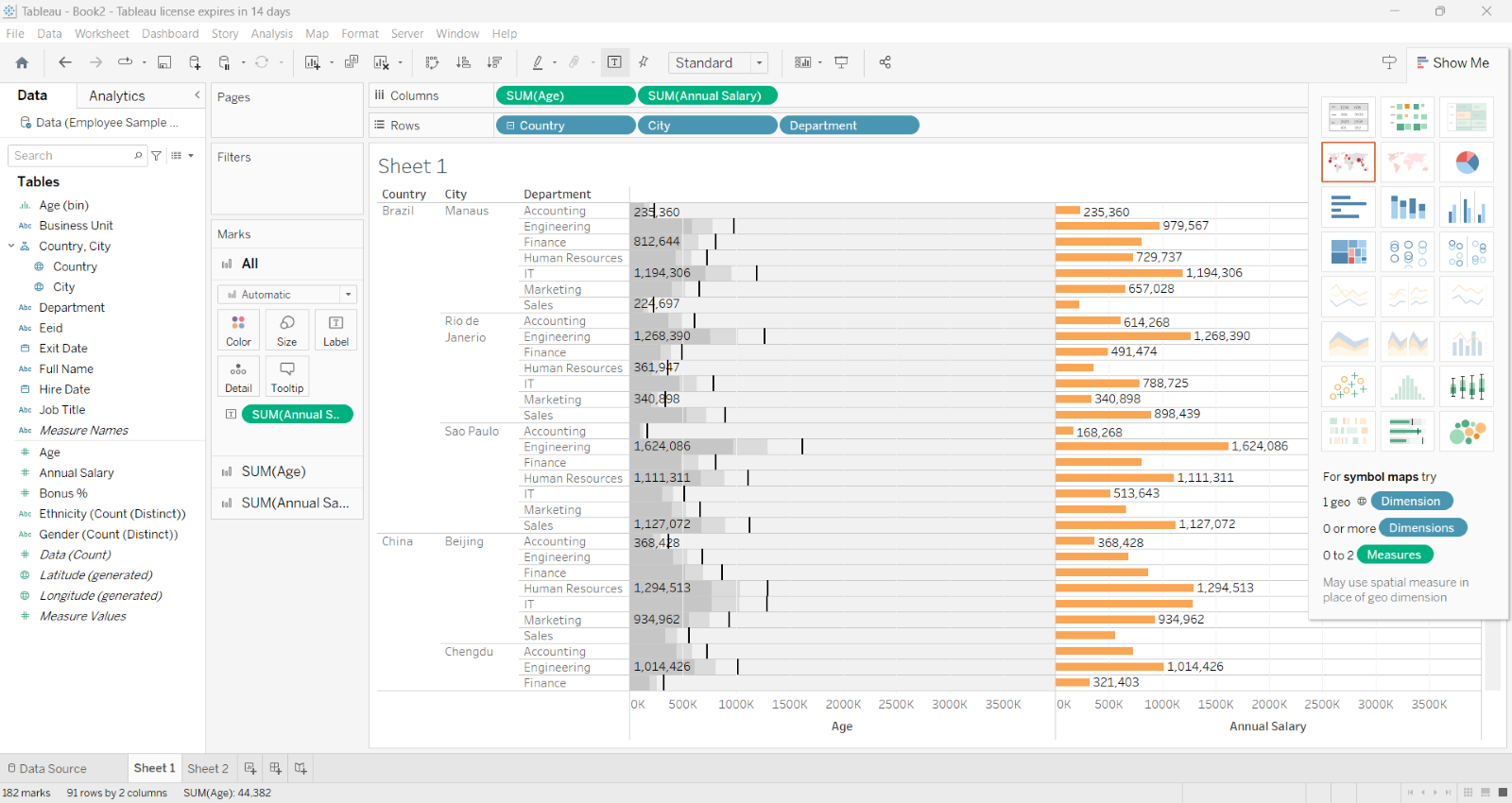
The different components of a bullet chart, such as the target, actual, and ranges, provide a comprehensive view of performance and allow for quick comparisons. Bullet charts are commonly used in performance tracking, goal management, and financial analysis.
1) Waterfall charts: Waterfall charts illustrate cumulative changes in data over a series of steps or categories. They are useful for visualising positive and negative contributions to a total value. Each step in a waterfall chart represents an increment or decrement, and the final bar represents the total value.
Waterfall charts find practical use in financial analysis, budgeting, and project management, where they help understand the impact of individual factors on the overall outcome.
2) Word clouds: Word clouds are visualisations that display words based on their frequency or importance within a text or dataset. They utilise font size and colour to represent the significance of each word, with larger and bolder words indicating higher frequency or importance.
Word clouds are often employed in text analysis, sentiment analysis, and summarising large volumes of textual data. They provide a quick and visually appealing way to identify key themes, popular topics, or frequent keywords within a dataset.
Develop necessary skills for Data Analysis with Business Intelligence Reporting!
Tips for using advanced charts in Tableau
In this section, you will explore tips for using advanced charts in Tableau, empowering you to take your Data Visualisations to the next level. Combining chart types, utilising calculated fields, leveraging statistical functions, and forecasting future trends can create more insightful and impactful charts that drive informed decision-making.
Combining chart types with dual-axis
Tableau's dual-axis feature allows you to combine different chart types within a single visualisation, creating a more comprehensive and informative representation of your data. You can effectively showcase different dimensions and measures simultaneously by overlaying multiple chart types, such as bar charts, line charts, or scatter plots. This technique enables you to highlight correlations, trends, and comparisons within the same chart, providing a richer understanding of your data.
Enhance context with reference lines and bands
Reference lines and bands in Tableau help provide valuable context and benchmarks in your charts. You can add reference lines to indicate specific values or thresholds, such as a target or an average, allowing easy comparison with your data points. On the other hand, reference bands allow you to highlight specific ranges or intervals, aiding in identifying patterns or variations. By incorporating these reference lines and bands, you can add clarity and deeper insights to your visualisations.
Utilise calculated fields
Calculated fields in Tableau enable you to perform complex calculations or transformations on your data, empowering you to derive new insights or create custom metrics. With calculated fields, you can create advanced formulas using mathematical operators, functions, logical expressions, and even combine multiple fields. This flexibility allows you to calculate growth rates, generate ratios, normalise data, or perform custom calculations based on your specific analysis requirements. By leveraging calculated fields effectively, you can enhance the depth and accuracy of your charts.
Harness Tableau's statistical functions
Tableau provides a rich set of built-in statistical functions to enhance data analysis. These functions include measures of central tendency, dispersion, correlation, regression analysis, hypothesis testing, and more. By utilising these functions, you can uncover deeper insights, identify relationships between variables, and perform advanced statistical analysis within your charts. Whether you need to analyse trends, detect anomalies, or conduct more sophisticated statistical modelling, Tableau's statistical functions offer a powerful toolkit for advanced charting.
Forecast future trends
Tableau's forecasting capabilities allow you to project future trends based on historical data. You can generate predictions and visualise potential future outcomes by applying forecasting algorithms. This feature is particularly valuable for strategic planning, budgeting, and decision-making. With Tableau's forecasting functionality, you can explore trends, anticipate changes, and make data-driven predictions, enabling you to proactively address challenges and opportunities in your business or organisation.
Learn various visual data analysis skills with our Tableau Desktop Training!
Conclusion
We hope that from this blog, you understood the effectiveness of using Tableau Charts as a Data Visualisation tool. By understanding the different types of Tableau Charts, following best practices, and employing advanced techniques, you can create compelling and informative visualisations that empower you to uncover valuable insights and make data-driven decisions.
Learn how to handle data with our Microsoft BI Training today!
Frequently Asked Questions

Bar Charts are the most popularly used Tableau Charts as it is the simplest way to produce visual representation. It gets the message across, quick and easy. Although if you wish to track progress of a certain variable a line graph is recommended.

When compared to Excel, we see that Excel can organise and store data to an extent and can perform some basic calculation. While Tableau offers a more powerful visualisation capability to manage larger data sets more effectively.

The Knowledge Academy takes global learning to new heights, offering over 30,000 online courses across 490+ locations in 220 countries. This expansive reach ensures accessibility and convenience for learners worldwide.
Alongside our diverse Online Course Catalogue, encompassing 17 major categories, we go the extra mile by providing a plethora of free educational Online Resources like News updates, Blogs, videos, webinars, and interview questions. Tailoring learning experiences further, professionals can maximise value with customisable Course Bundles of TKA.

The Knowledge Academy’s Knowledge Pass, a prepaid voucher, adds another layer of flexibility, allowing course bookings over a 12-month period. Join us on a journey where education knows no bounds.

The Knowledge Academy offers various Business Intelligence Reporting, including Microsoft Power BI Training, Business Objects Reporting Course and Crystal Reports Masterclass. These courses cater to different skill levels, providing comprehensive insights into the Objectives of Business Reports.
Our Office Applications Blogs covers a range of topics offering valuable resources, best practices, and industry insights. Whether you are a beginner or looking to advance your skills, The Knowledge Academy's diverse courses and informative blogs have you covered.
Upcoming Office Applications Resources Batches & Dates
Date
 Tableau Desktop Training
Mon 17th Jun 2024
Mon 9th Sep 2024
Mon 2nd Dec 2024


 Top Rated Course


 If you wish to make any changes to your course, please


