We may not have the course you’re looking for. If you enquire or give us a call on 01344203999 and speak to our training experts, we may still be able to help with your training requirements.
Training Outcomes Within Your Budget!
We ensure quality, budget-alignment, and timely delivery by our expert instructors.
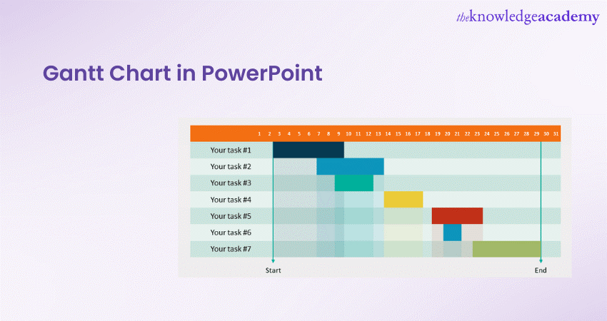
Effective project management has become crucial for big businesses and individuals in today’s competitive business market. Organisations are rapidly moving towards using Gantt Chart in PowerPoint to facilitate successful projects and achieve customer satisfaction.
Combining the features of PowerPoint with the dynamic capabilities of Gantt Charts, Gantt Chart in PowerPoint is a visual project management tool. It helps track tasks, timelines and dependencies.
However, it’s the right time if you and your organisation haven’t already switched to this comprehensive tool. But what is this tool about, and how is it beneficial in project management? Read this blog to learn more about Gantt Charts in PowerPoint. Also, explore their benefits and the process of creating these charts.
Table of Contents
1) Introduction to Gantt Charts in PowerPoint
2) Benefits of using Gantt Charts in PowerPoint
3) How to make a Gantt Chart in PowerPoint?
4) Integrating Gantt Charts into PowerPoint Presentations
5) Tips for designing an effective Gantt Chart
6) Conclusion
Introduction to Gantt Charts in PowerPoint
When it comes to creating impactful presentations, PowerPoint is the go-to software for many professionals. It offers numerous features and tools to enhance the visual appeal and effectiveness of your slides.
One such powerful tool is the Gantt Chart. Combining the versatility of PowerPoint with the project management capabilities of Gantt Charts can take your presentations to the next level.
A Gantt Chart in PowerPoint visualises a project schedule that helps project managers, teams, and presenters effectively communicate project plans, timelines, and progress. They enable presenters to showcase project schedules, track progress, and highlight milestones in an organised and visually appealing manner.
Whether you are presenting a business proposal, a project update, or a strategic plan, incorporating these charts can help you leave a lasting impression on your audience and convey your message more effectively.
With PowerPoint tips, user-friendly interface and powerful editing capabilities, creating a Gantt Chart within your presentation is straightforward. You can customise the chart to match your presentation’s theme, add animations to enhance the visual impact, and easily update the chart as the project progresses.
Using this tool in your presentations, you can provide a clear and concise overview of project tasks, their durations, and their relationships. This dynamic and interactive chart allows your audience to grasp the project’s timeline immediately, making complex information more accessible and engaging.

Benefits of using Gantt Charts in PowerPoint
Gantt Charts are not only powerful project management tools but also valuable assets in the realm of PowerPoint Presentations. Incorporating these charts in your PPT slides offers several benefits that can effectively enhance your ability to communicate project plans, timelines, and progress. Let’s explore the key advantages of using Gantt Charts in PowerPoint:
Visual representation
Gantt Charts visually represent project schedules, tasks, and dependencies. By incorporating them in your PowerPoint Presentation, you can present complex project data in a visually appealing and easily understandable format.
The chart’s horizontal bars and clear timelines allow your audience to grasp the project’s timeline and structure at a glance, making it easier to follow along and comprehend the information.
Timeline management
Managing project timelines is essential for successful project execution. Gantt Charts in PowerPoint enable you to visualise and manage project timelines effectively. By representing tasks and their durations on a timeline, you can identify overlapping activities, potential bottlenecks, and critical milestones. This helps you allocate resources efficiently, adjust schedules, and ensure the project stays on track.
Progress tracking
One of the significant advantages of Gantt Charts is their ability to track project progress. By updating the chart regularly with actual start and end dates, you can visually represent the completion status of each task.
This allows project stakeholders to monitor progress easily and identify any delays or deviations from the original plan. Tracking progress using a Gantt Chart in PowerPoint promotes transparency, accountability, and timely decision-making.
Effective communication
Gantt Charts facilitate effective communication and collaboration among project stakeholders. By presenting project plans, timelines, and dependencies in a clear and organised manner, you enable your audience to understand the project's scope and objectives.
This shared understanding fosters better collaboration, as team members can align their efforts, identify interdependencies, and coordinate tasks more efficiently. Additionally, Gantt Charts serve as a common reference point during meetings, discussions, and presentations, ensuring everyone is on the same page.
Master the art of designing effective Gantt Charts with our Microsoft PowerPoint MO300 Training.
Presentation Impact
PowerPoint presentations are meant to engage and captivate the audience. By incorporating Gantt Charts into your slides, you can make your presentations more dynamic and visually appealing.
Further, the chart's colourful bars, milestones, and dependencies create a visually stimulating experience for your audience, making it easier for them to absorb and retain information. The visual impact of Gantt Charts in PowerPoint helps you deliver a memorable presentation that leaves a lasting impression.
Using Gantt Charts in PowerPoint brings numerous benefits to your project management and presentation efforts. By leveraging the power of Gantt Charts in PowerPoint, you can effectively convey project plans, engage your audience, and achieve project success.
How to make a Gantt Chart in PowerPoint?
Creating a Gantt Chart in PowerPoint is a straightforward process allowing you to represent project timelines, tasks, and dependencies visually. By following these step-by-step instructions, you can create an impactful Gantt Chart that enhances your presentations. Let’s dive into the process of how to create a Gantt Chart in PowerPoint:
Step 1: Open PowerPoint and create a new slide
Step one includes performing the following:
a) Launch PowerPoint
b) Open a new or existing presentation
c) Create a new slide where you want to insert your Gantt Chart
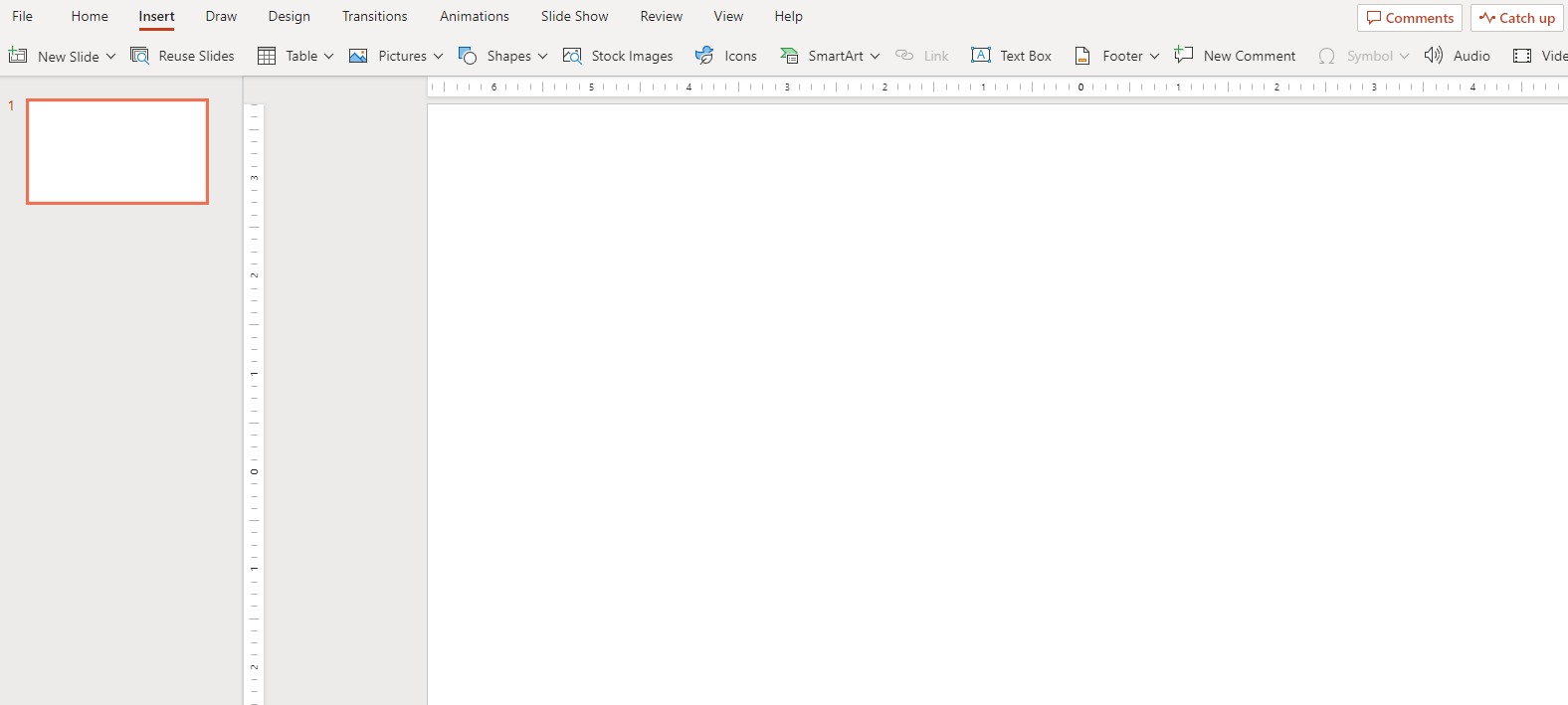
Step 2: Insert a Table
Step two involves inserting the table into your presentation. You will require to do the following:
a) In the new slide, go to the "Insert" tab in the PowerPoint ribbon
b) Click on the "Table" button
c) Choose the number of rows and columns you need for your Gantt Chart
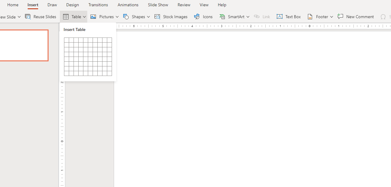
Step 3: Customise the table
In step three, you will need to do the following:
b) Adjust the column widths to accommodate your project timeline
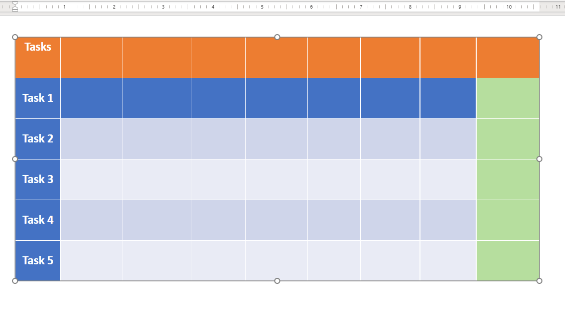
You can also format the table by changing the font, cell borders, and background colours to match your presentation's style. The table will look like the following image:
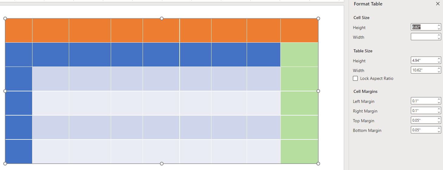
Step 4: Add task names
In the leftmost column of the table, enter the names of the tasks or activities that make up your project. Each task should have its own row in the table. Your table will look like the following image:
Step 5: Define the timeline
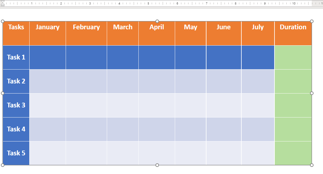
Across the top row of the table, define the timeline of your project. Each column represents a specific time period, such as days, weeks, or months. You can choose the appropriate time scale based on the duration of your project. You will be presented with a new table:
Step 6: Add task bars
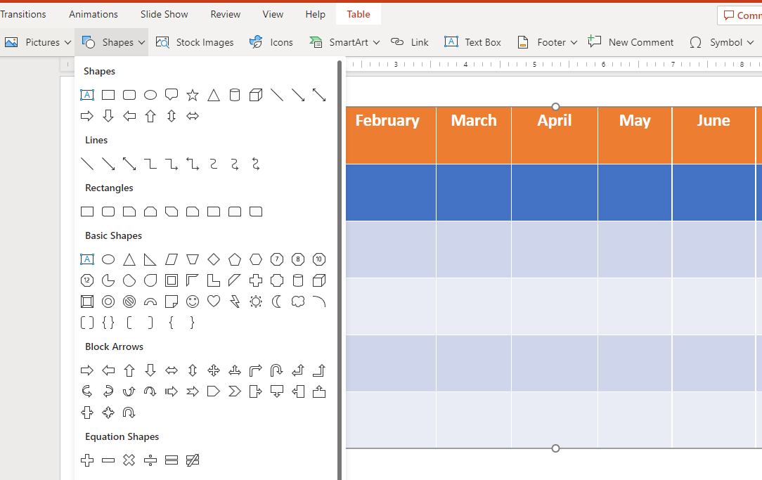
Select the cells corresponding to each task and its duration in the table. Format these cells to represent the tasks visually. One common approach is applying shading or fill colours to the cells to create horizontal bars representing the task duration.
Step 7: Include milestones
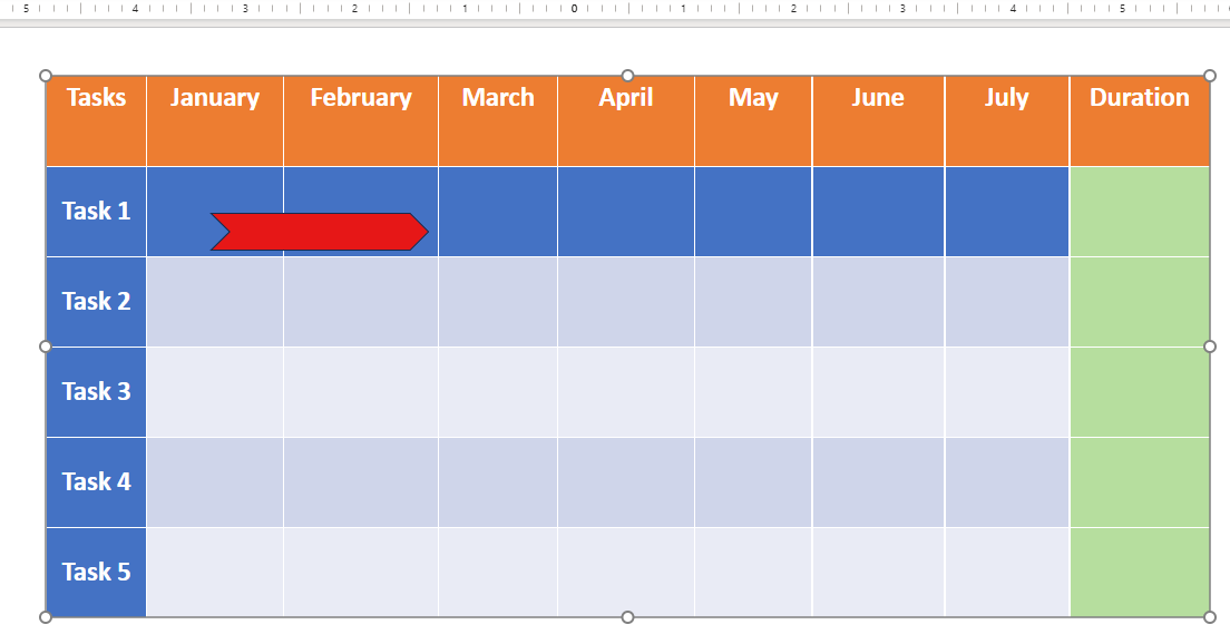
Identify significant milestones or deadlines in your project and mark them in the Gantt Chart. You can use symbols, icons, or different colours to highlight these milestones and make them visually distinct from regular tasks, as shown in the following image:
Step 8: Define dependencies
To represent task dependencies or relationships, you can use arrows or connecting lines between the task bars in the Gantt Chart. These visual indicators show the logical order in which tasks should be completed and illustrate their dependencies.
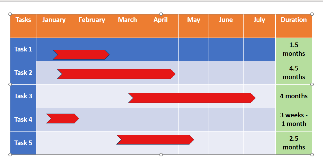
Step 9: Customise the Gantt Chart
To enhance the visual appeal of your Gantt Chart, you can customise it further. Experiment with different colours, fonts, and styles to match your presentation's overall design. Ensure that the chart is easy to read and understand.
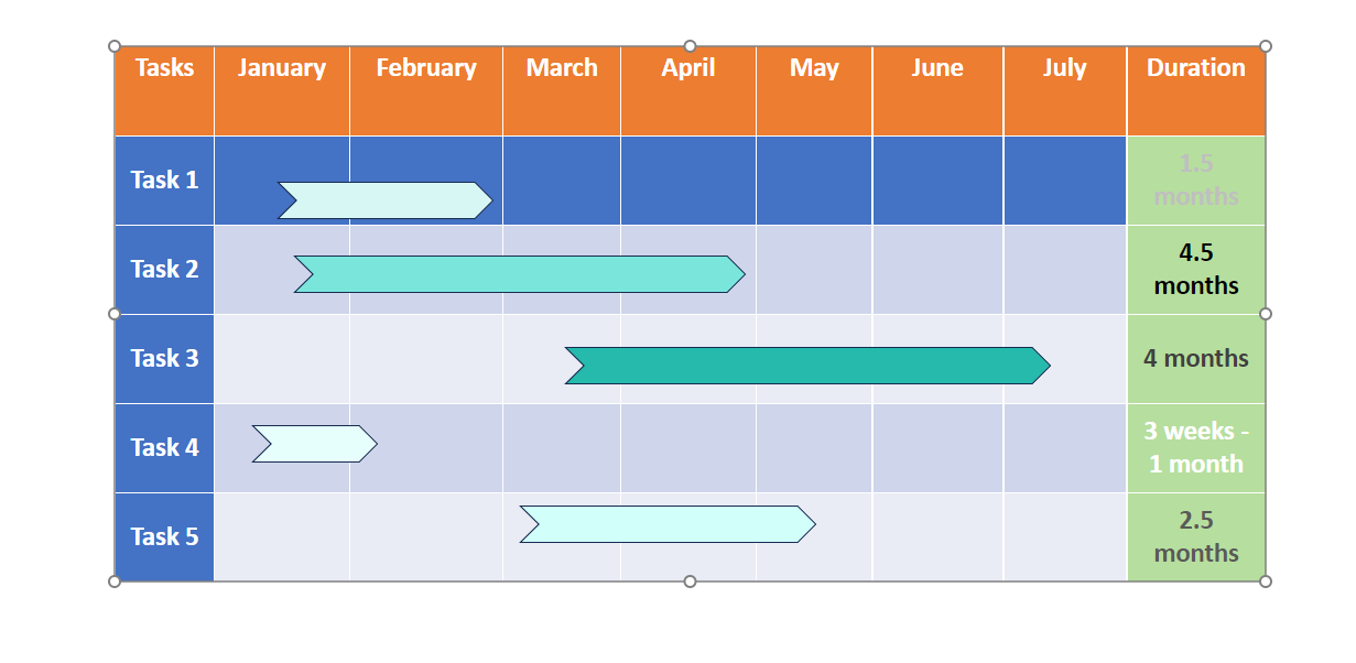
Step 10: Update and maintain the Gantt Chart
As your project progresses, update the Gantt Chart with the actual start and end dates of tasks. This will help you track the project’s progress and make any necessary adjustments. Regularly maintain the Gantt Chart to keep it up-to-date and accurate.
By following these ten steps, you can create a visually appealing and informative Gantt Chart in PowerPoint. Remember to save your presentation to preserve the Gantt Chart and ensure it is readily accessible for future use.
Master the tools and techniques to make your presentations stand out. Join our Microsoft Office Training now!
Integrating Gantt Charts into PowerPoint Presentations
Integrating Gantt Charts into PowerPoint presentations allows you to effectively communicate project plans, timelines, and progress to your audience. Here are some essential tips for seamlessly integrating Gantt Charts into your PowerPoint Presentations:
Slide placement
Decide where you want to place your Gantt Chart within your presentation. Consider the flow and narrative of your presentation and determine the most appropriate point to introduce the chart. Ideally, it should align with the topic or section that discusses project planning, timelines, or progress.
Chart size and position
Resize and position the Gantt Chart on the slide to ensure optimal visibility. Ensure the chart is large enough for the audience to read and understand.
Note: It should be manageable enough to overwhelm the rest of the slide content. Position the chart prominently to draw attention and ensure it is easily visible to all viewers.
Contextual text
Accompany your Gantt Chart with relevant text, captions, or explanations. Introduce the chart, explaining its purpose and highlighting key elements. Use concise and clear language to ensure your audience understands the chart’s context and how to interpret it.
Animation and interactivity
Consider adding animation effects to your Gantt Chart to enhance its visual appeal and engage your audience. You can reveal the chart gradually, element by element, to create a sense of anticipation and keep the audience focused. Additionally, consider using hyperlinks or interactive features to allow viewers to explore the chart in more detail or access additional project-related information.
Consistent design
Maintain consistency in design throughout your presentation. Ensure that the colours, fonts, and overall style of the Gantt Chart align with the rest of your slides. Consistency helps create a cohesive and professional-looking presentation that is easy to comprehend and visually appealing.
Real-time updates
Consider integrating real-time updates into your Gantt Chart if your project is ongoing. This can be done by linking your chart to project management software or spreadsheets. With real-time updates, you can dynamically reflect changes in task progress, timelines, or dependencies, providing your audience with the most up-to-date information during the presentation.
Proper documentation
Provide proper documentation for your Gantt Chart. Include a reference slide or handout that explains the symbols, colours, or other elements used in the chart. This documentation serves as a helpful resource for your audience, enabling them to understand the chart even after the presentation.
Tips for designing an effective Gantt Chart
Designing an effective Gantt Chart is crucial to ensure your project timelines are visually clear, engaging for your audience and easy to understand. Here are some valuable tips to consider when designing your Gantt Chart:
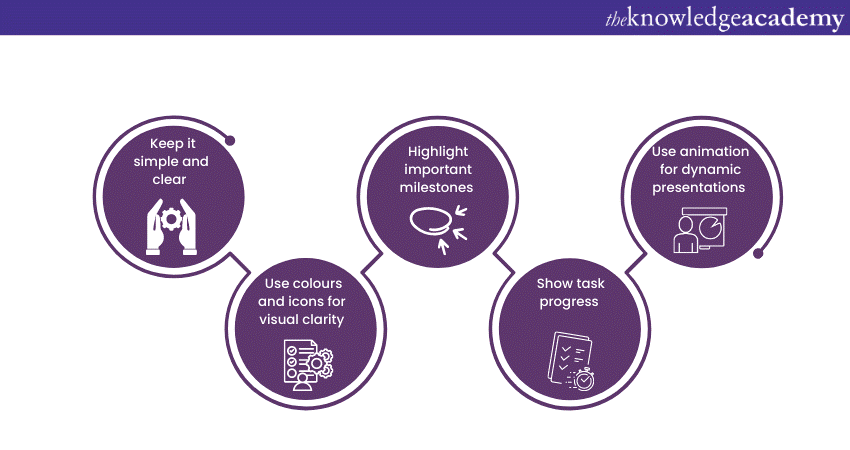
1) Keep it simple and clear
Simplicity is key when designing a Gantt Chart. Avoid cluttering the chart with excessive details or overwhelming visuals. Focus on the essential elements, such as tasks, durations, and dependencies. Keep the layout clean and organised, allowing your audience to grasp the project timeline at a glance quickly.
2) Use colours and icons for visual clarity
Utilise colours and icons to enhance the visual clarity of your Gantt Chart. Assign different colours to tasks or task groups to differentiate them visually. Use icons or symbols to represent milestones, deadlines, or important events within the project. This helps draw attention to critical elements and makes the chart more visually appealing and engaging.
3) Highlight important milestones
Identify and highlight significant milestones within your Gantt Chart. Milestones represent key achievements, project deadlines, or major events. By visually distinguishing these milestones, you bring attention to crucial points in the project timeline. This helps your audience understand the progress and importance of specific tasks or events.
4) Show task progress
Illustrate the progress of tasks in your Gantt Chart. Use shading, patterns, or colour fill to indicate the completion status of each task. This visual representation allows your audience to quickly assess the progress and identify any potential delays or bottlenecks. Clearly distinguish between completed, ongoing, and upcoming tasks for better comprehension.
5) Use animation for dynamic presentations
Consider adding animation effects to your Gantt Chart when presenting it in PowerPoint or other similar platforms. Animation can bring the chart to life, revealing different elements gradually or highlighting specific sections. This dynamic presentation style engages your audience and helps convey complex information more effectively.
Conclusion
By understanding Gantt Chart in PowerPoint and leveraging its capabilities, you can elevate your project management efforts and deliver compelling presentations that engage your audience and convey information effectively. With the ability to integrate Gantt Charts seamlessly into PowerPoint presentations, presenters can enhance the visual appeal and impact of their slides.
Enhance your Microsoft PowerPoint skills today with our Microsoft PowerPoint Masterclass.
Frequently Asked Questions
Upcoming Office Applications Resources Batches & Dates
Date
 Microsoft PowerPoint Training
Thu 16th May 2024
Thu 6th Jun 2024
Thu 4th Jul 2024
Thu 8th Aug 2024
Thu 5th Sep 2024
Thu 10th Oct 2024
Thu 7th Nov 2024
Thu 5th Dec 2024


 Top Rated Course


 If you wish to make any changes to your course, please


