We may not have the course you’re looking for. If you enquire or give us a call on 01344203999 and speak to our training experts, we may still be able to help with your training requirements.
Training Outcomes Within Your Budget!
We ensure quality, budget-alignment, and timely delivery by our expert instructors.
- Quick Powerful Graphics with Power View, PowerPivot, Power Query, Power Map and Power BI M55164
- Microsoft Power BI for End Users 55400AC
- Designing and Implementing Enterprise-Scale Analytics Solutions Using Microsoft Azure and Microsoft Power BI DP500
- Microsoft Power BI Data Analyst PL300
- Microsoft BI Training

Whether it’s a project pitch or a business meeting, data plays a vital role in decision-making. However, some data can be complex and challenging to comprehend. On the other hand, sometimes, understanding the data might be difficult, regardless of how good the presentation may be. This could negatively impact the outcome of the meeting. You can overcome this issue with Power BI Projects and its powerful visualisation features.
Power BI is an excellent tool with powerful features that simplify data with easy-to-fathom visual insights. According to Statista, the Business Intelligence (BI) tools market will grow to 12.18 billion GBP in the next few years. In this blog, you will learn some Power BI Projects for practice using sample datasets. Read this blog for the latest and interesting ideas for the Power BI Projects that will enhance your visualisation and data analytics abilities.
Table of Contents
1) Power BI Projects Ideas: Basic level
a) Power BI Projects for tracking the financial performance
b) Projects for optimising marketing campaigns
c) Projects for analysing customer migration
d) Power BI Projects for analysing product sales
2) Power BI Projects Ideas: Intermediate level
3) Power BI Projects Ideas: Advanced level
4) Conclusion
Power BI Projects Ideas: Basic level
Power BI is a very useful tool for visualising data to make informed business decisions. This section presents some basic Power BI Projects and ideas that even a beginner can create without any issues.
Signup for Microsoft Power BI Training & Certification Course and learn how to create powerful reports and design dashboards.
Power BI Projects for tracking the financial performance
![]()
People use Power BI Projects for analysing finances by measuring the Key Performance Indicators (KPIs), financial statements and charts. The collected parameters are then used for analysing finances. This type of project is useful for accounting companies as it can help fine-tune the client's financial reports. It increases the accuracy and efficiency of these reports. With its visual insights, you can quickly examine the reports and send them to your clients on time.
This type of Power BI Project helps clients get a better understanding of their finances as well as their work efficiency. So, projects like this help transition away from conventional financial reporting tools like Excel. You can use the data visualisation feature in Power BI for the following three situations:
a) You can use line charts and column charts for assessing financial statements
b) You can view the balance sheet page using the tools like cards and tables in Power BI
c) You can use waterfall charts, column charts and line charts to access the overview page
Power BI Projects for optimising marketing campaigns

Marketing campaigns are useful for generating leads, finding potential clients and communicating with existing customers. Analysing the campaign data helps find useful insight into your potential clients, marketing mediums, and overall cost. By utilising this data, you can figure out a way to optimise your campaign using Power BI.
This Power BI Project can showcase the effectiveness of different campaigns, their functionalities, and their overall performance. Moreover, it can be used to evaluate the features of a product and its performance. Apart from this, you can determine the success of various campaigns and tasks using this project. You can also use this project to get marketing channel performance data and determine client interests. You can use the marketing analytics dataset for these basic-level projects.
You can perform exploratory data analysis, statistical analysis and visualisations using this dataset on Power BI. Power BI Dashboard is a single-page sheet that can highlight specific insights. With this dataset, you can create an interactive dashboard that contains many useful insights.
Power BI Projects for analysing customer migration
Significant efforts and time are required to build a customer base. However, with one misstep, it could disappear in a blink of an eye. Companies constantly fear that they might lose customers to their rivals. Another significant challenge is customer attrition, where your client loses interest in your products and no longer wants to buy them.
Almost every organisation has faced this challenge in their life. Overcoming these challenges is not easy, yet it is not impossible. The key is to figure out why customers lost interest in your product, the aspects that affect it and the steps necessary to mitigate it. You can determine all of them using Power BI.
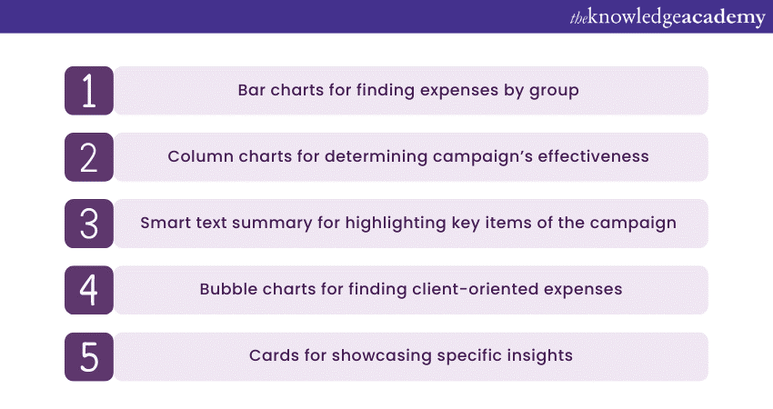
In this Power BI Project, you will discover why customers stopped purchasing your products. Anyone can use this project to examine the profit spread and sales from business managers to regional sales managers. You can extract deep and detailed data using proper visualisation techniques in Power BI Project. The factors like cash inflows and specific product attrition rates for the region will also be factored in. In this project, you can use the following data visualisation tools for various situations listed below:
a) You can use line charts, tables, cards, and bar charts for the summary page
b) You can use bubble charts, tables, column charts, and point maps for the client categorisation page
Power BI Projects for analysing product sales
Organisations need to maintain proper documents and records related to their sales. These data can give useful insight into their business performance and help determine which products are performing well and how to improve them. As a result, companies with proper records can easily succeed since they possess a lot of useful information.
It all depends on how well you maintain and analyse your sales data and what optimisation techniques you use. Having a large quantity of data is also not ideal since maintaining them is very difficult; therefore, you must prefer quality over quantity.
Companies can watch over their sales effectively with a project analysing their sales data. Using Power BI Projects like this, you can visualise profit by specific items and other sales-related factors using the sample dataset by Microsoft. Visualising these sales factors helps find and optimise business performance. Before visualisation, you must connect the dataset to a Power BI desktop to clear unrelated data. You can use the following data visualisation tools for various situations:
a) Funnel charts
b) Doughnut charts
c) Pie and bar charts
Power BI Projects Ideas: Intermediate level
Impressed with the capabilities of Power BI? Yet, the above are beginner-level projects. In this section, you will learn the intermediate-level Power BI Projects. These projects are slightly more difficult and have many use cases.
Projects for analysing finding abnormalities
Credit card usage is increasing daily, and so are credit card-related malicious activities. You can detect such malicious activities using a Power BI Project. This project could detect suspicious credit card transactions. It employs machine learning methods to discover abnormal transactions and events during credit card-related purchases. You can implement this method in the following scenarios:
a) In labelled datasets where supervised learning is required
b) In trained datasets where supervised learning is needed sometimes
c) In unlabelled datasets where unsupervised learning is needed
You can use malicious activity detection or card datasets in this Power BI Project. The initial step is to pack the dataset to the Power BI desktop. You can do this with a web connector and then use an already trained model or use Power BI to find out abnormalities.
In order to visualise these abnormalities, you can need to first label them. You can do that by the power query editor by running a Python script and get_ outliers () technique. Once you do that, you can visualise these outliers on the dashboard. You can use any elements like treemaps and line charts on the dashboard for visualising them.
The Price of Good Health
PyCaret, a Machine Learning Library (MLL), is used for Clustering analysis on Power BI. Clustering in Power BI means collecting data with common features. Clustering helps detect these fundamental data structures. Moreover, you can use the K-Means algorithm to train the model.
In this project, you should use the latest health expenses dataset from the World Health Organisation (WHO) database for global health expenditure. The next step is to upload the dataset into the Power BI Desktop. After it is uploaded and trained, you can visualise the cluster items in the dashboard. This will give detailed insights into health expenditures. In this project, you can use the following visualisation tools:
a) You can use filled maps and bar charts on the overview page of Power BI
b) You can use point maps for deep visualisation on Power BI
The Price of Energy
In this Power BI Project, different energy-producing sectors and exchanges are examined. Many subjects are covered, like energy consumption per the economy and the augmentation of wind energy and other related factors. You can use such projects to determine key insights for other factors like electricity consumption, etc.
You can use the dataset of international energy statistics for this project. By using this dataset, you can display various statistics like the most energy-producing sector, the most energy-producing country and the country with the most renewable energy production, etc. You can visualise this information on the Power BI dashboard. In this project, you can use the following visualisation tools:
a) Bar charts, cards, flow maps, etc on the overview page of Power BI
b) Treemaps, ribbon charts, bar charts on energy production and other statistics pages of Power BI
Covid

Covid has changed the world upside down as millions of people have been affected. Many nations struggled to protect their citizens as they were not properly prepared. With Power BI, you can get detailed insights on complex factors like total active, recovered and deceased cases and find the mortality rate of the pandemic by country. All of this raw data would be very complex to make sense of; however, you can make sense of it using a Power BI dashboard.
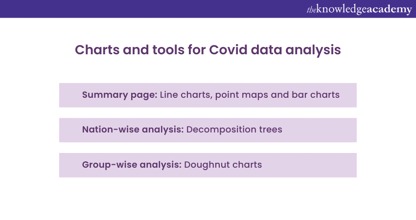
On the Power BI dashboard, you can comprehensively analyse the individual pages and key performance indicators on the summary page. You can throw in heat maps for better visualisation. You can use the Covid-19 dataset and load it on the editor. You can use the following visualisation tools for various scenarios:
a) You can use line charts, point maps, and bar charts on the summary page of Power BI
b) You can use decomposition trees for nation-wise analysis
c) You can use doughnut charts for group-wise analysis
Learn how to use measurement and target setting. Join our Balanced Business Scorecard Training course now!
Power BI Projects Ideas: Advanced level
Power BI, a Business Intelligence tool, helps accelerate decision-making with visualisation capabilities. In this section, you will learn some advanced-level Power BI Project ideas.
Power BI Project for optimising the cashflow with AutoML
Automated Machine Learning (AutoML) is a method that can automate hefty processes using Machine Learning. Using this, data scientists can build machine learning models relatively quickly without compromising quality.
In this Power BI Project, you are looking to optimise the cash flow and to do this, you can use the medical cost personal dataset of Kaggle. The challenge here is to accurately determine a patient's charges using unique data like the patient's demographics and risk index.
As usual, the initial step is to load the dataset on the Power BI desktop and then duplicate it. Then run the Python script in the power query editor to train this model. Try the automl() function to find out the top-performing model. You can use bubble charts, tables and bar charts, etc for creating the dashboard on Power BI
Life expectancy

The average life expectancy of a person can help determine how healthy the population is. Examining life expectancy when studying the diseases and other factors that influence the changing population is also beneficial.
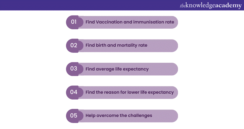
In this Power BI Project, you can analyse various factors like vaccinations, birth and mortality rate, socio-economic status and other health issues to find out the average life expectancy. This will help determine the reasons for shorter life expectancy and what changes should be made to improve it.
In this Power BI Project, you can use WHO's dataset on life expectancy. You can use the following visualisation tools for various scenarios:
a) You can use point maps, gauge charts, line charts and pie charts, etc., on the summary page
b) You can use tornado charts, doughnut charts and treemaps to illustrate nation-wise data.
Airport performance
Every year, the aviation industry has a huge growth of passengers. They're almost 5000 planes taking passengers and goods globally, which is likely to grow more as more countries develop economically. So, maintaining these huge volumes of passengers and planes is not an easy task. It requires a lot of preparation and instant decision-making, and Power BI can help you with that.
For this Power BI Project, you must examine the airport data properly to give easy and actionable insights. You can use the dataset that contains airline delays and cancellations for this project. You can include the total number of flights, delays, passenger feedback, flight processing time, etc.
Authorities at the airport could use these data analyses to make better decisions, particularly when there are flight changes, delays, medical emergencies or any other emergencies. Projects like this can make a massive difference in improving airport performance.
Average film sales
This Power BI Project is about visualising sales data related to movies into detailed visual insights. For this, you can use the dataset of IMDb. You can get this dataset from either the IMDb or from Kaggle for any set of years. The dataset would contain a range of movies with a rating of six or above and have several parameters like genre, gross budget, scores, gross sales, etc.
Next, load the dataset onto the power query editor, and you can create a custom chart pattern and use customisable filters like Slicers to choose country, genre and other parameters. Once you select the specific items, Power BI will display the corresponding parameters like gross box office collections, average rating, etc.
To do that, you can also sketch a histogram of the score parameter with release year and other parameters as slicer filters. You can also use a KDE plot to get more insights on a density graph for the selected genre in a specified time frame. You can create similar projects like this to figure out average sales data for the music industry.

Conclusion
We hope you liked reading this blog and understood the Top 12 Power BI Projects Ideas from beginner to advanced level. Apart from this, you would have also learned some tips and tricks on visualising a dataset. Power BI is a fascinating tool with many use cases, and learning how to use this tool can make all the difference in your data analysis.
Signup for our Business Intelligence Reporting courses and learn how to convert data into useful insights.
Frequently Asked Questions
Upcoming Microsoft Technical Resources Batches & Dates
Date
 Microsoft Power BI Course
Wed 15th May 2024
Wed 5th Jun 2024
Wed 19th Jun 2024
Wed 3rd Jul 2024
Wed 17th Jul 2024
Wed 7th Aug 2024
Wed 21st Aug 2024
Wed 4th Sep 2024
Wed 18th Sep 2024
Wed 9th Oct 2024
Wed 23rd Oct 2024
Wed 6th Nov 2024
Wed 20th Nov 2024
Wed 4th Dec 2024
Wed 11th Dec 2024
Wed 18th Dec 2024


 Top Rated Course


 If you wish to make any changes to your course, please


