We may not have the course you’re looking for. If you enquire or give us a call on 01344203999 and speak to our training experts, we may still be able to help with your training requirements.
Training Outcomes Within Your Budget!
We ensure quality, budget-alignment, and timely delivery by our expert instructors.

When it comes to creating visually captivating content in today's digital landscape, the challenges are numerous. Graphic Designers face the ongoing challenge of effectively conveying messages and captivating audiences within a highly competitive visual landscape. However, understanding Graphic Design Principles can help you overcome these hurdles and create impactful designs.
According to Glassdoor, the average gross salary of a Graphic Designer in the UK is about £33,000 annually. It could go higher based on your experience as well as your skill set. If you are interested in pursuing this profession, then understanding Graphic Design Principles is crucial.
That's exactly what this blog is all about. In this blog, you will learn about Graphic Design Principles in detail. Let's dive in deeper to learn more!
Table of Contents
1) Overview of Graphic Design Principles
2) Key Graphic Design Principles
a) Balance and compositions
b) Contrast and harmony
c) Typography
d) Colour theory
e) Proximity and alignment
f) Hierarchy and focal points
g) Repetition and consistency
h) Negative space
i) Simplicity and clarity
j) Functionality and user-centred design
k) Unity and variety
l) Emphasis and dominance
3) Conclusion
Overview of Graphic Design Principles
Graphic Design is the art of using visuals to communicate a message, evoke emotions, and direct the viewer’s attention. It is a language that transcends words and speaks to audiences in powerful ways. It blends artistic creativity with strategic thinking to achieve specific goals and outcomes.
Graphic Design influences how we perceive and remember things, whether it’s a logo, a poster, a website, or an advertisement. To create effective and appealing graphics, you need to understand the key Principles of Graphic Design. These rules help design elements work together smoothly and create a balanced and unified composition.
Key Graphic Design Principles
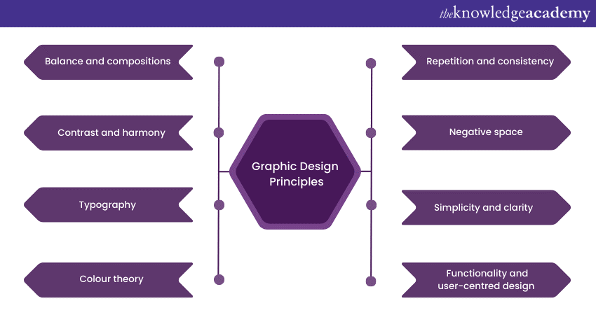
Graphic Design Principles are the guiding framework that designers follow to create visually pleasing and effective designs. These principles are the foundation for successful designs, helping designers make informed decisions about layout, colour, typography, and more. Let’s take a look at them below:

1) Balance and compositions
Balance is one of the basic Principles of Graphic Design. It refers to the distribution of visual elements to achieve equilibrium and harmony. There are two main types of balance:
a) Symmetrical balance: In symmetrical balance, elements are evenly distributed on either side of a central axis. This creates a sense of stability and order. Symmetry is often used for formal and traditional designs.
b) Asymmetrical balance: Asymmetry involves the uneven distribution of elements. While it might seem less structured, it adds energy and dynamism to the design. Asymmetry is commonly employed in modern and innovative designs.
Composition refers to how elements are arranged within a design. An effective composition guides the viewer's eye and communicates the intended message clearly.
a) Rule of thirds: The rule of thirds divides the design canvas into a grid of nine equal parts, placing essential elements along the intersections or lines. This technique enhances visual interest and guides the viewer's gaze.
b) Visual weight and balance: Elements in a design have varying visual weights. Larger elements, bold colours, and high-contrast items carry more weight. Achieving balance involves arranging these elements to create equilibrium.
2) Contrast and harmony
Contrast involves juxtaposing different elements to create visual interest and emphasis. This can include contrasting colours, sizes, shapes, and typography styles. Contrast draws attention to focal points and guides the viewer's gaze through the design.
Harmony, on the other hand, is the cohesive arrangement of elements to create a unified and pleasing visual experience. Achieving harmony involves maintaining consistency in design choices, such as using a consistent colour palette and typography style. Many graphic design software are available in the market to help you achieve harmony and colour consistency.
3) Typography
Typography is simply the art of arranging and designing different types of graphic design letters, numbers, symbols) to make text legible and visually appealing. Typography plays a crucial role in describing the tone, mood, and personality of a design.
a) Choosing the right typeface: Different typefaces have distinct personalities and evoke various emotions. Selecting the appropriate typeface that aligns with the design's purpose is essential.
b) Hierarchy and readability: Establishing a clear hierarchy of text ensures that important information stands out. Proper font sizing, line spacing (leading), and paragraph spacing contribute to readability.
c) Kerning, leading, and tracking: Adjusting letter spacing (kerning), line spacing (leading), and overall character spacing (tracking) improves the overall legibility and visual harmony of the text.
Start your journey into UX/UI Design excellence with our Online Internet Security Specialist Training. Register now and craft user-centred digital experiences!
4) Colour theory
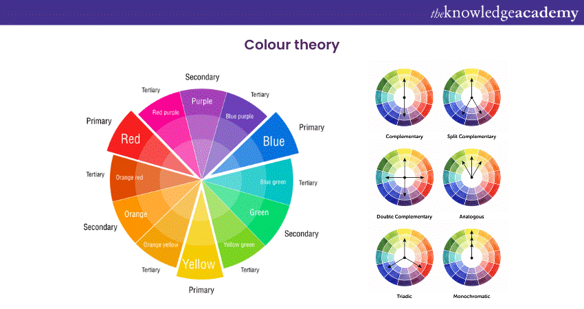
Colour theory is another important principle that designers have to follow. Understanding colour theory is crucial for creating visually appealing and emotionally impactful designs:

a) Basics of colour wheel: The colour wheel illustrates the relationships between colours. Complementary colours (which are opposite each other on the wheel) create a strong contrast, while analogous colours (next to each other) offer harmony.
b) Emotional impact of colours: Different colours evoke specific emotions and associations. Red can signify energy or passion, while blue might evoke calmness or trust.
c) Creating colour palettes: A well-constructed colour palette consists of primary, secondary, and accent colours. Consistently using these colours reinforces brand identity and enhances visual coherence.
5) Proximity and alignment
Proximity involves grouping related elements together to establish visual relationships and helps viewers identify connections between different pieces of information. This principle aids in organising information and preventing clutter.
Alignment, in this case, refers to the arrangement of elements along a common axis. Consistent alignment creates a sense of order and makes the design more visually pleasing and accessible.
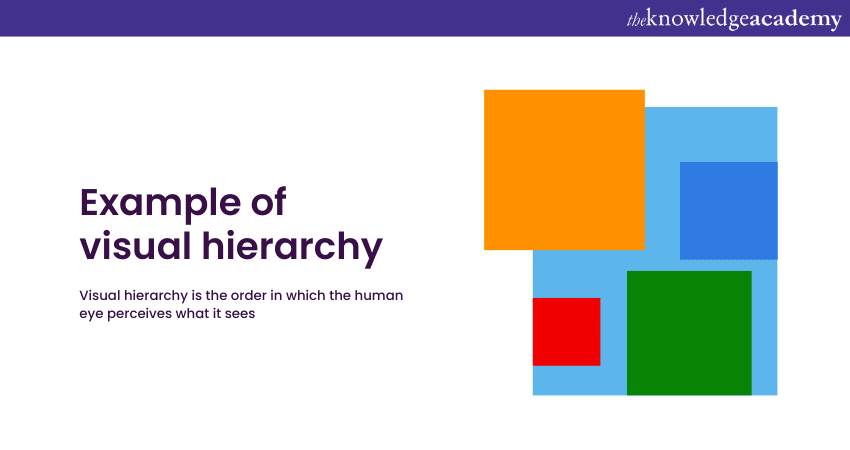
6) Hierarchy and focal points
Hierarchy organises content based on importance, guiding the viewer's eye through a logical sequence. An effective hierarchy ensures that key messages are noticed first.

Focal Points are areas of emphasis that draw the viewer's attention. Strategic placement of focal points enhances the visual impact of the design and communicates the primary message.
7) Repetition and consistency
Repetition involves using consistent design elements throughout a composition. This can include repeating shapes, colours, and typography choices. Repetition creates visual patterns and reinforces the design's identity.
Consistency in design maintains a uniform look and feel across various platforms and materials. It's particularly important for building a strong brand identity and recognition.
8) Negative space
Negative space (also known as whitespace) is the empty space surrounding design elements. Purposeful use of negative space highlights key elements and contributes to the design's balance and clarity.
a) Enhancing visual impact: Clever utilisation of negative space can create optical illusions and enhance the visual impact of the design.
b) Allowing breathing room: Adequate negative space improves the overall readability and approachability of the design, making it more inviting to the audience.
Bring your ideas to life with our Managing Virtual Teams– Sign up now!
9) Simplicity and clarity
Less is often more in design. Simplicity involves distilling a design into its essential elements. Minimalism eliminates distractions and allows the audience to focus on the core message or content.
Clarity ensures that the design effectively communicates its intended message. A clear design layout, combined with concise text and appropriate visuals, prevents confusion and enhances understanding.
10) Functionality and user-centred design
a) Designing for the User Experience: User-centred design prioritises the needs and preferences of the audience. Design decisions are made with the user's ease of use and engagement in mind.
b) Ensuring accessibility: Designs should be accessible to all users, including those with disabilities. Incorporating accessible design practices ensures that everyone can interact with the content effectively.
c) Usability vs. aesthetics: Balancing usability and aesthetics is crucial. While visually appealing designs capture attention, they must also be functional and user-friendly.
11) Unity and variety
Unity is the principle that brings all design elements together to create a cohesive and well-balanced whole. When elements share common attributes such as colour, shape, or style, they form a sense of unity, making the design feel organised and intentional.
Variety, on the other hand, introduces diversity and visual interest to a design. Incorporating diverse elements like different textures, sizes, and shapes adds excitement and prevents monotony. Balancing unity and variety creates a dynamic composition that captures attention while maintaining coherence.
12) Emphasis and dominance
Emphasis involves highlighting certain elements to make them stand out and capture the viewer's attention. Creating a focal point using size, colour, contrast, or placement ensures that the most important information is noticed first.
Dominance is the visual weight of certain elements in a design. By designating a dominant element, the designer guides the viewer's focus and provides a clear hierarchy of information.
Conclusion
Graphic Design Principles form the root of successful visual communication. By mastering these 12 principles and adopting them into your design process, you can develop designs that capture attention and convey messages with clarity, impact, and creativity. If you're an experienced Graphic Designer or a beginner, understanding these principles will elevate your work and contribute to the art and science of Graphic Design.
Unlock your creative potential and master the art of Graphic Design with our Virtual Graphic Designer Masterclass. Sign up now!
Frequently Asked Questions

The five elements of design, comprising line, shape, colour, texture, and space, are foundational in various artistic disciplines. They provide the essential building blocks for artists and designers to create visually captivating and harmonious designs.

Heuristic design involves the application of problem-solving techniques and intuitive design solutions. It focuses on creating user-friendly interfaces that enhance usability and overall user experience. This makes interactions with products, websites, or applications more efficient and enjoyable for users.

The Knowledge Academy takes global learning to new heights, offering over 30,000 online courses across 490+ locations in 220 countries. This expansive reach ensures accessibility and convenience for learners worldwide.
Alongside our diverse Online Course Catalogue, encompassing 17 major categories, we go the extra mile by providing a plethora of free educational Online Resources like News updates, Blogs, videos, webinars, and interview questions. By tailoring learning experiences further, professionals can maximise value with customisable Course Bundles of TKA.

The Knowledge Academy’s Knowledge Pass, a prepaid voucher, adds another layer of flexibility, allowing course bookings over a 12-month period. Join us on a journey where education knows no bounds.

The Knowledge Academy offers various Virtual Online Job Roles Training, including Virtual Graphic Designer Masterclass, Virtual Event Planner Masterclass, and many more. These courses cater to different skill levels, providing comprehensive insights into Graphic Design.
Our Business Skills blogs cover a range of topics related to Graphic Design, offering valuable resources, best practices, and industry insights. Whether you are a beginner or looking to advance your Graphic Design Skills, The Knowledge Academy's diverse courses and informative blogs have you covered.
Upcoming Business Skills Resources Batches & Dates
Date
 Virtual Assistant Course
Fri 14th Jun 2024
Fri 11th Oct 2024
Fri 20th Dec 2024


 Top Rated Course


 If you wish to make any changes to your course, please


