We may not have the course you’re looking for. If you enquire or give us a call on +44 1344 203 999 and speak to our training experts, we may still be able to help with your training requirements.
We ensure quality, budget-alignment, and timely delivery by our expert instructors.

Gantt chart is a significant Project Management tool used for planning, scheduling, and tracking project tasks. It displays information visually through a horizontal bar graph, allowing project managers and team members to easily see task schedules, dependencies, and progress. It can also streamline planning and scheduling, enhance remote work collaboration, and improve resource allocation and task delegation. This blog will walk you through effective methods to create a Gantt chart in Excel, ensuring you can manage tasks efficiently and help your team meet deadlines.
Table of Contents
1) Creating a Gantt Chart for Multiple Projects in Excel
a) Step 1: Compiling data sets for multiple projects in Excel
b) Step 2: Generating a stacked bar chart
c) Step 3: Inverting category axis sequence
d) Step 4: Adjusting label placement on the horizontal axis
e) Step 5: Modifying horizontal axis minimum, maximum, and major values
f) Step 6: Formatting Excel Gantt Chart
2) Conclusion
How to Create a Gantt Chart for Multiple Projects in Excel
We're going to show you how you can successfully create a Gantt Chart for Multiple Projects in Excel. Let's start by introducing our Excel worksheet so you understand what we aim to achieve with this blog.
Step 1: Compiling Data Sets for Multiple Projects in Excel
Below, you'll see the basic layout of our dataset. It includes columns for Project Name, Task Name, Start Date, Finish Date, Duration, and Progress.
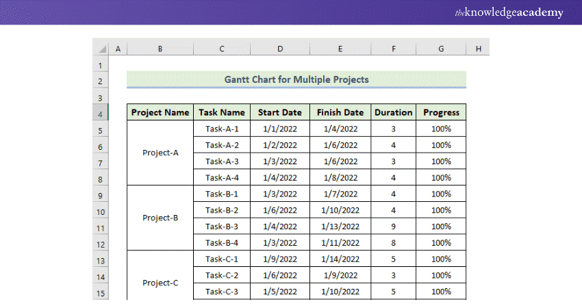
1) Project Name: Enter the name of each project.
2) Task Name: Specify different tasks for each project.
3) Start Date: Record when each task begins.
4) Finish Date: Note when each task ends.
5) Duration: This is calculated by subtracting the Start Date from the Finish Date.
6) Progress: Enter the progress status for each task.
Step 2: Generating a Stacked Bar Chart
Next, we'll insert a stacked bar chart using this dataset:
1) Select the cell range D4:D16.
2) Go to the Insert tab, click on the drop-down arrow under the Insert Column or Bar Chart in the Charts group, and select Stacked Bar Chart.
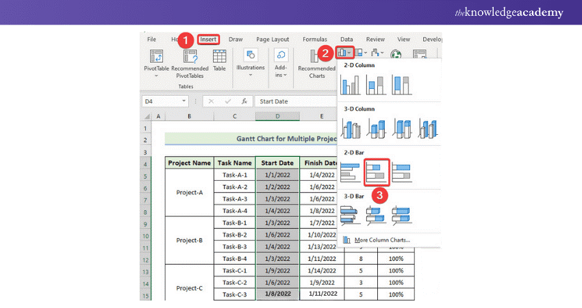
3) By default, the initial chart appears. Make the chart wider for more workspace.
4) Right-click on the chart, select 'Select Data' to add more data series on both the X-axis and Y-axis.
5) Click on 'Add' for another data series when the Select Data Source dialog appears, then input the series name and values in the Edit Series window and click OK.
6) Then click on 'Edit' from the Horizontal (Category) Axis Labels and input the Task Name column data.
Discover vital Excel functions for Business Analytics with our Business Analytics With Excel Masterclass – sign up today!
Step 3: Inverting category axis sequence
Finally, we are going to reverse the category axis order:
1) Double-click on the Category Axis where "Task-C-4" is at the top, but you want "Task-A-1" to be at the top.
2) In the Format Axis task pane, under Axis Options, select 'Categories in reverse order.'
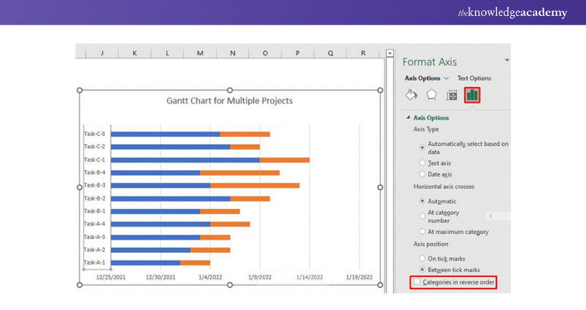
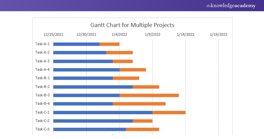
3) This will adjust the chart so that the tasks are displayed in the desired order. Follow these steps to effectively manage and visualise multiple projects using a Gantt chart in Excel. Therefore, you will get the chart given below.
Step 4: Adjusting label placement on the horizontal axis
On top of that, the Horizontal Axis (value axis) also moves when you change the orientation of the Categories. To adjust this in a Gantt Chart With Dependencies in Excel, simply click the Category Axis and go to the Label Position option in the Axis Options tab of the Format Axis task pane.
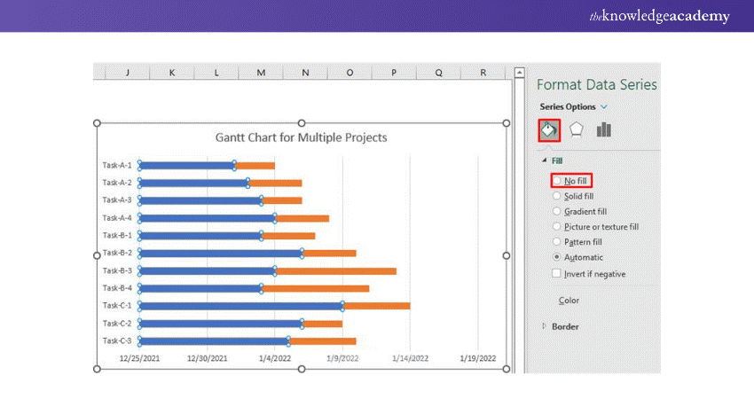
1) Choose the blue bars. In the chart below, you can see all the blue bars that have been selected.
2) After that, in the Format Data Series task pane and in the Fill & Line tab, choose No Fill.
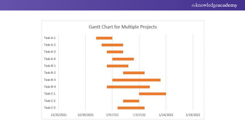
Look at the chart given below to see the Gantt chart we have created.
Enhance your professional skills with our Microsoft Office Training – register today!
Step 5: Modifying horizontal axis minimum, maximum, and major values
Now, alter the Major, Minimum, and Maximum Values of the Horizontal Axis according to it. You have to follow the given rules.
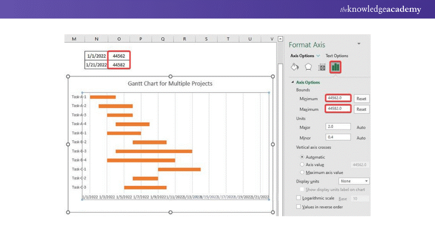
1) Now, our first task from Project "Task A-1" starts on the date 01/01/2022; therefore, the start date is our horizontal axis. So, double-click on the horizontal axis to open the Format Axis task pane.
2) In the Axis Options, set the Minimum Value to 44562. We know that this is "44562," represents the date 01/01/2022. The Maximum Value has been automatically set, although we will alter it to 44582. And change the Major Units to 2.
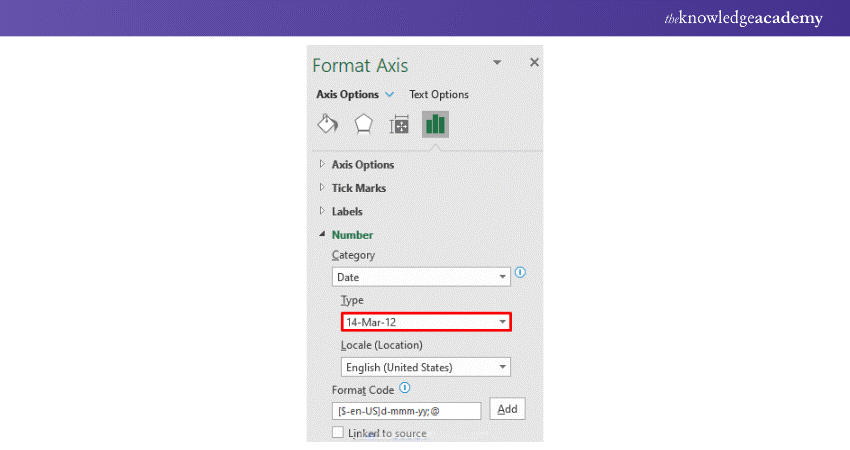
3) You can represent the horizontal axis much better; simply click on the Number and select Type from the options to have your date format.
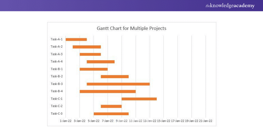
Therefore, you will get the Gantt chart given below.
Step 6: Formatting Excel Gantt Chart
Now, the time has come to format the above chart. For that, you have to follow the following process.
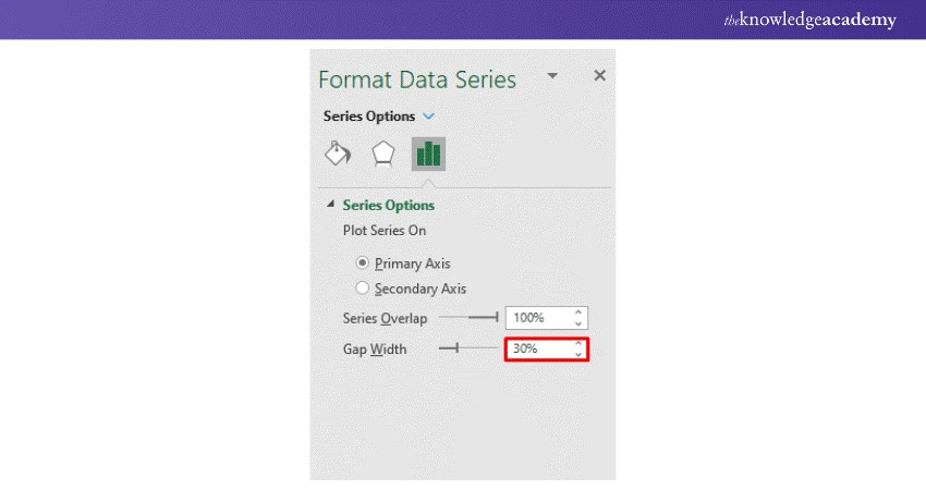
1) From the Format Data Series task pane, click on any of the red bars. On the Series Options, change the Gap Width value to 30%. It will reduce the Gap between the Category Axis position.
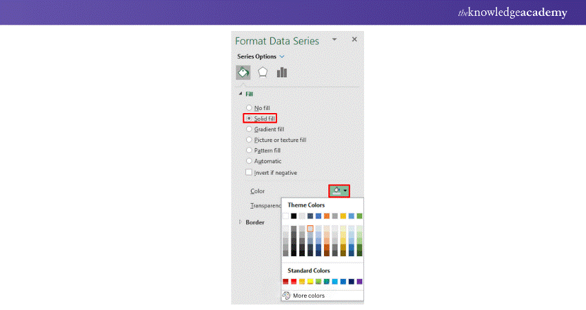
2) Further under the Format Data Series, click Fill & Line and select Solid Fill. Next, fill the data series with the required colour.
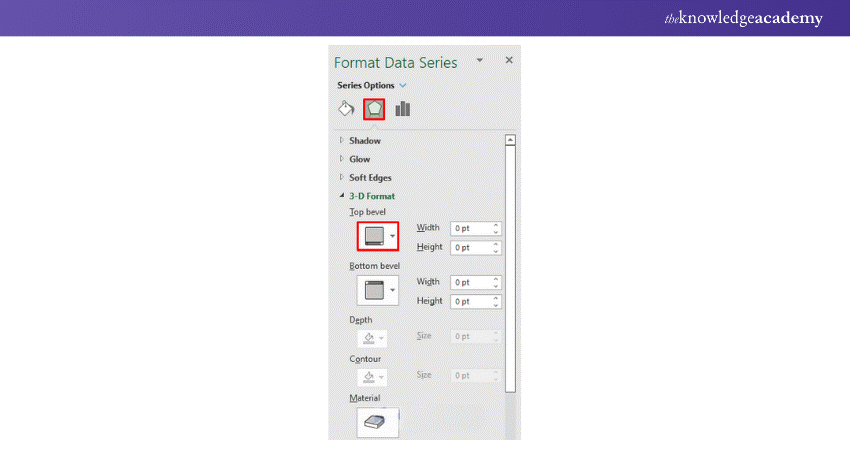
3) Afterwards, form the Format Data Series, select 3-D Format, and choose Angle type bevel from the Top Bevel drop-down.
4) Ensure Data Labels for this data series are shown by clicking the Chart Elements icon at the top right of the chart. From the menu that drops down, ensure the Data Labels option is checked.
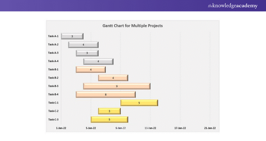
5) Now you should change the Chart Title content to "Gantt Chart for Multiple Projects" and set the font size for this text to a bigger one. We wish to display Horizontal grid lines.
6) Indeed, a wide range of background colours may be chosen for the chart area and the dashed grid lines. That ultimately is left up to you.
7) After Formatting, you will finally get the Gantt chart given below.
Learn to create and prepare Gantt charts by registering for our Excel Training With Gantt Charts course!
Conclusion
Gantt charts: Gantt charts are among the tools for project scheduling. Therefore, Gantt charts are part of almost all the software meant for project management. In fact, learning how to Make a Gantt Chart in Excel can be just as effective, as many project managers use this approach. Gantt chart software is available as a standalone desktop tool or an online version to instantly share the chart with other stakeholders. So, we hope that you understood how you can successfully create a Gantt Chart for Multiple Projects in Excel.
Frequently Asked Questions
What are the main limitations of a Gantt chart?

The main limitation of a Gantt chart is its complexity in managing large projects with numerous tasks and dependencies. It can become cluttered and hard to read, making it difficult to track progress effectively.
Do we get a free Gantt chart template in Excel?

Yes, Excel offers free Gantt chart templates. You can find them in the template gallery within Excel, which provides a basic framework for creating and customising your Gantt chart to fit specific project needs.
What are the other resources and offers provided by The Knowledge Academy?

The Knowledge Academy takes global learning to new heights, offering over 3,000+ online courses across 490+ locations in 190+ countries. This expansive reach ensures accessibility and convenience for learners worldwide.
Alongside our diverse Online Course Catalogue, encompassing 19 major categories, we go the extra mile by providing a plethora of free educational Online Resources like Blogs, eBooks, Interview Questions and Videos. Tailoring learning experiences further, professionals can unlock greater value through a wide range of special discounts, seasonal deals, and Exclusive Offers.
What is Knowledge Pass, and how does it work?

The Knowledge Academy’s Knowledge Pass, a prepaid voucher, adds another layer of flexibility, allowing course bookings over a 12-month period. Join us on a journey where education knows no bounds.
What are related courses and blogs provided by The Knowledge Academy?

The Knowledge Academy offers various Microsoft Excel Training & Certification Course, including Microsoft Excel Masterclass, Excel for Accountants Masterclass, and Business Analytics With Excel Masterclass. These courses cater to different skill levels, providing comprehensive insights into Excel methodologies.
Our Office Applications Blogs cover a range of topics related to Microsoft Excel, offering valuable resources, best practices, and industry insights. Whether you are a beginner or looking to advance your Excel skills, The Knowledge Academy's diverse courses and informative blogs have you covered.

Richard Harris is a highly experienced full-stack developer with deep expertise in both frontend and backend technologies. Over his 12-year career, he has built scalable web applications for startups, enterprises and government organisations. Richard’s writing combines technical depth with clear explanations, ideal for developers looking to grow in modern frameworks and tools.

Upcoming Office Applications Resources Batches & Dates
Date
 Excel Training with Gantt Charts
Fri 22nd May 2026
Fri 21st Aug 2026
Fri 20th Nov 2026


 Top Rated Course


 If you wish to make any changes to your course, please


