


 Top Rated Course

We may not have the course you’re looking for. If you enquire or give us a call on +33 805638382 and speak to our training experts, we may still be able to help with your training requirements.
How to Make a Gantt Chart in Excel: A Complete Guide
The Knowledge Academy 09 September 2025A Gantt Chart is a Project Management tool that helps you visualise timelines for your project at a glance by listing the tasks and deadlines that must be met. With it, you can List your project tasks, start dates, and end dates in a table, then insert a stacked bar chart to visually represent your project timeline.

Training Outcomes Within Your Budget!
We ensure quality, budget-alignment, and timely delivery by our expert instructors.
Table of Contents

Ever wish you could magically organise your project timeline in one go? Learning How to Make a Gantt Chart in Excel is the next best thing! This easy-to-use tool lets you see your project’s entire journey from start to finish without the chaos. With just a few clicks, you can transform scattered tasks and deadlines into a sleek, visual plan that keeps everything on track.
Once you discover How to Make a Gantt Chart in Excel, you’ll wonder how you ever managed without it. It’s more than just a timeline; it’s a game-changer. You can customise colours, adjust the timeline, and even add labels to highlight key milestones. It’s all about making your project not only organised but visually appealing too, because managing a project should feel as good as it looks!
Table of Contents
1) What is a Gantt Chart in Excel?
2) How to Make a Gantt Chart in Excel?
3) Gantt Chart Template in Microsoft Excel
4) Advantages of Excel Gantt Charts
5) Disadvantages of Excel Gantt Charts
6) Conclusion
What is a Gantt Chart in Excel?
A Gantt Chart is a style of bar chart that visually represents tasks within a project. It is a powerful project management tool used to plan schedules, improve resource allocation, and track project progress. A Gantt Chart consists of two main axes:
1) The vertical axis lists all tasks.
2) The horizontal axis represents the project timeline.
Horizontal bars in the chart show each task’s duration, with the bar length indicating the start and end times. This structure helps project managers predict the overall project timeline with accuracy.
The Gantt Chart became widely known in the early 20th century when Henry Gantt, a mechanical engineer, introduced the model to track the progress of tasks in manufacturing. This allowed supervisors to monitor whether production schedules were on track and take corrective actions if needed.

How to Make a Gantt Chart in Excel?
Creating Gantt Charts in Excel is a fairly straightforward process. Here are the quick steps to help you get started:
1) Step 1: Begin by entering your project’s tasks, start dates, and end dates into a table. The duration for each task can be calculated by the formula:
Duration = End Date – Start Date
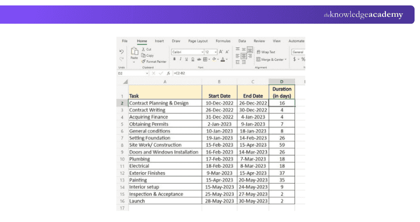
2) Step 2: Next, create a bar chart using the data in the Start Date column. Highlight the Start Date range (B1:B16 in this example).
Then go to the Insert tab and select Bar > Stacked Bar from the charts group.
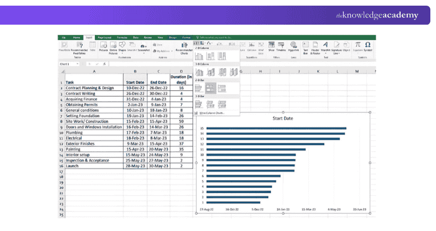
3) Step 3: A stacked bar will appear. Right-click on the chart area, click Select Data, and click Add to include the Duration data.
In the Edit Series window, enter the series name and the series values (D2:D16). Ensure no headers or empty cells are selected, then click OK.
Become familiar with the worksheet, data, and formulas. Join our Excel Training With Gantt Charts – Today!
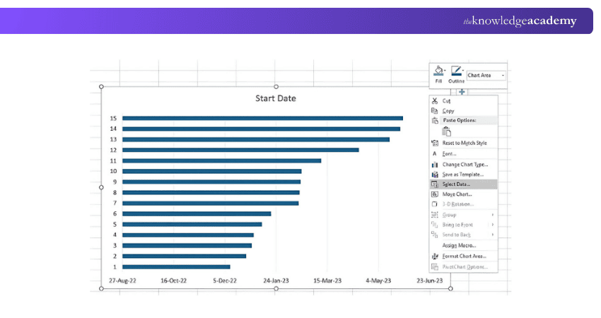
Now, click on the Add button to plot more data (Duration) in the Gantt Chart.
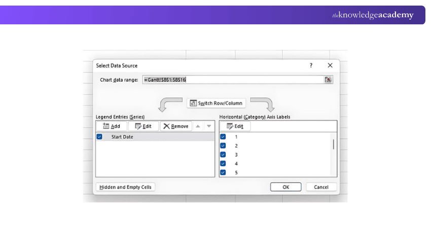
This opens an Edit Series window, where you can add the series name and series values as seen in the image.
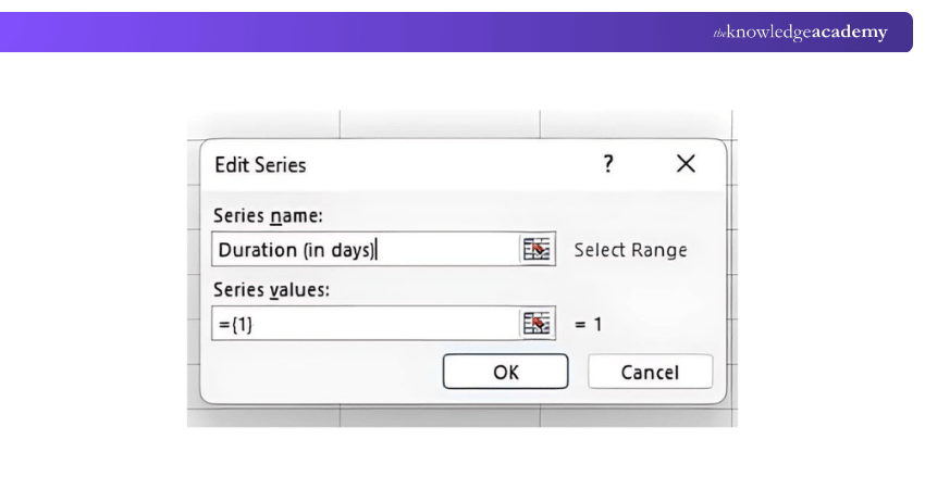
Add series values (D2:D16) as seen in the image. Make sure to not include a header or an empty cell by mistake. Once you have entered the details in the box, click the OK button for the data to be added to the Excel Gantt Chart.

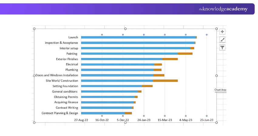
The resulting bar chart will look like similar to the following image
Learn advanced formulas and functions with our Excel For Accounting Course – Join now!
4) Step 4: To replace the dates on the left side of the chart with task names, right-click on the chart area and click Select Data again.
Choose Start Date from the left pane and click Edit. In the Axis Labels window, select the range for the task descriptions (A2:A16), and click OK twice.
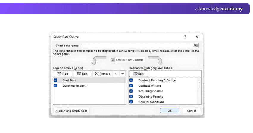
An Axis Labels window opens, and you can select the range you selected previously for the duration column range. In our case, we will select the column range A2:A16 and click OK twice to close the open windows.

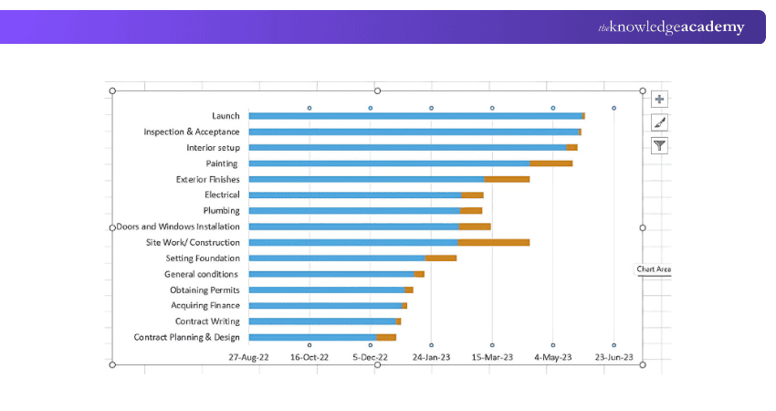
With all the task descriptions added to the left-hand-side (like the following image), the Gantt Chart at this point will look something like this:
5) Step 5: Click on the bars in your Gantt Chart to select them. Right-click and choose Format Data Series.
On the Format Data Series window, select the bars you want to modify. For example, right-click the blue bars, select No Fill, and then set the border to No Line.

The Format Data Series window will be something like the image below. You can use those options and experiment to see what changes happen to your Gantt Chart.
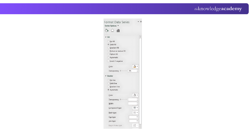
Now, click on the blue bar > Format Data Series > No Fill
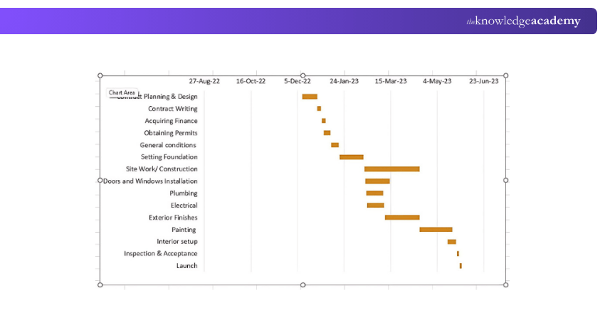
Switch to Border > No Line
This will make your Gantt Chart look, like the image below.
1) List Your Project Schedule in an Excel Table
To create a project schedule in Excel, follow these steps:
1) Create a Table: Set up columns for Task Name, Start Date, End Date, Duration (calculated as End Date - Start Date), and Status.
2) Enter Data: Input the tasks and corresponding dates for each project phase.
3) Calculate Duration: Use the formula = End Date - Start Date to automatically calculate the duration.
4) Optional Columns: Add extra columns for resources or dependencies if necessary.
Once your table is ready, you can convert it into a Gantt chart to visualise the project timeline.
2) Start Making Your Excel Gantt by Setting it up as a Stacked Bar Chart
1) Select Blank Cell: In the same worksheet as your Excel table, click any blank cell.
2) Insert Stacked Bar Chart: Go to the Insert tab in the Excel ribbon. In the Charts section, click the Bar Chart dropdown menu, then select Stacked Bar (do not choose 100% Stacked Bar).
3) Chart Setup: A large blank white chart will appear on your worksheet, ready for data input.
3) Add the Start Dates of Your Tasks to the Gantt Chart
To add the start dates of your tasks to the Gantt chart in Excel, follow these steps:
1) Select Data: Highlight the Start Date column in your project table.
2) Insert Stacked Bar Chart: Go to the Insert tab, click on the Bar Chart dropdown in the Charts section, and choose Stacked Bar (not 100% Stacked Bar).
3) Create Chart: Excel will generate a blank chart with the start dates displayed as the first part of the bars.
4) Add Duration: Right-click the chart, click Select Data, and click Add to include the Duration data series.
Boost your skills in Excel for business analytics. Join our Business Analytics With Excel Course – Today!
4) Add the Durations of Your Tasks to the Gantt Chart
To add the durations of your tasks to the Gantt chart in Excel, follow these steps:
1) Right-click the Chart: After inserting the stacked bar chart, right-click on the chart and click Select Data.
2) Add Duration Data: In the Select Data Source window, click Add under the Legend Entries (Series) section.
3) Enter Duration Values: In the Edit Series window, set the Series Name to "Duration" and the Series Values to the range containing the task durations (e.g., D2:D16).
4) Click OK: After entering the values, click OK to add the durations to the chart.
5) Add the Descriptions of Your Tasks to the Gantt Chart
To add task descriptions to your Gantt chart in Excel, follow these steps:
1) Right-click the Chart: Click on the Gantt chart, then right-click and select Select Data.
2) Edit Axis Labels: In the Select Data Source window, under the Horizontal (Category) Axis Labels section, click Edit.
3) Select Task Descriptions: In the Axis Labels Range box, select the range that contains your task names or descriptions (e.g., A2:A16).
4) Click OK: After selecting the range with your task descriptions, click OK. The descriptions will now appear along the left side of your Gantt chart, replacing the start dates.
6) Format Your Chart to Look Like a Gantt Chart
1) Remove Start Date Bars: Click the Start Date bars, right-click, select Format Data Series, and choose No Fill.
2) Change Bar Colours: Right-click on the Duration bars, select Format Data Series, and pick a colour.
3) Reverse Task Order: Right-click the vertical axis, select Format Axis, and check Categories in reverse order.
4) Add Task Labels: Right-click the Duration bars, select Add Data Labels, and format as needed.
5) Adjust Time Scale: Right-click the horizontal axis, choose Format Axis, and set Minimum and Maximum bounds.
7) Complete Your Gantt Chart With These Styling Tips
1) Colour Code Tasks: Use different colours for task categories to improve visual organisation.
2) Adjust Bar Width: Modify Gap Width for thicker or thinner bars.
3) Label Milestones: Add milestones with unique shapes or colours.
4) Add Gridlines: Make tasks easier to read by adding gridlines.
5) Customise Fonts: Adjust font size and style for better clarity.
Enhance your skills with Excel VBA & Macro training with our Microsoft Excel VBA And Macro Training – Register today!
Gantt Chart Template in Microsoft Excel
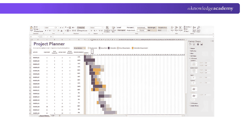
Gantt Chart templates in Microsoft Excel are available in Excel 2013 – 2022. This template is ready to use and requires no learning curve once you click on it.
The Excel template displayed in the image is called the Gantt Project Planner, a useful tool for creating a Gantt Chart With Dependencies in Excel. The purpose of this project planner is to keep track of your project's progress for a set of activities.
Advantages of Excel Gantt Charts
Using Excel to create Gantt Charts comes with several benefits, making it a go-to tool for project managers and those involved in project planning. Here are a few key advantages:

1) Centralised Project Information: Excel allows you to store all your project data in one place. You can access your tasks, deadlines, and milestones in a single view, making project tracking more streamlined.
2) User-Friendly Interface: Excel offers an easy-to-use platform for building Gantt charts manually. Simply input the date range, highlight relevant data, and use the 'Chart Wizard' to create the chart. Customise it further to suit your specific project needs.
3) Seamless Integration: Excel’s integration capabilities allow you to combine Gantt charts with other tools like formulas, calculations, and data analysis features. This offers a more holistic approach to project management within a single platform.
Disadvantages of Excel Gantt Charts
Although Excel Gantt Charts are commonly used in project management, they come with a few drawbacks that could limit their effectiveness in certain scenarios. Here are some of the key disadvantages:
1) Difficulty in Keeping Information up to Date: Excel is not a cloud-based tool, so project data isn’t updated in real time across devices. To keep your team informed, you must manually send the latest version of your spreadsheet, which can make it very challenging to ensure everyone is on the same page.
2) Task Assignment Limitations: In older Excel versions, users are unable to assign tasks to others, which makes it challenging for team members to understand their responsibilities and track what others are working on.
3) Collaboration Challenges: Excel makes it difficult for project teams to collaborate effectively during live projects. Since Gantt charts in Excel are not cloud-accessible, team members cannot easily view or edit the project in real time.
Conclusion
Learning How to Make a Gantt Chart in Excel is a great way to manage your project timelines efficiently. From organising tasks to tracking deadlines, Excel provides a range of excellent Project Management tools that simplify the process. With a Gantt chart, as explained in this blog, you can stay organised and ensure your project progresses smoothly to a successful and stress-free completion.
Take your Excel skills to the next level now. Join our Microsoft Excel Course – Today!
Frequently Asked Questions
How to Use Gantt Project for Career Development Plan?

Using a Gantt project for a career development plan, you can:
a) Visualise career goals and milestones in an organised way.
b) Set realistic deadlines and track your progress towards each goal.
c) Break down complex projects into manageable tasks.
d) Collaborate with mentors and colleagues to gain valuable insights.
What Four Items are Shown on a Gantt Chart?
The four items that are shown on a Gantt Chart are:
a) Tasks
b) Task duration
c) Task start and end dates
d) Task owner or responsible person
What are the Other Resources and Offers Provided by The Knowledge Academy?
The Knowledge Academy takes global learning to new heights, offering over 3,000 online courses across 490+ locations in 190+ countries. This expansive reach ensures accessibility and convenience for learners worldwide.
Alongside our diverse Online Course Catalogue, encompassing 19 major categories, we go the extra mile by providing a plethora of free educational Online Resources like Blogs, eBooks, Interview Questions and Videos. Tailoring learning experiences further, professionals can unlock greater value through a wide range of special discounts, seasonal deals, and Exclusive Offers.
What is The Knowledge Pass, and How Does it Work?
The Knowledge Academy’s Knowledge Pass, a prepaid voucher, adds another layer of flexibility, allowing course bookings over a 12-month period. Join us on a journey where education knows no bounds.
What are Related Courses and Blogs Provided by The Knowledge Academy?
The Knowledge Academy offers various Microsoft Excel Courses, including the Microsoft Excel Course and Excel for Accounting Course, and the Excel Training with Gantt Charts. These courses cater to different skill levels, providing comprehensive insights into Comparison of Two Columns in Excel.
Our Office Applications Blogs cover a range of topics related to Microsoft Excel, offering valuable resources, best practices, and industry insights. Whether you are a beginner or looking to advance your Excel Skills, The Knowledge Academy's diverse courses and informative blogs have you covered.

The Knowledge Academy


Global Training Provider
The Knowledge Academy is a world-leading provider of professional training courses, offering globally recognised qualifications across a wide range of subjects. With expert trainers, up-to-date course material, and flexible learning options, we aim to empower professionals and organisations to achieve their goals through continuous learning.

Upcoming Office Applications Resources Batches & Dates
Date
 Microsoft Excel Course
Microsoft Excel Course
Mon 6th Jul 2026
Microsoft Excel Course
Mon 3rd Aug 2026
Microsoft Excel Course
Tue 1st Sep 2026
Microsoft Excel Course
Mon 5th Oct 2026
Microsoft Excel Course
Mon 2nd Nov 2026
Microsoft Excel Course
Mon 7th Dec 2026

 If you wish to make any changes to your course, please


