We may not have the course you’re looking for. If you enquire or give us a call on +1800812339 and speak to our training experts, we may still be able to help with your training requirements.
Training Outcomes Within Your Budget!
We ensure quality, budget-alignment, and timely delivery by our expert instructors.

With the evolution of computers and the advent of the internet, the Gantt Chart in Excel has become a popular and a standard feature among all Different Types of Charts in Excel. They have been admired and are immensely useful due to their ability to view available resources easily.
But do you know what a Gantt Chart in Excel is? In simple terms, a ‘Gantt Chart’ is a type of Bar chart that illustrates a project schedule. It shows the start date and finish date of each task in a project. It also exhibits the dependencies between the task and the resources assigned.
Thanks to features like the Gantt Chart, Microsoft Excel became extremely popular among users. Perhaps you are also wondering How to make a Gantt Chart in Excel. It's easy! To learn further, keep reading this blog! This blog explains how to make a Gantt chart in Excel, its components, benefits and drawbacks.
Table of Contents
1) What is a Gantt Chart in Excel?
2) How to make a Gantt Chart in Excel?
3) Gantt Chart template in Microsoft Excel
4) Advantages of Excel Gantt Charts
5) Disadvantages of Excel Gantt Charts
6) How to improve the designs of Gantt Chart in Excel?
7) Conclusion
What is a Gantt Chart in Excel?
A Gantt Chart is a pivotal Project Management tool, aiding in meticulous planning, efficient resource allocation, and ongoing project progress tracking. It takes the form of a bar chart, effectively visualising all tasks within a project.
At its core, the Gantt Chart offers two primary axes for representation. Vertically, it lists the tasks involved, while horizontally, it delineates the project's timeline. Central to the chart are the horizontal bars, each symbolising a task within the project. The length of these bars corresponds to the duration of each task, indicating both its start and end times. This visual representation empowers Project Managers to forecast the entire project timeline accurately.
The inception of the Gantt Chart traces back to the early 20th century when Henry Gantt, a mechanical engineer, pioneered its usage. Initially employed in manufacturing, Gantt utilised the model to track the progress of tasks within the production process meticulously. This allowed supervisors to gauge the adherence to production schedules and swiftly implement adjustments if deviations occurred, ensuring timely project completion.
In contemporary times, the utility of Gantt Charts transcends industry boundaries. While initially entrenched in manufacturing, they have found widespread application across diverse sectors such as software development, construction, and beyond. Gantt Charts are commonly used in Project Management to visualise and track a project's progress and identify potential problems or delays in the project schedule.
They can also be utilised to communicate the project plan to stakeholders and team members, allocate resources and assign tasks to team members. Versatility makes them indispensable tools for teams that effectively manage project schedules and deliverables.

How to make a Gantt Chart in Excel?
To Create a Gantt Chart in Excel, you can follow these steps:
a) Open a new spreadsheet in Excel and enter your project data in the following columns:
1) Task: The name of the task
2) Start Date: The start date for the task
3) Duration: The number of days it will take to complete the task
4) End Date: The end date for the task
b) Select the cells containing your project data and go to the "Insert" tab in the ribbon.
c) Click the chart option in the "Charts" group to insert a Gantt Chart into your spreadsheet.
d) Customise the appearance of your Gantt Chart by right-clicking on the chart and selecting "Format Chart Area." From here, you can change the colours, font sizes, and other design elements of your chart.
e) If you want to add or edit tasks in your Gantt Chart, modify the data in the cells of your spreadsheet. The Gantt Chart will automatically update to reflect the changes.
Example of Gantt Chart in Excel
If you want to learn how to make a Gantt Chart in Excel, consider the following example:
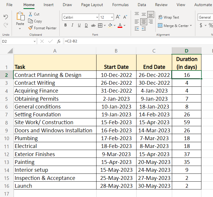
Step 1: For our example, First, let us create a Project table as seen in the image below.
Once you enter the tasks, start date, and end date, the duration can be calculated as follows.
Duration = End date – Start date
Step 2: Make a bar chart using the data in the Start Date column
Select the Start Date column range, B1:B16, in our example.
Now, click on Insert tab > click Bar in charts group > Stacked Bar.
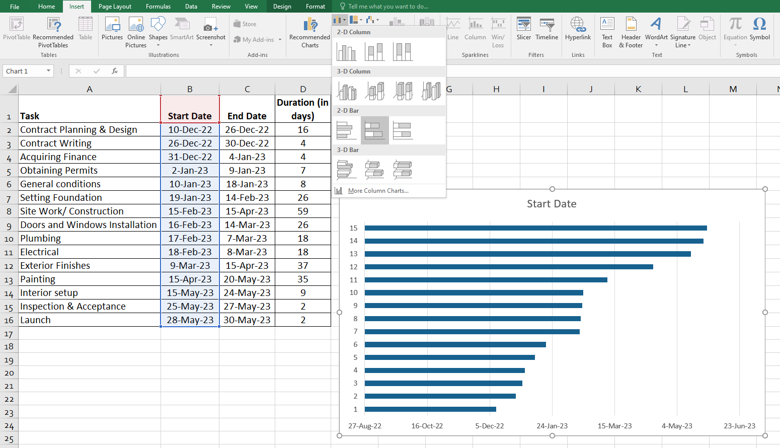
Step 3: This will result in producing the stacked bar as seen in the image below.
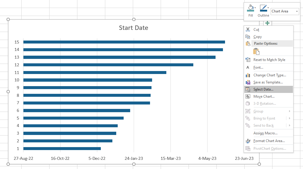
Right-click in the chart area and choose Select Data option
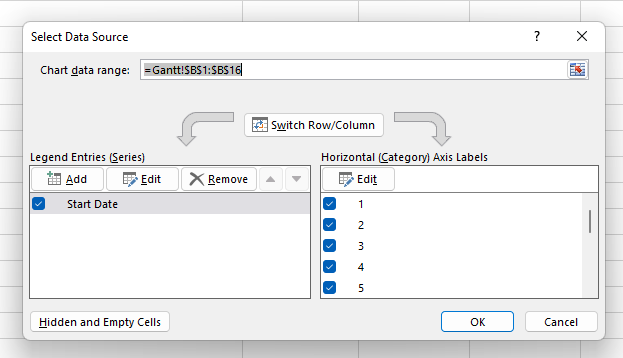
Now, click on the Add button to plot more data (Duration) in the Gantt Chart.
This opens an Edit Series window, where you can add the series name and series values as seen in the image.
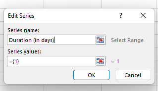
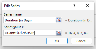
Add series values (D2:D16) as seen in the image. Make sure to not include a header or an empty cell by mistake. Click the OK button once you have entered the details in the box for the data to be added to the Excel Gantt Chart.
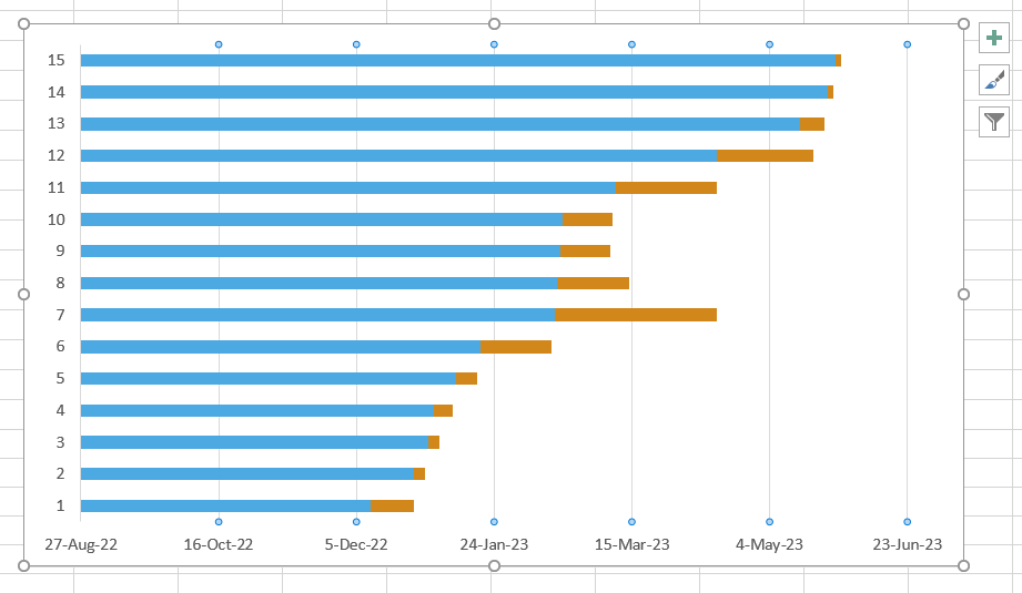
The resulting bar chart will look like similar to the following image
Transform yourself into a professional Microsoft Excel expert with Microsoft Excel VBA and Macro Training- join now!
Step 4: Adding task descriptions to the Excel Gantt Chart. To replace the dates on the left-hand side of the chart with the list of tasks:
Right-click in the chart area and choose the Select Data option to open the Select Data Source window.
Select the Start Date option from the left pane under Legend Entries and click the Edit button on the right pane.
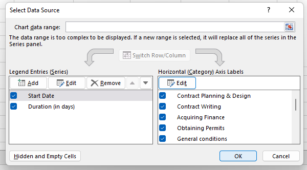
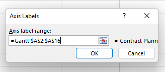
An Axis Labels window opens, and you can select the range you selected previously for the duration column range. In our case, we will select the column range A2:A16 and click OK twice to close the open windows.
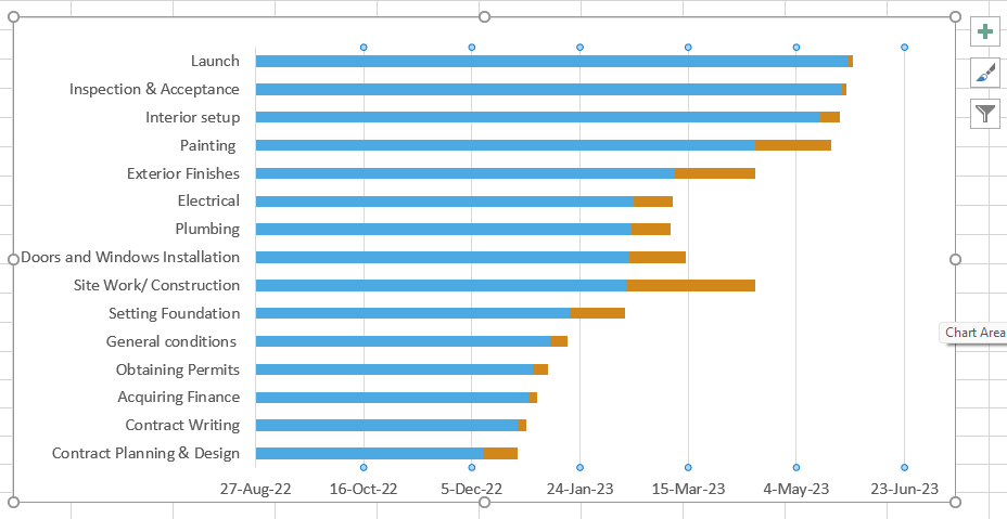
With all the task descriptions added to the left-hand-side (like the following image), the Gantt Chart at this point will look something like this:
Step 5: Transforming the bar graph
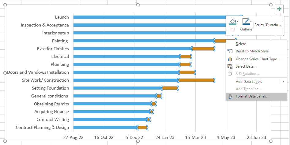
Clicking on the orange or blue bar in your Gantt Chart will select them all, and you can right-click on them to choose the Format Data Series option.
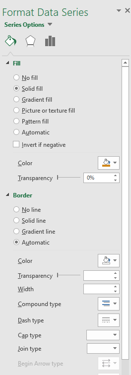
The Format Data Series window will be something like the image below. You can use those options and experiment to see what changes happen to your Gantt Chart.
Now, click on the blue bar > Format Data Series > No Fill
Switch to Border > No Line
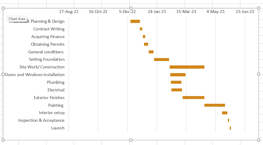
This will make your Gantt c=Chart look, as seen in the image below.
Gantt Chart template in Microsoft Excel
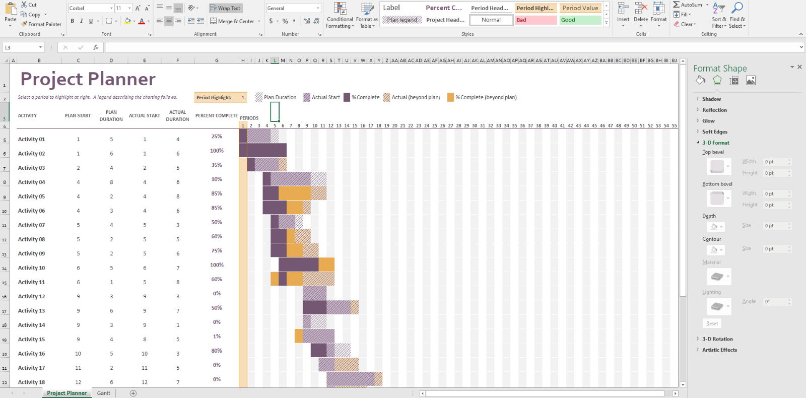
Gantt Chart templates in Microsoft Excel are available in Excel 2013 – 2022. This template is ready to use and requires no learning curve once you click on it.
The Excel template displayed in the image is called Gantt Project Planner. The purpose of this project planner is to keep track of your project's progress for a set of activities.
Advantages of Excel Gantt Charts
Using Excel to create Gantt Charts offers several advantages, making it a popular choice for Project Managers and individuals involved in Project Planning. Here are some significant advantages of using Excel Gantt Charts:
1) User-friendly interface: Excel is widely used and is familiar to most professionals. Its user-friendly interface allows users with varying levels of expertise to create Gantt Charts without extensive training.
2) Flexibility: Excel provides flexibility in terms of customisation. Users can easily modify the chart to suit their specific project needs. This includes adjusting colours, formatting, and adding elements like milestones or dependencies.
3) Dynamic updates: Excel Gantt Charts can be easily updated to reflect changes in the project timeline. As projects get completed or if there are delays, users can quickly adjust the chart to show the present status of the project.
4) Integration with other Excel features: Excel allows users to integrate Gantt Charts with other features such as formulas, calculations, and Data Analysis. This integration helps in a more comprehensive approach to Project Management within a single platform.
5) Cost-effective: Excel is a part of the Microsoft Office suite, and many organisations already have access to it. There's no need for additional software purchases, making it a cost-effective solution for small to medium-sized projects.
Disadvantages of Excel Gantt Charts
While Excel Gantt Charts are widely used for Project Management, they have several disadvantages that might impact their effectiveness in specific scenarios. Here are the significant disadvantages:
1) Limited collaboration: Excel Gantt Charts often lack real-time collaboration features. Multiple users may find it challenging to work on the same Gantt Chart simultaneously, leading to version control issues. This limitation can hinder collaborative project planning, especially in dynamic team environments.
2) Complexity in large projects: As a project grows in complexity and involves numerous tasks and dependencies, managing them within an Excel Gantt Chart can become unwieldy. Large projects may require extensive scrolling and navigating, making maintaining a clear overview of the entire project timeline difficult.
3) Dependency management challenges: Excel Gantt Charts may need help to represent and manage task dependencies effectively. While basic dependencies can be handled, intricate relationships and constraints between tasks may be challenging to articulate accurately. This limitation can compromise the accuracy of project scheduling.
4) Limited automation: Excel Gantt Charts often lack automation features for dynamic updates. Any changes in project timelines or task dependencies may require manual adjustments, making it time-consuming and prone to errors. This limitation becomes more apparent in projects with frequent changes or uncertainties.
5) Scalability issues: Excel Gantt Charts may face scalability issues when handling projects with many tasks or an extended timeline. The software might become sluggish, affecting performance and responsiveness. This limitation can hinder the practicality of using Excel for managing extensive and lengthy projects.
Register and become a skilled Microsoft Excel professional with Microsoft Excel Masterclass now!
How to improve the designs of Gantt Chart in Excel?
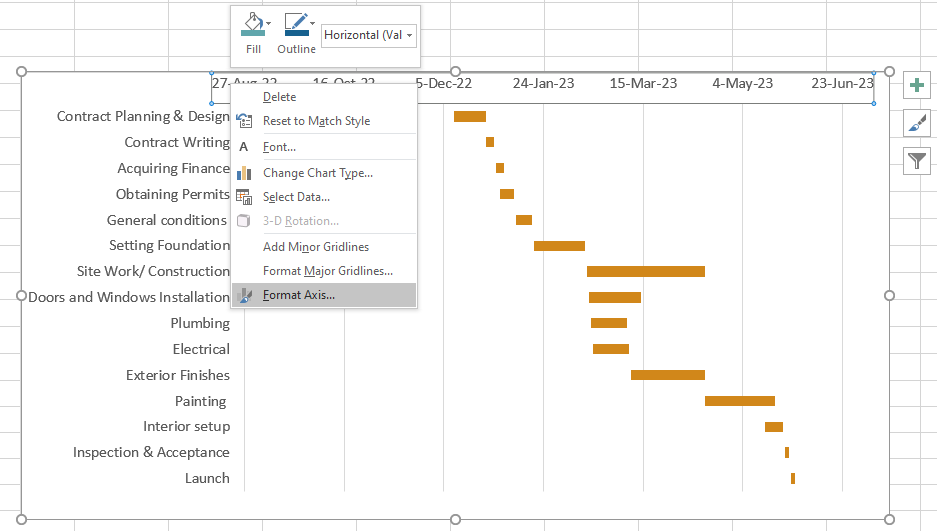
You can format data series by clicking on them to select and then Right-click on the dates, Click on Format Axis and make changes.
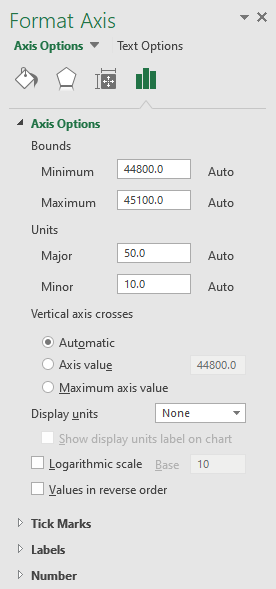
The Format Axis window opens looks something like this, where you can make necessary changes:
You can make more changes to the Gantt Chart to enhance its look. In our case, we will try to enhance the orange bars in the Gantt Chart by selecting them and right-clicking to choose the Format Data Series option.
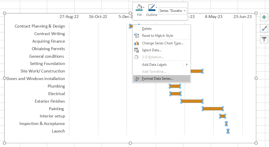
In the Format Data Series window, we will find multiple options where you can change the size or angle of the selected bars in the chart. Fill colours from different options available, add gradients and do much more.
In the image below, you can see that we have used the gradients to enhance the chart using the Series Options:
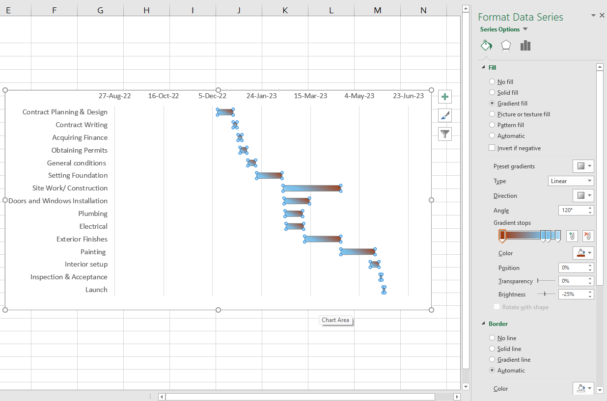
By switching to Format Chart Area, you can change the shadow and glow, and make changes to the bar in 3-D Format, as seen in the image below.
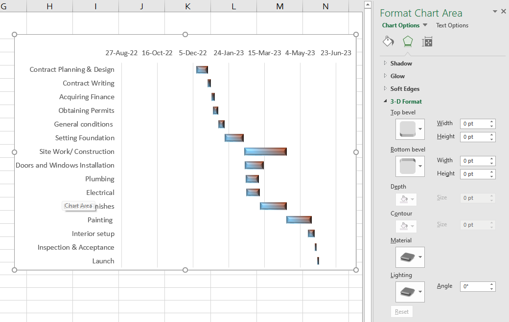
The changes made to the start date or duration will automatically reflect the changes in your chart. The Excel Gantt Chart can be saved in image format or published online by converting it to HTML format.
Acquire skills in Microsoft Excel for Data Analysis with Data Analysis Training using MS Excel Training.
Conclusion
In this blog, we have understood How to Make a Gantt Chart in Excel and the ways it will help you keep track of time and start and finish dates. Also, the predefined milestones of the project can be consistently monitored, and the relationships between project activities can be easily maintained using the Gantt Charts.
Learn how to create advanced Excel formulas, macros and much more in our MS Excel training - sign up for Microsoft Excel Expert Training. Sign up now!
Frequently Asked Questions

Industries such as construction, engineering, Software Development, and event management highly value Gantt Chart expertise. These sectors rely on precise project scheduling and resource management, where Gantt Charts serve as indispensable tools for orchestrating complex workflows and meeting tight deadlines.

For career advancement, professionals often recommend mastering Gantt Chart software tools such as Microsoft Project, Asana, Trello, and Smartsheet. These platforms offer comprehensive Project Management features, including Gantt Chart functionality, essential for effective project planning and execution.

The Knowledge Academy takes global learning to new heights, offering over 30,000 online courses across 490+ locations in 220 countries. This expansive reach ensures accessibility and convenience for learners worldwide.
Alongside our diverse Online Course Catalogue, encompassing 17 major categories, we go the extra mile by providing a plethora of free educational Online Resources like News updates, Blogs, videos, webinars, and interview questions. Tailoring learning experiences further, professionals can maximise value with customisable Course Bundles of TKA.

The Knowledge Academy’s Knowledge Pass, a prepaid voucher, adds another layer of flexibility, allowing course bookings over a 12-month period. Join us on a journey where education knows no bounds.

The Knowledge Academy offers various Microsoft Excel Training & Certification Courses, including Microsoft Excel Masterclass, Business Analytics with Excel and Excel Training with Gantt Charts. These courses cater to different skill levels, providing comprehensive insights into How to Create a Project Plan in Excel.
Our Office Applications Blogs cover a range of topics related to Microsoft Excel, offering valuable resources, best practices, and industry insights. Whether you are a beginner or looking to advance your Excel Skills, The Knowledge Academy's diverse courses and informative blogs have you covered.
Upcoming Microsoft Technical Resources Batches & Dates
Date
 Microsoft Excel Course
Fri 12th Jul 2024
Fri 20th Sep 2024
Fri 15th Nov 2024


 Top Rated Course


 If you wish to make any changes to your course, please


