




We may not have the course you’re looking for. If you enquire or give us a call on + 1-866 272 8822 and speak to our training experts, we may still be able to help with your training requirements.
What is Logo Design? Types, Principles & Brand Importance
By Richard HarrisLast updated on: 09 September 2026
Logo Design creates visual symbols that represent a brand, helping people recognise it while expressing its identity through colour, shapes, and typography. A well-designed logo builds trust, strengthens brand recognition, and communicates a business's values across digital and print platforms, creating a lasting impression.

Every iconic brand begins with a memorable logo. A strong logo captures attention, reflects a brand's personality, and helps customers recognise and remember it. As one of the most valuable branding assets, Logo Design plays a key role in shaping how a business is perceived, building trust, and creating a lasting impression across both digital and physical platforms.
A well-designed logo does more than enhance visual appeal, it communicates a brand's values, differentiates it from competitors, and strengthens brand recognition over time. In this blog, we'll explore What is Logo Design, why it matters, the different types of logos, the principles of effective logo creation, and best practices for building an iconic brand identity.
What is a Logo?
A logo is a visual symbol or graphic mark that represents a brand, business, organisation, or product. It serves as a distinctive identifier, helping people recognise and remember a brand while communicating its identity, values, and personality. Logos can include text, symbols, shapes, colours, or a combination of these elements to create a unique visual identity.
A well-designed logo is more than an attractive graphic; it is a key component of a brand's identity. It creates consistency across marketing materials, websites, packaging, and digital platforms while helping businesses build credibility, trust, and long-term brand recognition. An effective logo is simple, memorable, versatile, and relevant to the brand it represents.
What is Logo Design?
Logo Design is the strategic process of creating a visual identity that reflects a brand's mission, values, personality, and objectives. To fully understand What is Logo Design, it is important to recognise that it combines creativity with research and planning to produce a logo that resonates with the target audience while supporting the brand's overall identity and positioning.
The process involves understanding the brand, developing concepts, selecting appropriate visual elements, and refining the design to ensure it is distinctive, versatile, and memorable. What does Logo Design mean goes beyond aesthetics by creating a timeless visual identity that strengthens brand recognition and supports long-term marketing and business success.

Why is Logo Design Important in UX Design?
In UX design, an effective logo supports consistency across digital products while reinforcing the brand's identity. The following highlight why Logo Design is important in UX Design:
1) Strengthens Brand Recognition: A distinctive logo makes it easier for users to identify and remember a brand across websites, mobile apps, and other digital platforms.
2) Builds Trust and Credibility: A professional logo creates a positive first impression and helps users feel more confident about interacting with a brand or product.
3) Creates a Consistent User Experience: Displaying the same logo across multiple touchpoints establishes visual consistency, making digital experiences more familiar and intuitive.
4) Communicates Brand Personality: Colours, typography, symbols, and visual style work together to express a brand's values, helping users understand what the business represents.
5) Improves User Engagement: A memorable and meaningful logo creates stronger emotional connections with users, encouraging long-term brand recognition and loyalty.
Types of Logos
Understanding What is Logo Design also means recognising the different types of Logos used to represent brands. Each type has a unique style and purpose, helping businesses communicate their identity effectively. Here are some of the key types of Logos:
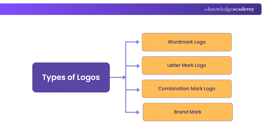
1) Wordmark Logo
This type focuses on the brand name and is presented in a stylised text format. It's ideal for companies with a distinctive name that becomes a memorable Brand identity when presented in a unique font or colour scheme. Examples include Google and Coca-Cola, where the Brand name, through distinctive typography, becomes the Logo itself.
2) Letter Mark Logo
Similar to wordmarks, letter marks are typography-based logos that use initials instead of the full name. This style is excellent for companies with lengthy words, as it simplifies the design and makes it easier to remember. Brands like IBM and HBO effectively use their initials to create a compact, visually appealing representation.
3) Combination Mark Logo
These Logos combine a symbol or icon with a wordmark or letter mark. This approach offers the versatility of using either or both elements across various applications. Brands like Adidas and Lacoste use this type to associate a visual icon with their name, enhancing Brand recognition.
4) Brand Mark
This type of Logo is also known as a pictorial mark. It uses a symbol or icon without text. The sign must be exceptionally recognisable, as it solely represents the Brand. Apple’s apple and X’s bird are quintessential examples of symbols becoming synonymous with the brand.
Master CorelDRAW to design professional logos, illustrations, and branding materials with confidence and precision with our CorelDRAW Training - Join now!
Essential Elements of a Logo
A well-designed logo helps in communicating your brand’s message clearly and memorably. The best logos combine visual appeal with strategic design choices that reflect the essence of the brand. Below are the four essential elements that form the foundation of a strong logo:
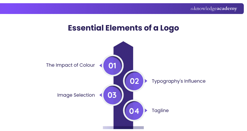
1) The Impact of Colour
Colour plays a powerful role in how people perceive your brand. Different colors evoke different emotions and associations. Choosing the right color palette helps set the tone of your brand and can make your logo more memorable. Consistency in color across your branding also builds recognition and trust.
For Example:
a) Blue conveys trust and professionalism used by banks and tech companies
b) Red expresses energy, passion, and urgency
c) Green symbolises growth, nature, or health
d) Black suggests luxury, sophistication, and elegance
2) Typography's Influence
Typography, or the font style used in your logo, can speak volumes about your brand. Whether it’s bold, elegant, modern, or playful, your choice of typeface should reflect your brand’s personality.
Typography also affects readability. The font should be clear and scalable, whether on a business card or a billboard.
a) Serif fonts often feel traditional and trustworthy
b) Sans-serif fonts are clean, modern, and easy to read
c) Script fonts give a more personal or creative feel
3) Image Selection
Some logos include icons, symbols, or abstract graphics that visually represent the brand. The image should enhance the logo, not clutter it. Strong image selection helps create a unique visual identity that stands out. These elements should be:
a) Simple and easy to recognise
b) Relevant to the brand’s purpose or story
c) Scalable to work in small and large formats
4) Tagline
A tagline is a short phrase or sentence that’s sometimes included with a logo to reinforce the brand’s message. Not all logos need a tagline, but when used well, it can:
a) Clarify what the business does
b) Highlight a key value or promise
c) Strengthen emotional connection with the audience
Create scalable vector graphics and professional logos using powerful open-source design tools with Inkscape Training - Sign in today!
Characteristics of an Effective Logo Design
An effective Logo Design is more than just a catchy image; it's a critical component of a Brand's identity. Key characteristics define the effectiveness of a Logo in communicating a Brand’s essence and ensuring its recognition and recall.
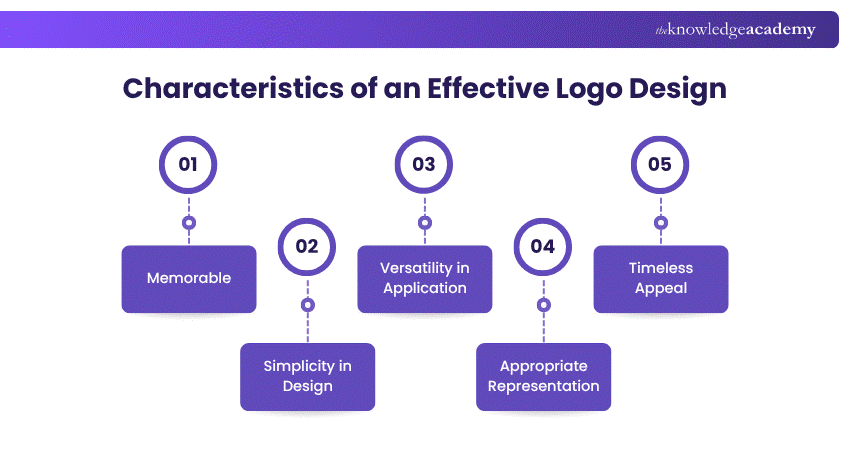
1) Memorable
A great Logo should stick in the viewer's mind. This memorability ensures that the Brand remains at the forefront of its audience's thoughts. For example, the Apple Logo is instantly recognisable and hard to forget, making it highly effective.
2) Simplicity in Design
The most impactful Logos are often the simplest. A clean, uncluttered design makes a Logo easily recognisable and more versatile for various mediums. Google's Logo, for instance, is a study of simplistic effectiveness.
3) Versatility in Application
An effective Logo must work well in different contexts, sizes, and platforms. It should be as effective on a small mobile screen as on a large billboard. Versatility also means the Logo should be effective in both colour and black and white.
4) Appropriate Representation
The design should be appropriate for the Brand’s industry and target audience. For example, a law firm and a children's toy store would have vastly different Logo Designs that are appropriate for their respective fields.
5) Timeless Appeal
While trends in design can inspire, an effective Logo should have a timeless quality that doesn't appear outdated as styles change. The Coca-Cola Logo is a prime example of a design that has stood the test of time.
Enhance your graphic design capabilities by learning image editing, logo refinement, and digital artwork with GIMP Training - Register now!
Design Principles to Follow When Creating a Logo
Applying fundamental design principles helps create memorable and effective logos. Understanding What is Logo Design also highlights how these principles work together to build a strong and recognisable brand identity. The following are the key design principles to follow when creating a logo:
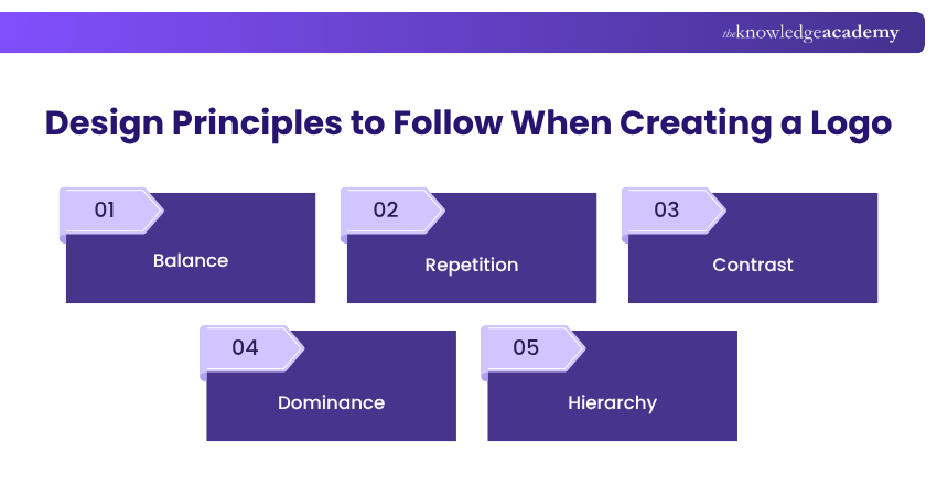
1) Balance
Balance ensures that all elements of a logo are arranged harmoniously, creating a stable and polished appearance. Proper alignment, spacing, and symmetry prevent the design from feeling cluttered or uneven, making it easier for viewers to understand and remember.
2) Repetition
Repetition creates consistency by using recurring shapes, colours, patterns, or typography throughout the design. When applied thoughtfully, it strengthens the logo's visual identity and helps guide the viewer's attention naturally.
3) Contrast
Contrast uses differences in colour, size, shape, or typography to highlight important elements within the logo. It improves visibility, attracts attention, and makes the design more engaging while ensuring key features stand out.
4) Dominance
Dominance establishes a clear focal point by making one visual element more prominent than the others. Whether through size, colour, or typography, this principle helps direct attention to the most important part of the logo while maintaining overall balance.
5) Hierarchy
Hierarchy organises visual elements in a logical order, guiding the viewer through the logo's information. By carefully arranging text, symbols, and other design components, it improves readability and ensures the brand message is communicated effectively.
What Should I Consider When Choosing a Logo Design
Choosing the right logo is essential for building a strong and recognisable brand identity. A well-designed logo should reflect your business, appeal to your target audience, and remain effective across different platforms. The following are the key factors to consider when choosing a logo design:
1) Understand Your Brand Identity
Your logo should represent your brand's values, mission, and personality while appealing to your target audience. A clear understanding of your brand identity helps create a logo that communicates your message and builds a meaningful connection with customers.
2) Consider the Style and Aesthetic
Select a design style that aligns with your brand image, whether modern, classic, minimalist, or creative. The right combination of colours, typography, and visual elements strengthens your brand identity and helps differentiate your business.
3) Prioritise Simplicity and Versatility
Simple logos are easier to recognise, remember, and reproduce across different media. A versatile design should maintain its clarity and impact on websites, packaging, social media, business cards, and large-format displays.
4) Think About Colour and Font Compatibility
Colours and typography play an important role in communicating your brand's personality and values. Choose combinations that complement each other, remain easy to read, and create a consistent visual identity across all branding materials.
Develop creative illustration and visual design skills to bring distinctive logo concepts and brand identities to life with our Digital Painting Course - Join today!
5 Logo Design Mistakes and How to Avoid Them
Even the most creative logo can fall short if it ignores essential design principles. Avoiding common mistakes helps create a logo that is memorable, relevant, and effective across different platforms. The following are some common logo design mistakes and how to avoid them:
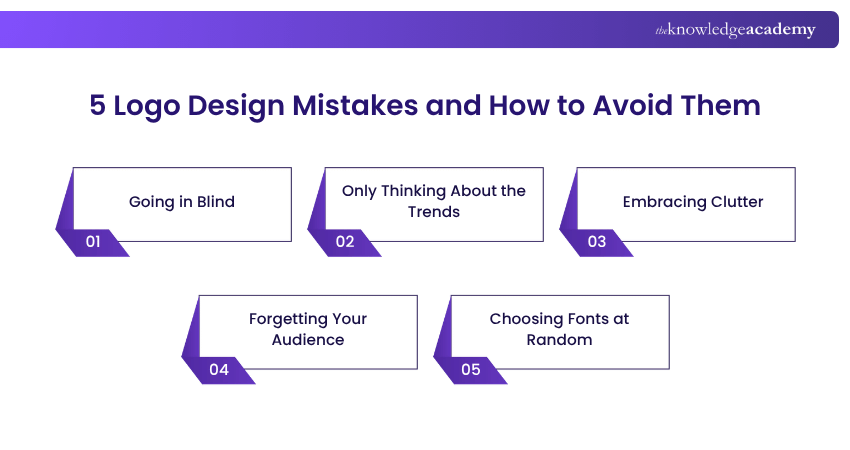
1) Going in Blind
Creating a logo without researching your brand, competitors, or target audience often results in a design that lacks purpose and fails to stand out. This can make it difficult for customers to connect with your brand.
How to Avoid It: Begin by understanding your brand identity, market, and audience expectations. Conduct research before sketching ideas to ensure your logo reflects your brand and differentiates it from competitors.
2) Only Thinking About the Trends
Designing a logo solely around current trends may make it look modern initially, but it can quickly become outdated as styles change. Trend-driven logos often require frequent redesigns to remain relevant.
How to Avoid It: Focus on creating a timeless design that reflects your brand's personality rather than following temporary design trends. A classic logo remains effective and recognisable for years.
3) Embracing Clutter
Using too many colours, fonts, icons, or decorative elements can make a logo confusing and difficult to recognise. Overly complex designs also lose clarity when displayed at smaller sizes.
How to Avoid It: Keep the design simple and purposeful by including only essential visual elements. A clean logo is easier to remember, reproduce, and apply consistently across different media.
4) Forgetting Your Audience
A logo designed around personal preferences instead of customer expectations may fail to connect with the intended audience. This can reduce its effectiveness in communicating the brand's identity.
How to Avoid It: Design your logo with your target audience in mind. Consider their preferences, industry expectations, and the message you want your brand to communicate before finalising the design.
5) Choosing Fonts at Random
Selecting typography without considering the brand's personality can create an inconsistent or confusing visual identity. Poor font choices may also affect readability across different platforms.
How to Avoid It: Choose fonts that complement your brand's tone and remain clear at different sizes. Consistent, readable typography strengthens brand recognition and creates a more professional logo.
What Are the Three Rules of Good Logo Design?
The principles ensure a logo is effective, timeless, and impactful. The three key rules of good Logo Design are:
1) Simplicity: It should be easy to recognise and remember
2) Versatility: It must work across all sizes and formats
3) Relevance: It should reflect the brand’s identity, values, and industry

Richard Harris


Senior Full Stack Developer and Technology Educator
Richard Harris is a highly experienced full-stack developer with deep expertise in both frontend and backend technologies. Over his 12-year career, he has built scalable web applications for startups, enterprises and government organisations. Richard’s writing combines technical depth with clear explanations, ideal for developers looking to grow in modern frameworks and tools.


 If you wish to make any changes to your course, please


