




We may not have the course you’re looking for. If you enquire or give us a call on 01344203999 and speak to our training experts, we may still be able to help with your training requirements.
How to Create a Dashboard in Excel: A Step-by-Step Guide
ByThe Knowledge AcademyLast updated on: 22 September 2026
Explore How to Create a dashboard in Excel and know about dashboard design, data analysis, visualisation techniques, advanced features, and best practices. A dashboard in Excel visually represents key metrics using PivotTables, PivotCharts, Slicers, and Timelines, allowing quick filtering and analysis from a single data source.

Data is powerful, but without clear visualisation, valuable insights can remain hidden in plain sight. This is where learning How to Create a Dashboard in Excel can come handy. An Excel dashboard transforms rows of numbers into an interactive, easy-to-understand story, thus helping you track performance, spot trends and make smarter decisions.
Whether you're managing sales or analysing business data, learning How to Create a Dashboard in Excel can elevate your reporting skills. From preparing your data and building PivotTables to adding charts, slicers, and interactive features, there’s a lot this Excel skill can offer. In this blog, you’ll learn how to turn raw data into a dynamic dashboard that delivers actionable insights at a glance. So read on!
What is an Excel Dashboard?
An Excel Dashboard is a powerful tool to display key information and metrics in a condensed and visually engaging format. Essentially, it's a one-page summary that provides a brief overview of the status and performance of a particular area or project.
All Dashboards in Excel are typically created using a combination of tables, charts, graphs, and pivot tables. Moreover, these are often enhanced with interactive elements like slicers and drop-down menus for dynamic data exploration.
The primary purpose of an Excel Dashboard is to let users make informed decisions based on the data presented. By consolidating and visualising large amounts of data, Dashboards make intricate information more accessible and understandable. Businesses use them widely to track Key Performance Indicators (KPIs), financial reporting, Project Management, and more. Excel's flexibility allows these dashboards, including those for Cohort Analysis in Excel, to be customised for different needs, making them invaluable tools for Data Analysis and reporting.

Why are Excel Dashboards Useful?
Excel Dashboards help organisations present data in a clear, visual format, making it easier to monitor performance, analyse information, and make informed decisions. Key benefits include:
a) Track Key Performance Indicators (KPIs):
Monitor important metrics, such as sales, revenue, or project progress, in one place to measure performance and identify areas for improvement.
b) Perform Complex Analysis:
Use formulas, PivotTables, and charts to simplify large datasets and present insights in an easy-to-understand format.
c) Support Better Decision-making:
Provide accurate, up-to-date insights that help managers make informed, data-driven decisions.
d) Identify Business Problems:
Highlight trends and performance issues, enabling teams to investigate problems and take corrective action quickly.
e) Improve Forecasting and Planning:
Analyse historical data and explore different scenarios to support budgeting, forecasting, and strategic planning.
The Significance of Excel Dashboards
Let’s discuss the importance of Excel Dashboards:
a) Data Consolidation: Excel Dashboards combine various data sets in a single view. Thus, they make it easier to see the big picture without the need to toggle between multiple spreadsheets.
b) Real-time Data Analysis: Dashboards can be set up to reflect real-time data, providing up-to-date information for timely decision-making.
c) Enhanced Visualisation: With charts, graphs, and Conditional Formatting in Excel, Excel Dashboards transform rows of data into visual formats, aiding in quicker comprehension and analysis.
d) Customisation and Flexibility: Excel Dashboards can be tailored to meet specific user needs, allowing for customisation regarding data displayed, layout, and design.
e) Interactive Features: Features like slicers and drop-down menus make Dashboards interactive, enabling users to filter and sort data to focus on specific metrics or periods.
f) Improved Reporting and Communication: Dashboards summarise key information. It makes it easier to communicate insights to stakeholders clearly and concisely.
g) Time-saving: By automating data consolidation and update processes, dashboards save significant Data Analysis and reporting time.
h) Performance Tracking: Dashboards are ideal for monitoring KPIs and other performance metrics, offering a quick view of targets versus actuals.
i) Accessible Data Insights: They democratise data access within an organisation, allowing non-technical users to gain insights without needing in-depth Data Analysis skills.
j) Strategic Decision-making: By providing a clear view of trends, patterns, and anomalies, dashboards support more informed and strategic business decisions.
Prerequisites Before Creating a Dashboard in Excel
Before creating an Excel Dashboard, it is important to have a clear strategy. Planning the dashboard's purpose, audience, data, layout, and distribution ensures it delivers meaningful insights and meets users' needs. Consider the following key elements before you begin building your dashboard:
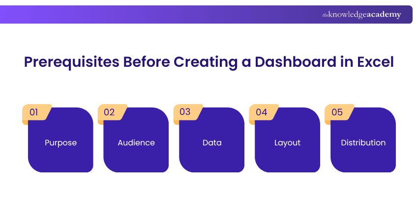
1) Purpose
Define why the dashboard is being created and the business goals it should achieve. Determine whether it is intended to answer a specific business question, monitor performance, or solve a particular problem. A clear purpose helps you focus on the most important metrics and KPIs that drive business decisions.
2) Audience
Identify who will use the dashboard and understand what information they need. Senior executives may require a high-level overview of business performance, while managers and analysts often need detailed reports and interactive data. Knowing your audience helps determine the level of detail and the most suitable visualisations.
3) Data
Decide what data the dashboard will use and where it will come from. Ensure the data is accurate, complete, and well-organised before importing it into Excel. Remove duplicates, correct errors, and determine whether the dashboard will use static data or connect to regularly updated data sources.
4) Layout
Plan a layout that presents information clearly and logically. Select the most appropriate charts, tables, and KPIs based on the dashboard's purpose and audience. If users need to explore data further, include interactive features such as slicers, filters, or PivotCharts while keeping the design simple and uncluttered.
5) Distribution
Determine how the completed dashboard will be shared with users. It can be distributed through email, shared folders, cloud storage, or exported as a PDF. If users should not modify the dashboard, protect the workbook with passwords or enable read-only access to maintain data accuracy and integrity.
How to Make a Dashboard in Excel in Seven Steps?
Let us now discuss some steps which will help you learn How to Create a Dashboard in Excel:
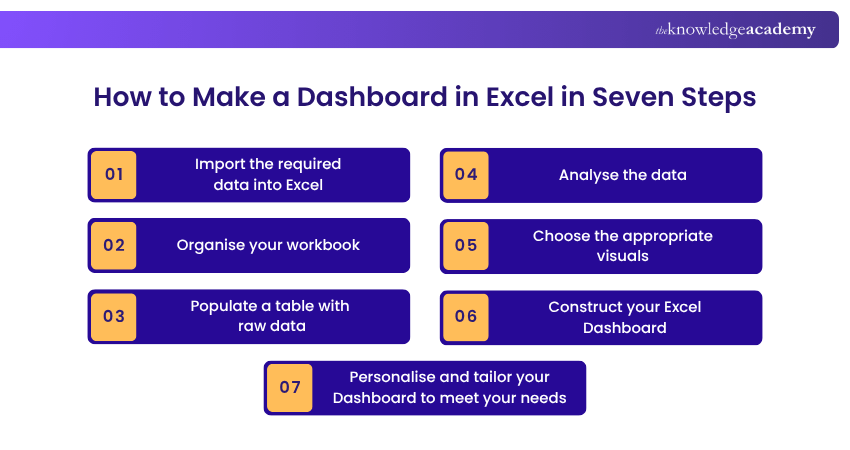
Step 1: Import the Required Data Into Excel
Let us have a look at the steps to import data while creating a Dashboard in Excel:
a) Understand Data Requirements: Clearly define what data is necessary for your dashboard. Consider metrics, periods, and data granularity.
b) Choose Appropriate File Formats: Ensure your data is in a compatible format, such as CSV, XML, or Excel files.
c) Use Excel's Data Model: Consider using Excel's Data Model feature to create relationships between different tables for complex data sets.
d) Eliminate Redundant Data: Remove any unnecessary or duplicate data during the import process to streamline your dashboard.
e) Handle Large Data Sets Efficiently: For large data sets, use Excel's Power Query or Data Model features to manage and analyse the data effectively.
f) Data Transformation: If necessary, transform the data (pivot, merge, split columns, etc.) using Power Query.
g) Error Checking: After import, use Excel’s error-checking features to identify and correct any issues in your data.
h) Document Data Sources: Record data sources for future reference and updates.
i) Automate Data Import: Automate the process to save time and reduce manual errors.
j) Regular Updates: Set up a routine for regular data updates, especially for dashboards used for ongoing monitoring.
Step 2: Organise Your Workbook
The second step involves organising your workbook. Let’s see the steps that you have to follow:
a) Segment Data Logically: Divide your data across different sheets, such as separating historical data from current data.
b) Use Tables for Data Management: Convert ranges into tables for better data management and to enable structured references in formulas.
c) Develop a Colour Scheme: Use a consistent colour scheme throughout your workbook for a cohesive and professional appearance.
d) Establish Data Flow: Ensure a logical flow from raw data sheets to analytical models and visualisation sheets.
e) Optimise for Performance: Avoid unnecessary formulas and complex calculations that can slow down your workbook.
f) Create a Dashboard Sheet: Dedicate a sheet specifically for your dashboard where all visualisations will be displayed.
g) Use Cell Comments for Instructions and Notes: Add comments to cells to provide instructions or explanations, making the workbook user-friendly.
h) Group Similar Items: Group similar items together for clarity, such as keeping all financial or customer data in adjacent columns or sheets.
i) Incorporate Dynamic Ranges: Use named ranges that automatically adjust as data changes or grows.
j) Create Template Sheets: If the dashboard will be used repeatedly, create template sheets that can be duplicated and reused for consistent reporting.
Acquire knowledge on time-saving shortcuts and productivity tips with the Microsoft Excel Course – Join now!
Step 3: Populate a Table with Raw Data
Populating a table with raw data is critical in dashboard creation as it forms the base for all analyses and visualisations. To ensure accuracy and efficiency in this process, consider the following:
a) Input Accuracy: Begin by inputting data accurately into Excel. This step is fundamental because errors in data entry can lead to misleading analysis and decisions.
b) Structured Tables: Convert your data range into a structured table format. This can be done by selecting the range and using the 'Insert Table' option. Structured tables in Excel offer advantages such as automatic range adjustment, easier referencing in formulas, and better sorting and filtering capabilities.
c) Data Types and Formatting: Ensure each column in your table correctly represents its data type (e.g., date, text, number). Proper formatting not only improves readability but also prevents errors in data processing.
d) Large Data Handling: Consider using Excel's Power Query tool to import and manage the data efficiently for large datasets. Power queries can handle millions of rows much more effectively than standard Excel sheets.
e) Data Validation: Employ data validation techniques to restrict the type of data or the values that users enter into a cell. This includes settings like dropdown lists, date ranges, or number limits, which help prevent data entry errors. Data validation in Excel allows users to maintain data consistency and accuracy with customisable rules for each cell or range.
f) Conditional Formatting: You can use Conditional Formatting to highlight important data, trends, or outliers. It can help quickly identify key information within large datasets.
g) Dealing with Missing Data: Identify and manage missing data appropriately. Options include leaving it blank, inputting a placeholder (like 'N/A'), or using statistical methods to estimate the missing value.
h) Data Sorting and Filtering: Utilise Excel's sorting and filtering tools to organise your data. This helps in analysing specific data subsets and identifying patterns or anomalies.
i) Normalisation and Data Transformation: If required, normalise your data to ensure consistency, especially when dealing with different scales or units of measurement.
j) Data Documentation: Document your data sources and any transformations or manipulations done to the data. This is crucial for maintaining transparency and for future reference.
k) Security Considerations: Ensure your data is secure, mainly if it contains sensitive or confidential information. Use password protection or encryption where necessary.
l) Data Refresh and Update Mechanisms: If your dashboard will be used to continually update data, establish a mechanism for refreshing the data in your table. This could be a manual process or an automated one using Excel’s data connection features.
m) Optimise Data for Analysis: Prepare your data for analysis by organising it logically. This could involve grouping related data, creating summaries, or segmenting the data into categories.
n) Automation with Macros: For repetitive data entry tasks, use Excel Macros to automate the process, which saves time and reduces errors.
o) Data Review and Audit: Finally, thoroughly review your data. This could involve checking for accuracy, completeness, and consistency. Consider having another person audit your data to ensure its integrity.
Step 4: Analyse the Data
This step involves a variety of techniques and tools within Excel to uncover trends, patterns, and anomalies. Here’s how to approach it:
a) Use PivotTables for Summary Analysis: PivotTables are one of Excel's most powerful tools for Data Analysis. They allow you to summarise and analyse large data sets from different perspectives quickly. You can create PivotTables to show sums, averages, counts, and other summaries of your data.
b) Data Segmentation: Break your data into smaller segments for more detailed analysis. This can be done based on various criteria like periods, demographics, product categories, etc.
c) Trend Analysis: Use Excel’s charting tools to identify trends over time. Line charts or area charts are particularly effective for this purpose.
d) Comparative Analysis: Compare different sets of data to identify differences or similarities. This can be done using bar charts, column charts, or scatter plots.
e) Use Conditional Formatting for Highlighting Key Data: Apply Conditional Formatting to your data to automatically highlight essential values, such as high or low numbers or values that meet specific criteria.
f) Correlation Analysis: You need to determine if there are any correlations between different data points. This can be done through scatter plots or by calculating correlation coefficients.
g) Perform What-if Analysis: Use Excel’s what-if analysis tools, such as Data Tables, Scenario Manager, or Goal Seek to explore different scenarios and understand the potential impact of various decisions.
h) Utilise Advanced Excel Functions: Use advanced Excel functions such as VLOOKUP, INDEX, MATCH, and various statistical functions for deeper Data Analysis.
i) Data Filtering and Drill-down: Use filters to focus on specific subsets of data. PivotTables offer interactive filtering options, including slicers, which can be particularly useful for dashboards.
j) Ratio and Variance Analysis: Calculate ratios and variances to understand relationships and differences in your data. This is particularly useful in Financial Analysis.
k) Error Checking and Data Validation: Ensure the accuracy of your analysis by checking for and correcting any errors. Use Excel’s auditing tools to trace and review formulas and calculations.
l) Create Dynamic Charts and Graphs: Develop charts and graphs that update automatically as your data changes. This can be achieved by linking charts to dynamic ranges or PivotTables.
m) Leverage Excel's Power BI Tools: For more advanced Data Analysis, consider using Excel’s Power BI tools, such as Power Query and Power Pivot, which offer enhanced data modelling and analysis capabilities.
n) Use Comments and Notes for Clarity: Add comments or notes to your data to explain any assumptions, methodologies, or unusual findings in your analysis.
o) Data Interpretation and Insight Generation: The most critical part of Data Analysis is interpreting the results to generate meaningful insights. Look beyond the numbers to understand what they mean for your business or project.
p) Validate Findings with Additional Data Sources: If possible, validate your findings with additional data sources to ensure the reliability of your insights.
q) Collaborative Review and Feedback: Share your findings with colleagues or stakeholders for joint review and feedback. This can provide fresh perspectives and help refine your analysis.
r) Document Your Analysis Process: Keep a record, including the techniques used and any assumptions made. This documentation is essential for transparency and for understanding the basis of your insights.
Gain in-depth knowledge of VBA and learn to build customisable applications with our Microsoft Excel VBA and Macro Training - Join now!
Step 5: Choose the Appropriate Visuals
Here's how to choose the appropriate visual:
a) Identify Key Metrics: Identify the key metrics and data points most important for your dashboard's purpose. Your choice of visuals should be driven by the story you want to tell with your data.
b) Understand Your Audience: Tailor your visuals to your audience's preferences and understanding level. Different audiences might require different types of visualisations.
c) Select Relevant Chart Types: Excel offers a variety of chart types. Use bar charts for comparisons, pie charts for parts of a whole, line charts for trends and more specialised charts like waterfall or radar charts for specific data types.
d) Use Conditional Formatting: Apply Conditional Formatting to provide visual cues, like colour-coding, to help quickly identify trends, outliers, or critical values in data sets.
e) Keep it Simple and Clear: Avoid cluttering your dashboard with too many visuals. Keep it simple and focus on clarity to ensure the message is easily understood.
f) Consistent Design Elements: Use consistent colours, fonts, and styles across all visuals to create a cohesive look and feel. This enhances readability and professionalism.
g) Interactive Elements: Incorporate interactive elements like slicers, dropdown menus, or scroll bars that help users interact with the dashboard and drill down into specifics.
h) Use Dashboard Best Practices: Follow dashboard design best practices such as aligning elements, maintaining a balance between whitespace and visuals, and logically grouping related data.
i) Test and Iterate: Once your visuals are in place, test them with a few users and iterate based on feedback. Make sure your visuals are effectively communicating the intended message.
j) Accessibility: Ensure your visuals are accessible to every user, including those with colour vision deficiencies. Use colourblind-friendly palettes and add text labels where necessary.
Step 6: Construct Your Excel Dashboard
Constructing your Excel Dashboard involves combining all the elements like data, analysis, and visuals into a cohesive and interactive interface. Here's How to Create Excel Dashboard
a) Define the Layout: Start by defining the layout of your Dashboard. Decide where each chart, graph, table, or other element will be placed. A well-planned layout ensures a logical flow and ease of understanding.
b) Assemble Visual Elements: Place your chosen charts and graphs onto the Dashboard. Position them strategically based on their importance and relevance to each other.
c) Incorporate Data Tables: Include small data tables if they add value or provide necessary context to your visuals.
d) Ensure Responsiveness: Ensure your Dashboard elements adjust correctly when resizing the Excel window. This might involve locking aspect ratios of charts or using dynamic positioning.
e) Create a Navigation System: If your Dashboard has multiple layers or pages, create a simple navigation system to move between them. This can be done using hyperlinks or buttons.
f) Interactive Features: Implement interactive features like slicers, timelines, or dropdown lists to allow users to filter data and customise the view according to their needs.
g) Dynamic Elements: Use formulas and Excel functions to make your Dashboard dynamic. This includes making charts that update automatically as the underlying data changes.
h) Integrate External Data Sources: If your Dashboard pulls data from external sources, set up these connections and ensure they update as needed.
i) User-friendly Design: Ensure your Dashboard is user-friendly. This includes making it intuitive to use, easy to navigate, and providing clear instructions where necessary.
j) Test Functionality and Performance: Test your Dashboard thoroughly to ensure all elements work as intended. Check the performance, especially if you’re working with large data sets.
Step 7: Personalise and Tailor Your Dashboard to Meet Your Needs
This is the last step of creating a Dashboard in Excel. This step is important as it helps ensure the Dashboard effectively serves its intended purpose. Follow these last few steps:
a) Identify Specific Goals: Determine the specific objectives and KPIs that your Dashboard should focus on.
b) Customise Layout and Design: Adjust the layout, colour scheme, and overall design to match your personal or corporate branding and aesthetic preferences.
c) Tailor Data and Metrics: Include only relevant data and metrics that align with your goals and audience's needs.
d) User Interactivity: Add interactive elements like slicers, dropdowns, and buttons for customised data exploration.
e) Accessibility and Usability: Ensure the Dashboard is easy to understand and navigate, accommodating different user skill levels.
f) Automate and Update: Set up automatic updates for real-time data and include dynamic elements for ongoing relevance.
g) Regular Reviews and Adjustments: Periodically review and adjust the dashboard to align with changing needs and feedback from users.
Do you want to learn more about column fields and their functionality? Then register now for our Excel for Accountants Courses!
Advanced Excel Dashboard Features
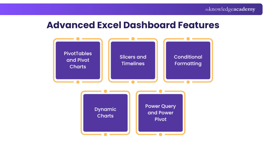
Excel offers several advanced features that make dashboards more interactive, dynamic, and easier to analyse. These tools help users explore data and gain deeper insights:
a) PivotTables and PivotCharts:
Summarise large datasets quickly and create dynamic charts that automatically update once the underlying data changes.
b) Slicers and Timelines:
Add interactive filters that allow users to view data by categories, dates, or other criteria without changing the original dataset.
c) Conditional Formatting:
Highlight trends, exceptions, or important values using colours, icons, or data bars to make key insights easier to identify.
d) Dynamic Charts:
Create charts that automatically adjust as new data is added, ensuring the dashboard remains accurate and up to date.
e) Power Query and Power Pivot:
Import, clean and integrate data from multiple sources while handling larger datasets more efficiently than standard Excel tools.
Limitations of Excel Dashboards
While Excel Dashboards are effective for reporting and analysis, they have some limitations, particularly for large datasets and complex business needs. The following are some of the most common challenges to consider:
a) Performance Issues with Large Data:
Excel may become slow when handling large datasets, complex formulas, or multiple worksheets, affecting dashboard performance.
b) Limited Real-time Data:
Dashboards require manual or scheduled refreshes, making Excel less suitable for real-time reporting.
c) Collaboration Challenges:
Multiple users editing the same dashboard can lead to version conflicts and accidental changes.
d) Limited Data Visualisation Options:
Although Excel offers various charts, it lacks the advanced and highly interactive visualisations available in dedicated BI tools.
e) Difficult to Scale:
As dashboards grow in size and complexity, they become harder to manage, making specialised BI platforms a better choice for enterprise-level reporting.
Learn all about Business Analytics with our Business Analytics with Excel Course– Join now!

The Knowledge Academy develops accessible learning content across Project Management, IT, Cybersecurity, Data Science, Business Analysis, HR, Accounting and Finance, Leadership and Health and Safety. Its resources combine subject research with clear explanations to help professionals build practical knowledge across a wide range of disciplines.
View Detail

 If you wish to make any changes to your course, please


